

One Site for aiRA, Written Industry by Industry
aiRA is Capillary Technologies' on-demand insights and analytics agent for customer data. Teams ask about their customer and marketing data in plain language and get the answer, the reasoning behind it, and a recommended move waiting for their approval.
When I came in, aiRA had one basic homepage, generated with AI. I built the complete site from the ground up, end to end, handling both design and development: the information architecture, the visual system, every page and the front end. It's live, and it's now the landing site for Capillary's US workshop tour.

The Brief
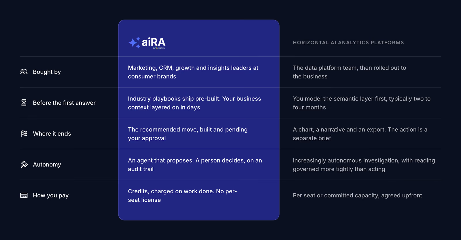
aiRA's buyer is a marketing, CRM or growth lead at a consumer brand, not a data team. The site had to read like it was written for that person's industry and week, not like a horizontal analytics platform built to pass a data-team evaluation.
A complete site
Grow a single homepage into a full marketing site, designed and built from scratch, hosted on Cloudflare.
A page for every situation
Marketing inside a restaurant chain is a different job from marketing inside a fashion retailer. Pages by industry and by category, retail first.
The real product
Show the actual product as much as possible, never a hand-built imitation.
One goal
Every page leads to one thing: a 30-minute working session.
A Solution-First Homepage
The first homepage explained the product and its agentic marketing story. In a review a week later, Capillary said two things: the solutions were too well hidden, and the site should stay on what's being sold now, ask a question and get an answer.
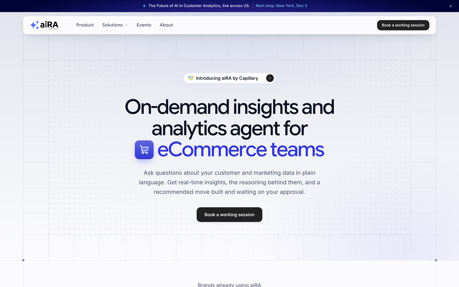
The homepage hero
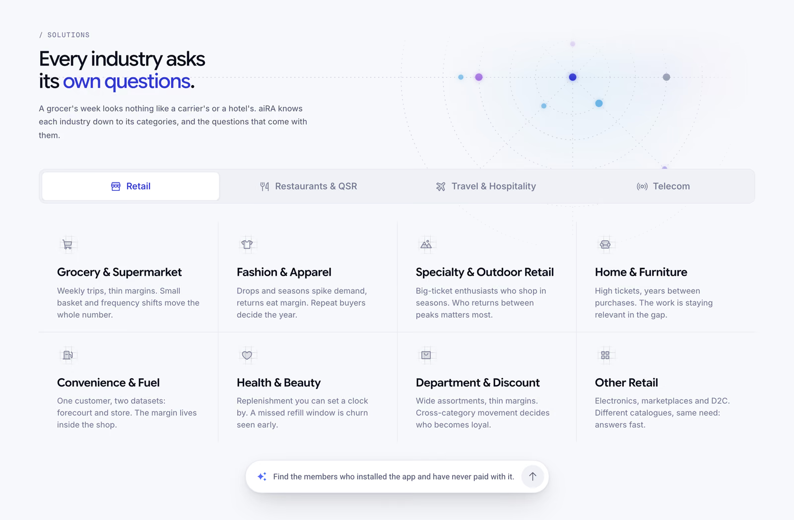
I kept that version as a snapshot and rebuilt the homepage around industries. Four tabs (Retail, Restaurants & QSR, Travel & Hospitality, Telecom) each open their categories, and a floating question bar under them rolls through real questions from that industry and links into its page. A visitor who only skims still meets a question from their own world, one click from their page.
Switching industries on the homepage
Pages Written for Each Industry
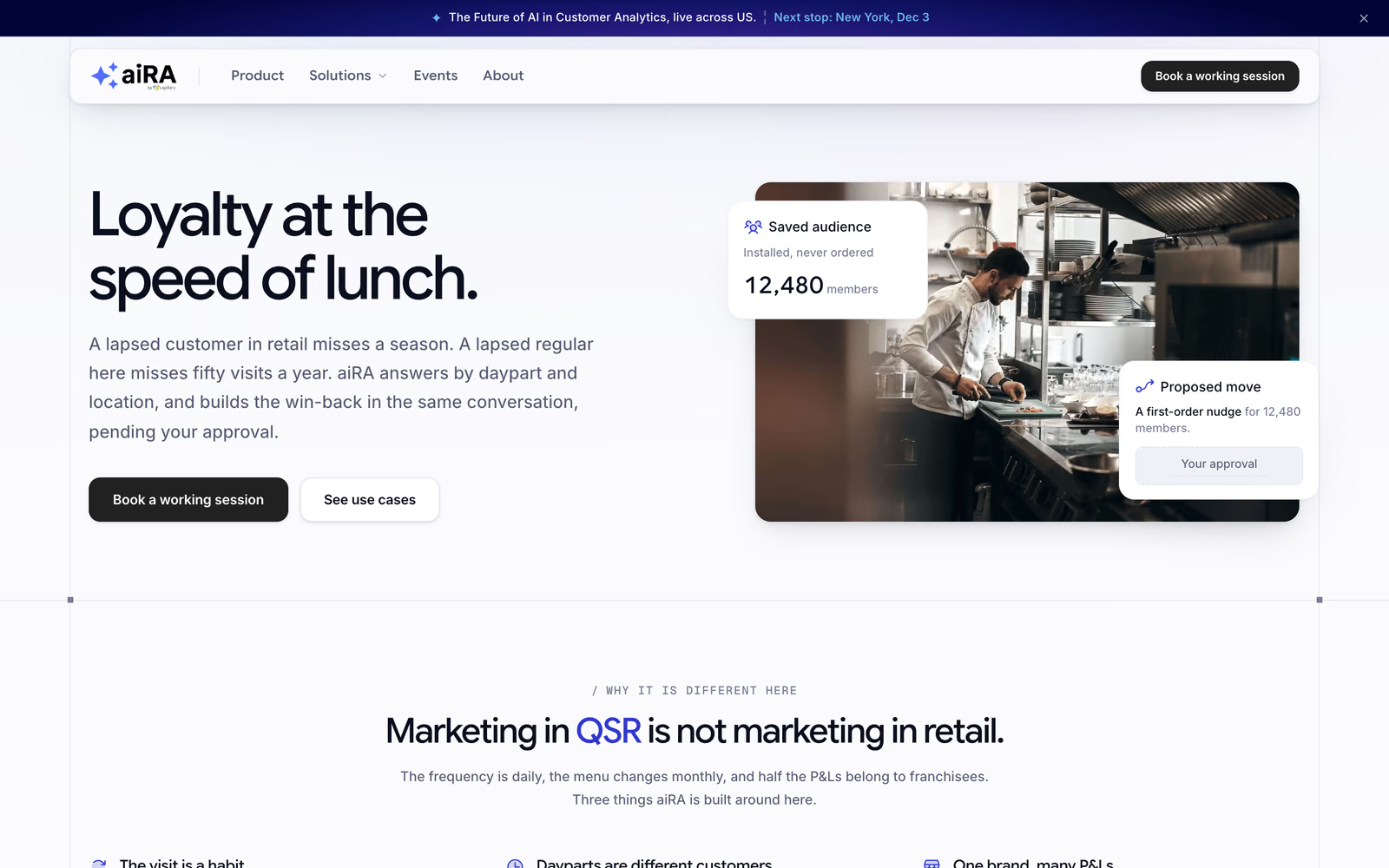
The brief was easy to say: marketing in QSR isn't marketing in retail. So the unit of the site became the industry page and the retail category page, four industry hubs and eight retail categories.
Restaurants & QSR
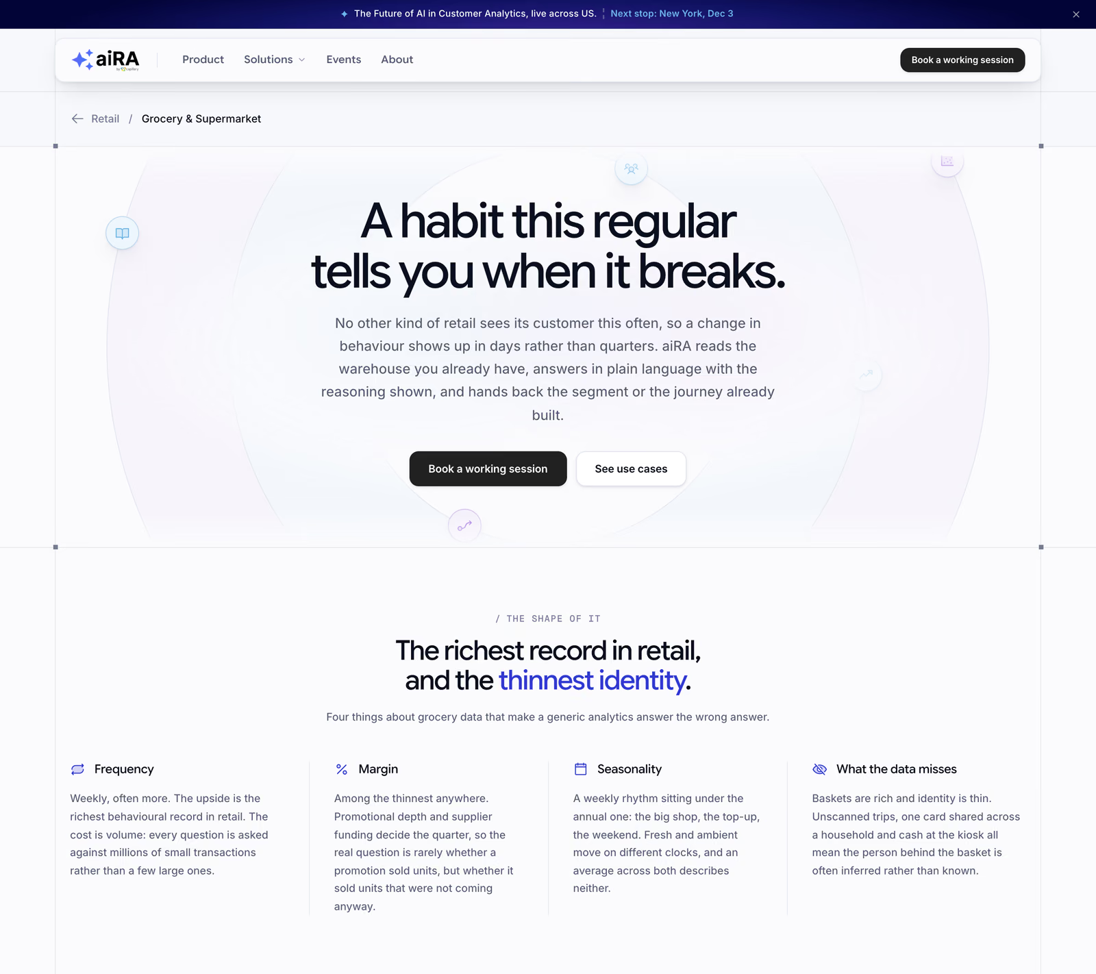
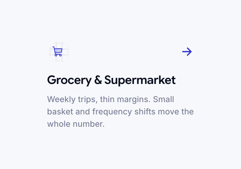
Each category page opens on what makes that category's data different. Grocery's hero reads "A habit this regular tells you when it breaks." Then come four facts about frequency, margin, seasonality and what the data misses, then real questions in that category's vocabulary, then what aiRA runs for it, taken from Capillary's own capabilities deck.
Grocery & Supermarket, one of eight retail categories
I also built a two-dropdown finder page, then retired it. The navigation and the homepage already took people to the right page, so it was a step nobody needed.
The Real Product, Never a Mock-Up
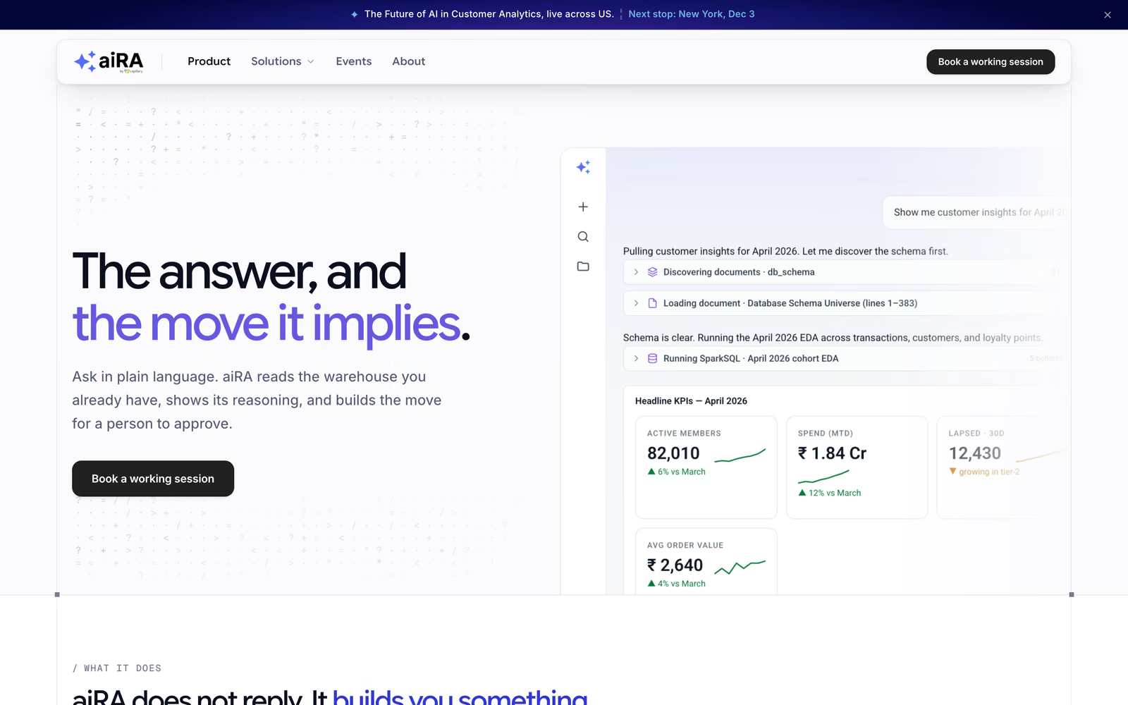
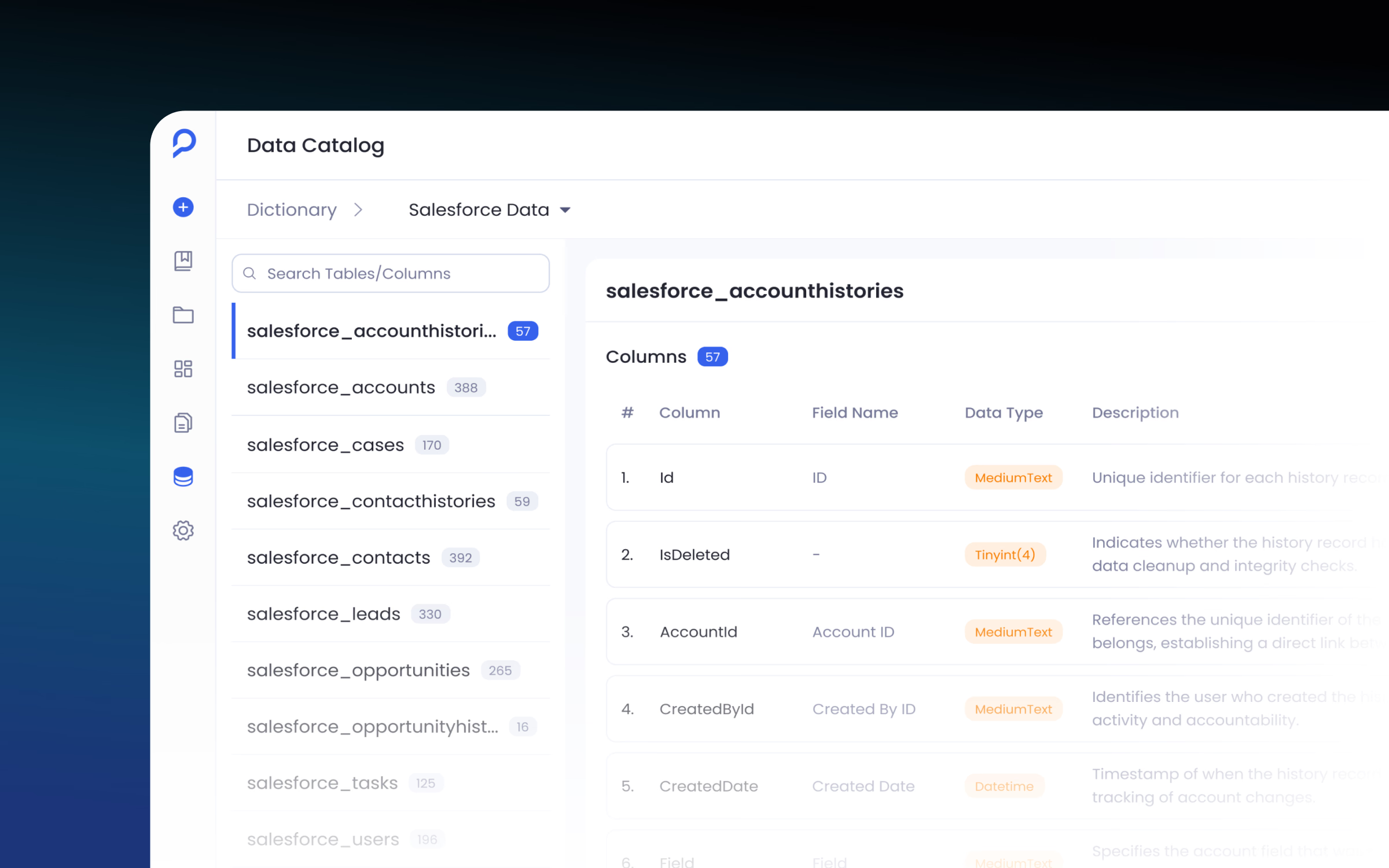
Every product surface on the site is a real capture, or drawn in HTML and CSS from real screenshots. The product page opens on a real capture that dissolves into the page.
The product page
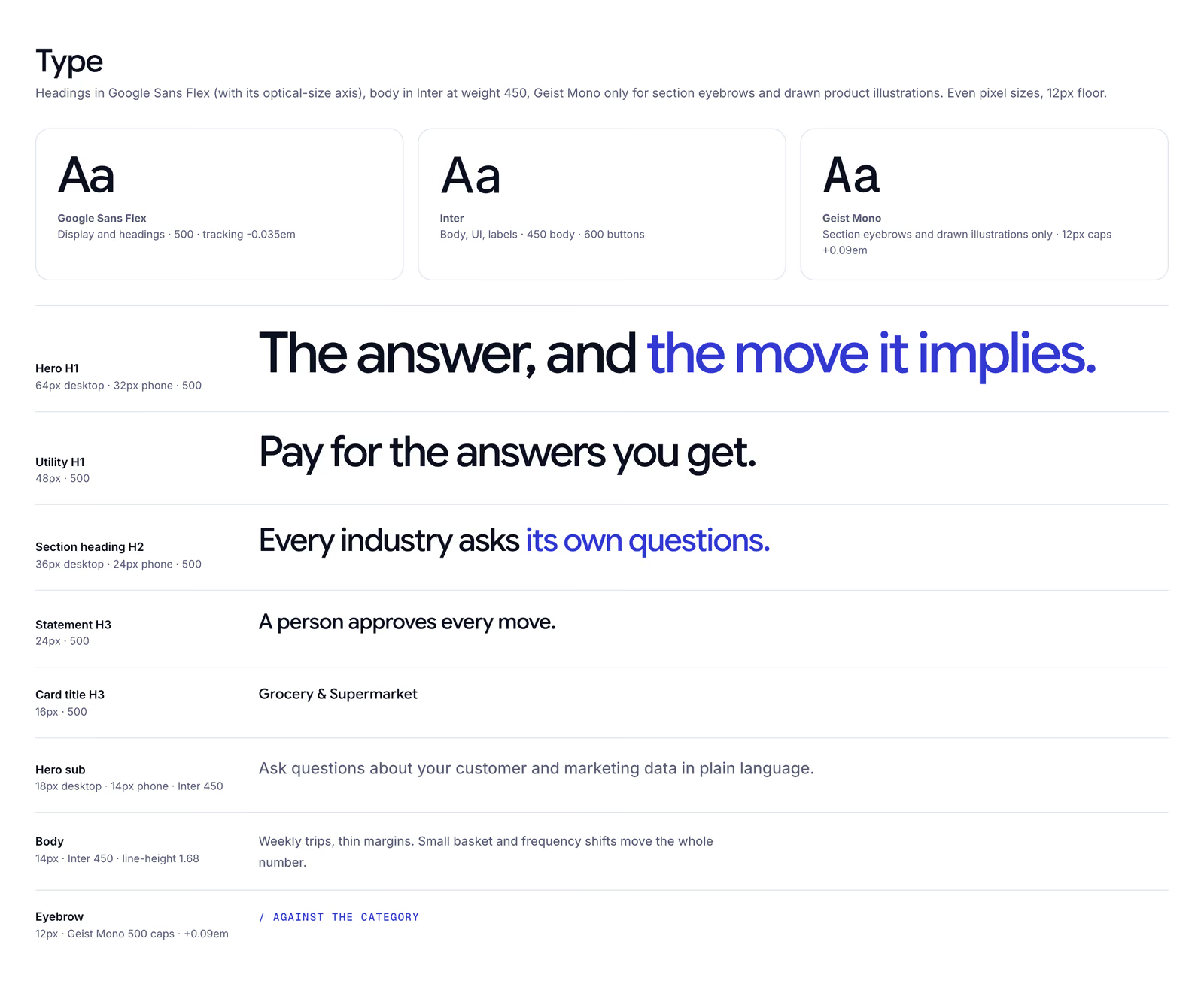
Its "What it does" section is five small drawings, each a different kind of figure: a chat thread, a question fanning out into an answer, a segment and a journey, a first-week checklist, the query behind an answer, and a tree of loyalty terms.
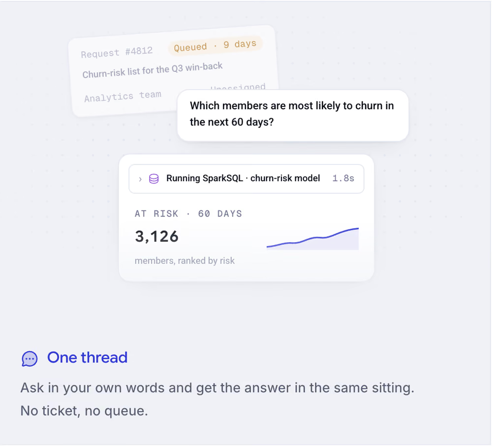
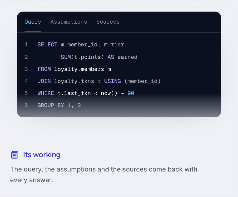
Three of the five drawings in "What it does"
"Your first week", one of the drawings, works: tick a row and the tick draws in as the text is struck through
The rollout timeline is interactive too. Picking a phase grows the line to it, moves the output note, and lights the 99% parity gate at the end.
The rollout timeline
Events as a Campaign
In October, Capillary started a US workshop tour, The Future of AI in Customer Analytics, as its main push for leads. The events had to read as events, not as an aiRA pitch.
I built the events hub as a tour poster: stacked type, a live stop list with the played stops ticked, and a ticket-shaped "up next" strip. Every event page uses the same ticket grammar: a printed ticket in the hero, a countdown that turns into "This event has ended", and torn-edge dividers. Registration opens Luma's checkout from the event page, and a bar across the whole site points at the next stop.
The tour poster
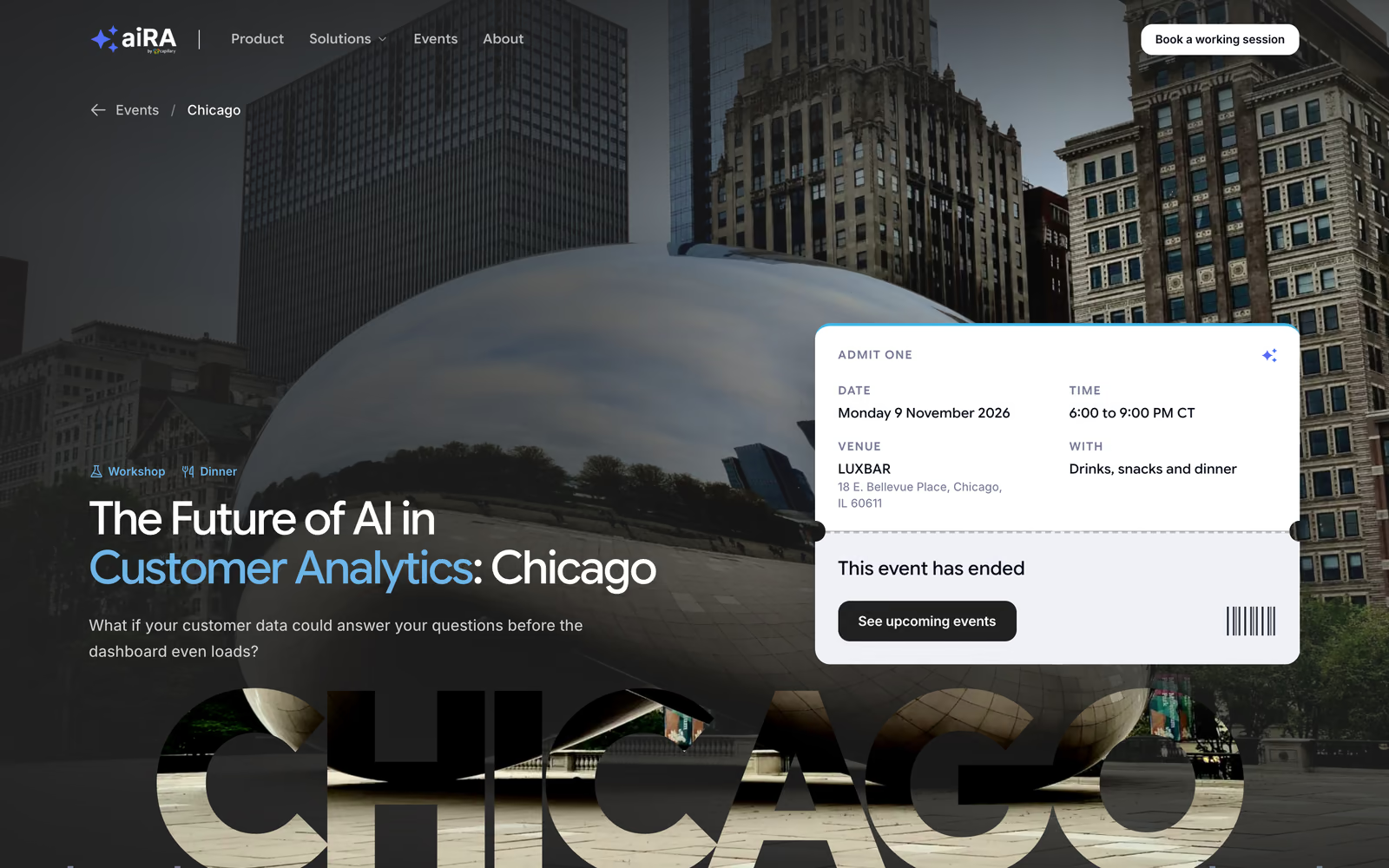
An event page: the city name cut out of its own photo
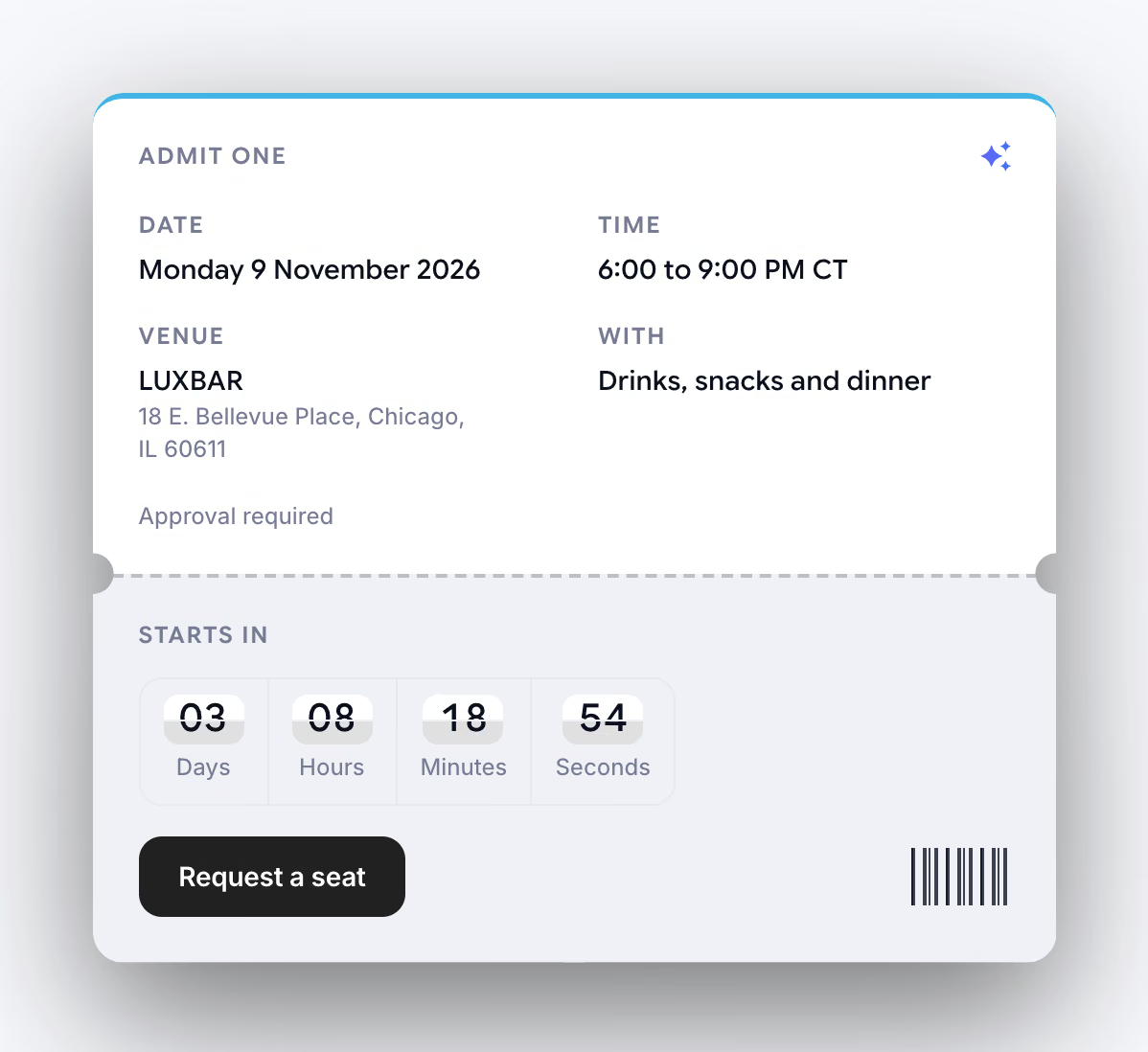
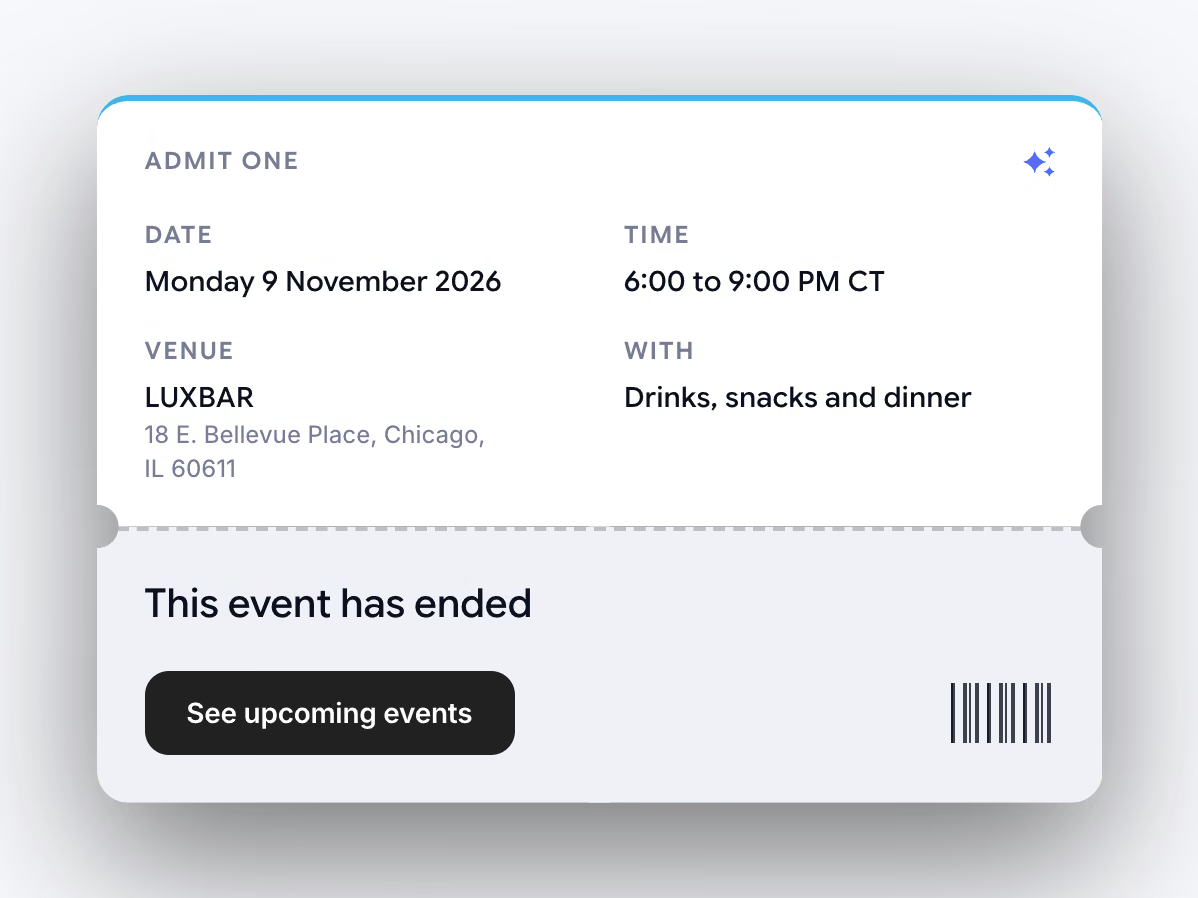
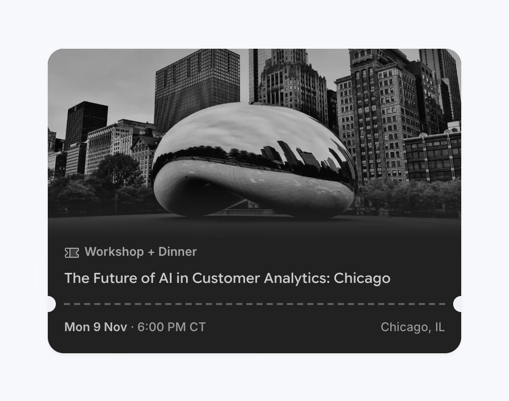

The countdown, ticking

The hero band tears off like a ticket, and the up-next strip sits on the seam
One Action, Said One Way
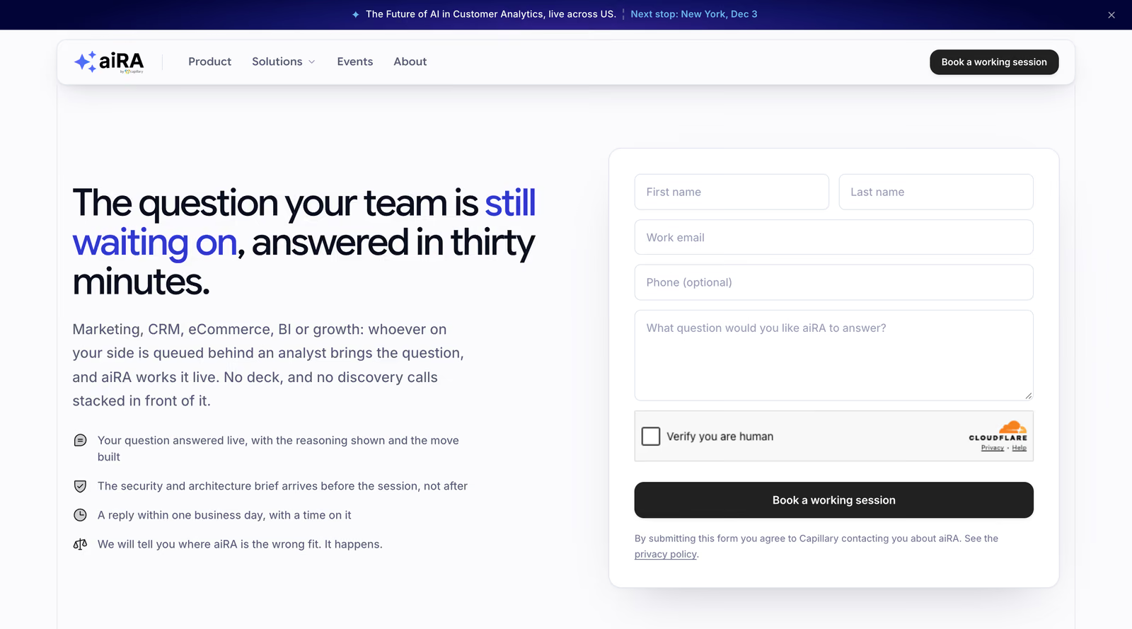
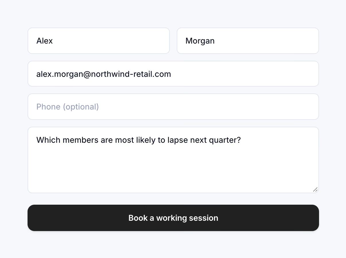
Every page closes on the same button, "Book a working session": the same words everywhere, with no icon and no variants. The booking page promises only what a 30-minute call can honestly deliver. An early line about using "your data" came out, because a configured instance takes weeks of onboarding.
The booking page
The form takes work email addresses only, is protected from spam, records the campaign a visitor came from, and sends each lead by email until Capillary picks a CRM.
The same rule shaped pricing. Capillary has no public price list, so the homepage says only what's true: one line Capillary had approved, "No per-seat pricing. Pay based on usage.", and three terms taken from aiRA's own terms and conditions.
Details That Carry It
The announcement pill above the hero needed a go button that read as its action. Two arrows sliding through a small window read as one arrow sliding sideways, and a grey circle was too quiet to read as an action at all.
The final button is one glyph drawn as two paths. At rest it's a caret in a filled black circle. On hover the circle takes the brand colour and stretches into a pill while the arrow's tail draws in, so the shape and the glyph move as one gesture.
The announcement pill on hover
The whole site moves on one easing curve, cubic-bezier(0.22, 0.61, 0.36, 1), and short durations. The mega menu opens in 0.18s as it fades in and drops 6px into place, a category card's arrow slides in over 0.28s, and an FAQ answer opens in 0.3s.
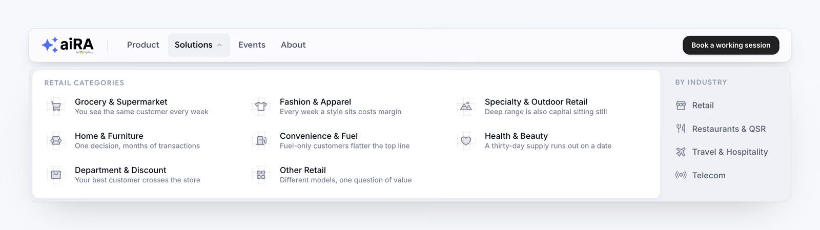
The mega menu, opening on hover
Category cards: the icon takes the brand colour and an arrow slides in
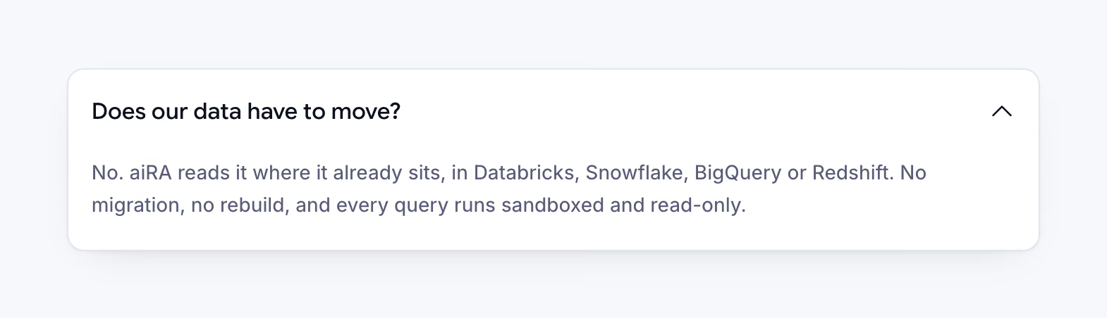
The FAQ: one answer open at a time
The page frame is the site's signature: hairline rails down both edges of every section, a hairline at each boundary, and a small brand square wherever they cross. Every animation stops when a visitor has asked for reduced motion.
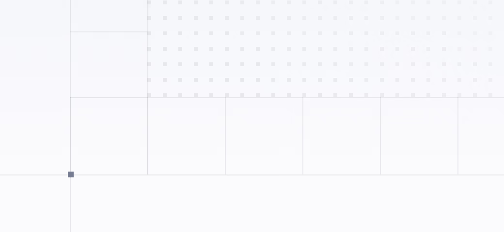
Where the rails cross, a 6px brand square
The Components
The pieces the pages are built from, each designed once and reused everywhere: the navigation and its mega menu in light and dark, the FAQ, the closing call to action, the event ticket, and all of it on a phone.
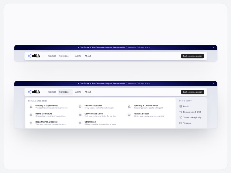
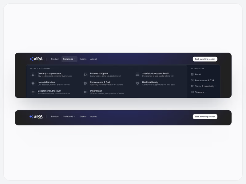
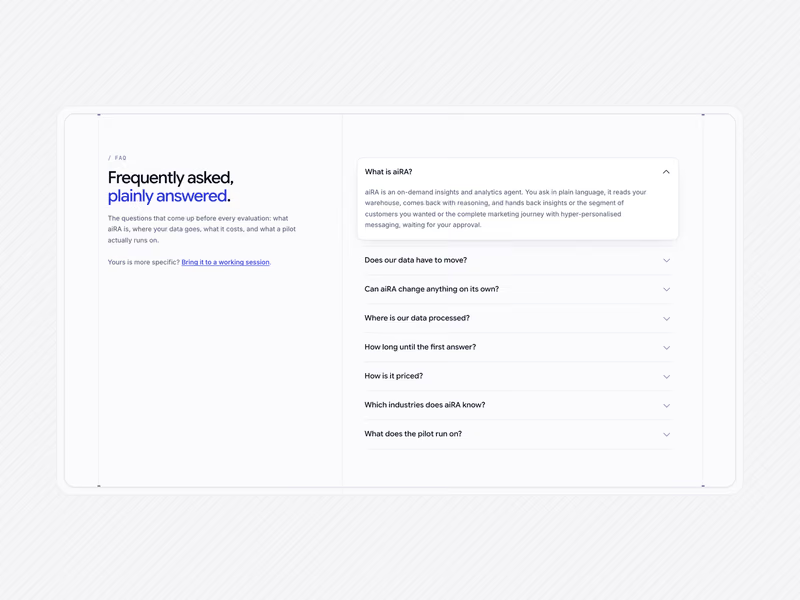
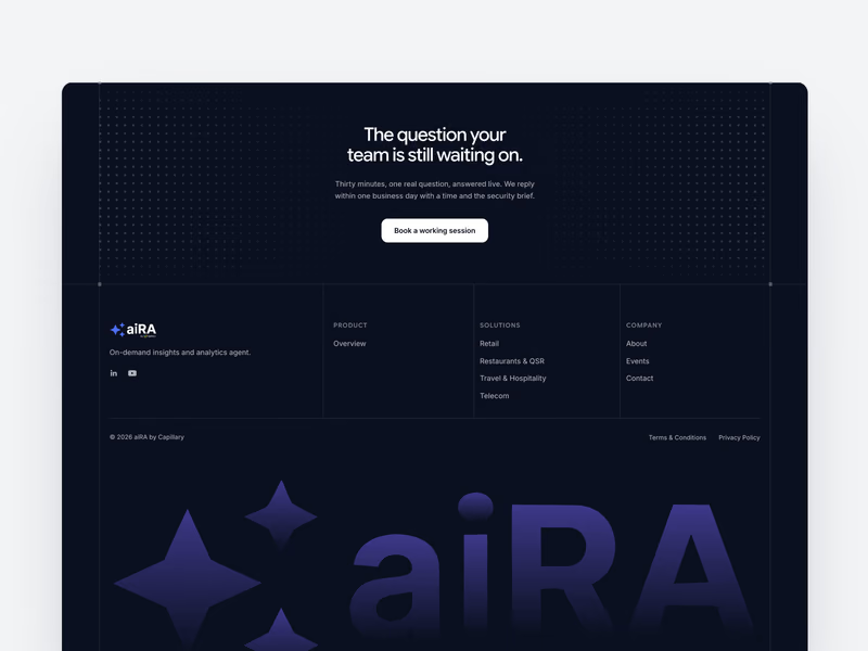
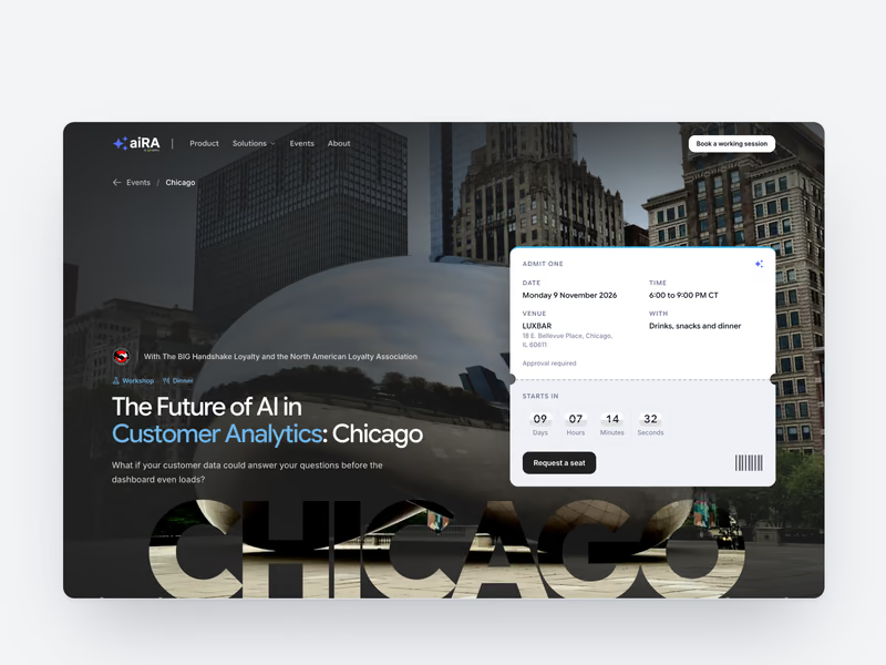
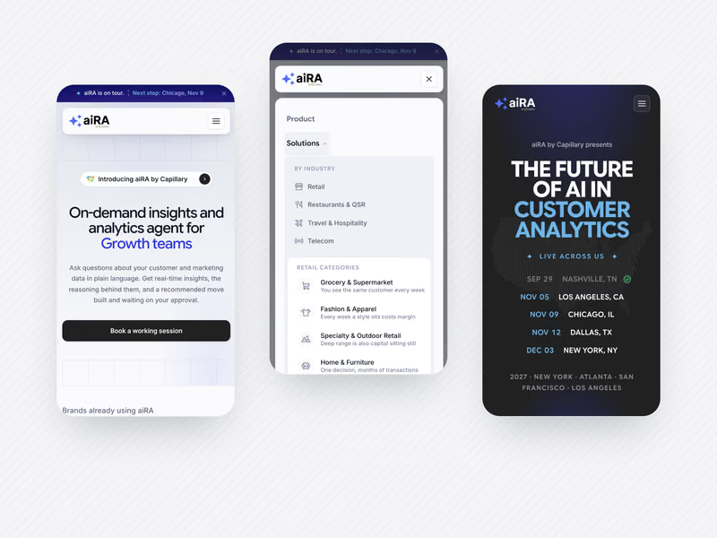
And the same pieces as they run on the live site:
The Visual System
Capillary's three colour ramps, Primary, Secondary and Tertiary, are one colour at three hues: the same saturation and lightness, about 30 degrees either side of the brand blue. That blue clears 7:1 on white, so it doubles as the brand's ink.
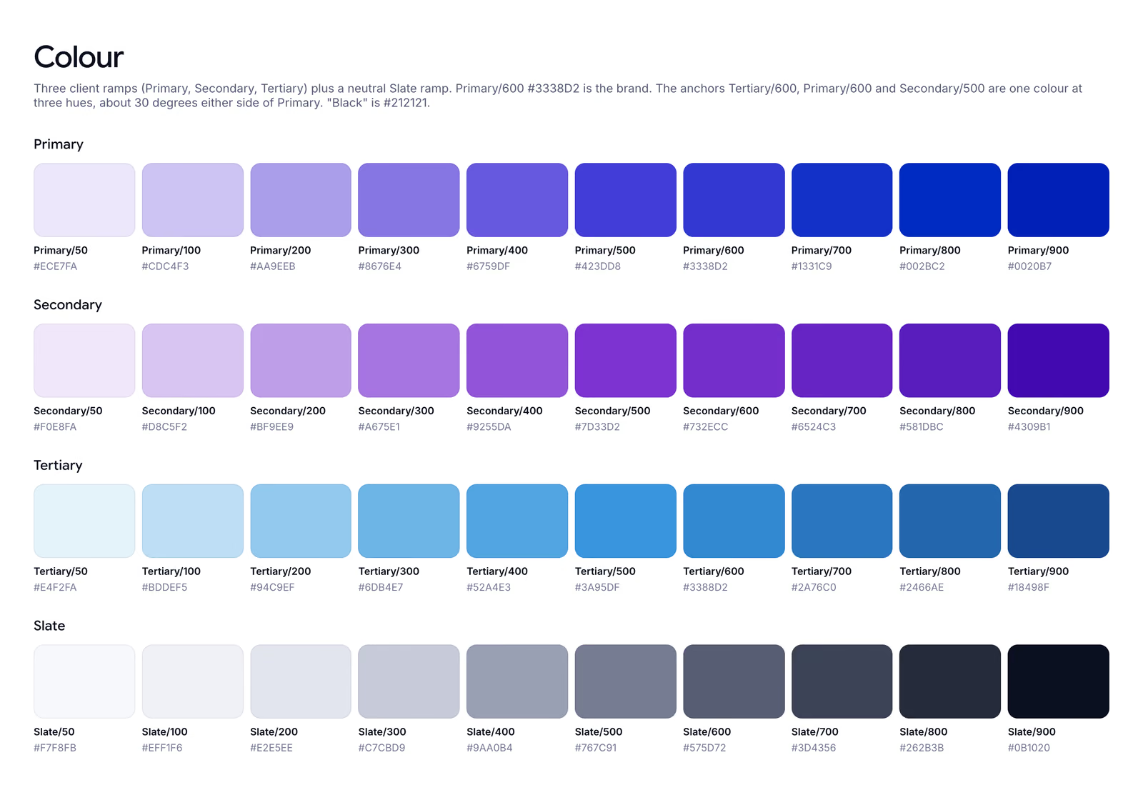
Colour
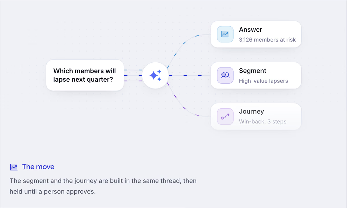
Headings are set in Google Sans Flex with its optical-size axis, so a 64px headline and a 16px card title get different drawings. Body text is Inter at weight 450, so small text doesn't run thin.
Type
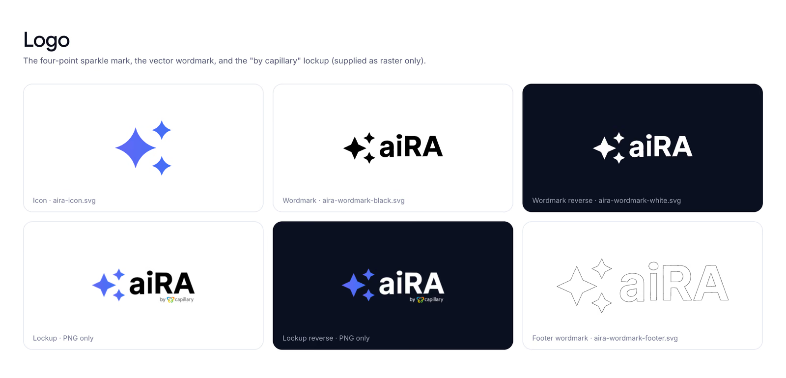
The logo arrived as a raster image, so I rebuilt the sparkle mark as a vector from measured geometry.
Logo
Built to Stay Simple
The site is plain HTML, CSS and JavaScript on Cloudflare Pages, with no framework and no build step. One token file holds every colour, the header and footer are shared components, and the fonts are self-hosted.
A speed pass for phones cut the homepage download by about 2.1MB of 2.8MB, mostly by resizing images. A later pass took the product page from 1.07MB to 0.49MB and fixed a layout shift. Tabs and dropdowns work from the keyboard, every page reads with JavaScript off, and nothing overflows down to 360px.

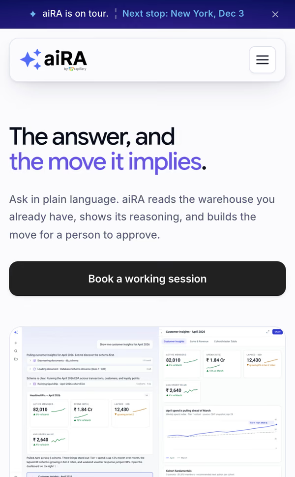
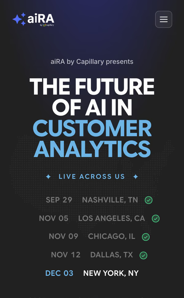
On a phone
It's now 27 pages: home, product, about and booking, four industry hubs, eight retail categories, the events hub with a page per event, and the legal pages.
The Tour Beyond the Site
The tour needed to travel past the website, so I made its creatives in the same system: a social card for every page, a poster for each stop, covers for the event listings, the LinkedIn page's logo and banner, and a set of ten LinkedIn posts in dark and light.
The social card every page shares
Six of the ten LinkedIn posts