
One of One brand guidelines
The identity system for One of One, an endorsed brand of Blume Ventures for its media and podcasts. One shape, one voice, one guest.
Introduction
One of One is Blume's endorsed brand for media and podcasts: it has its own mark, and Blume signs it. It approaches conversation the way Blume approaches investing: one person, considered closely. The mark is a speech bubble whose plate traces the custom letterforms and folds into a tail, so the title and the symbol are a single object. The by Blume signature sits inside the mark, in official Blume colours, so every appearance is signed by the firm.
Versions
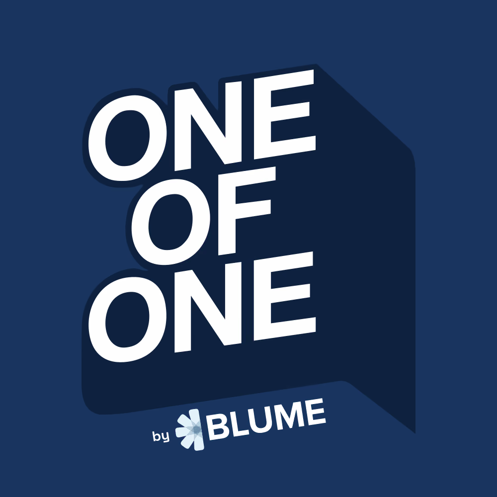
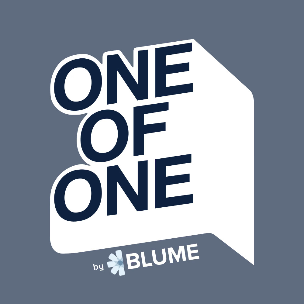
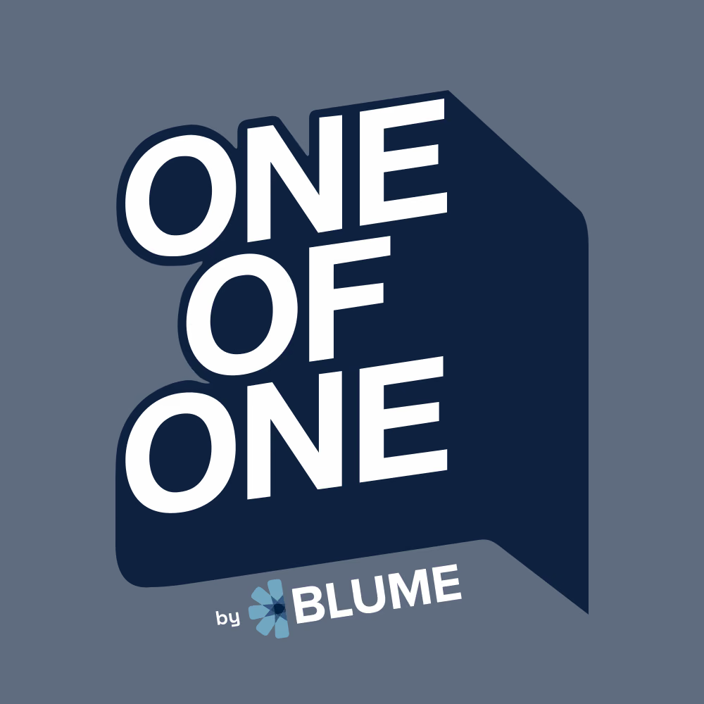
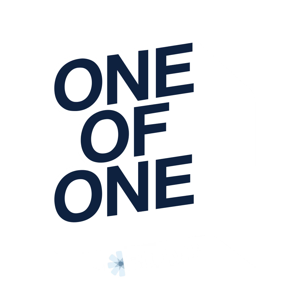
Four versions cover every surface, and the choice is made by the background, never by taste. Regular is the default and lives on Light Blue. Dark belongs on the deep navy panel. Inverted carries the mark onto cobalt, accents and photography. Grey is the quiet option for neutral layouts and print.
Logotype scale
Use the supplied mark as a single piece of artwork and preserve the relative size, spacing and angle of every element. The full mark works at 64 px and above. The by Blume signature stays readable from 120 px; below that, prefer layouts where the mark appears larger.
- 160 px
- 120 px
- 96 px
- 64 px
- 48 px
- 32 px
Clear space
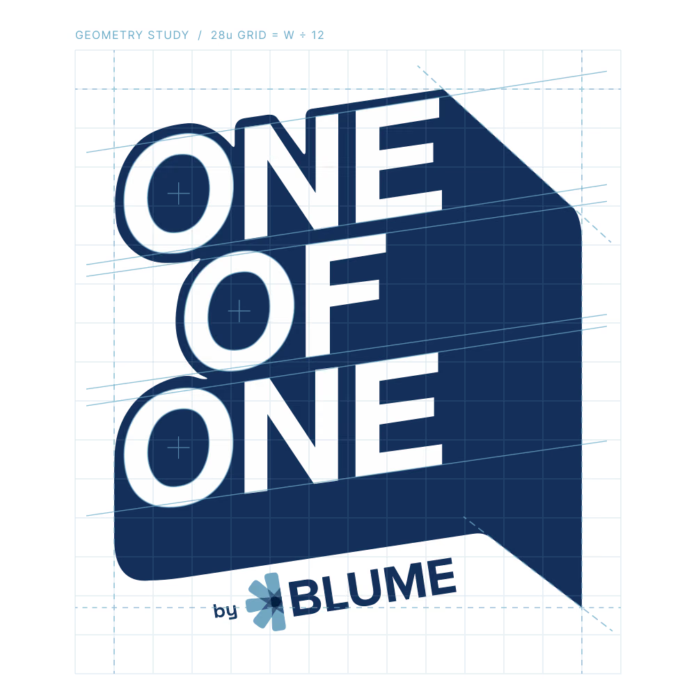
Keep a margin of x on all sides of the mark, where x is the height of the word OF. No type, logos or page edges enter this zone.
120 px64 pxColour
Light Blue is the home of the brand: cover art, episode art, and anywhere the show introduces itself. The navies hold the title and the bubble, Petal Blue belongs to the Blume flower in the signature, and white does the talking on dark surfaces. Values are sampled from the final artwork and match the Blume primaries.
Give Light Blue the largest area and let the navy mark anchor it. White provides the principal reading contrast. Cobalt appears in a focused position: a thumbnail, a story, a launch.
Click a swatch to copy its HEX
Accents
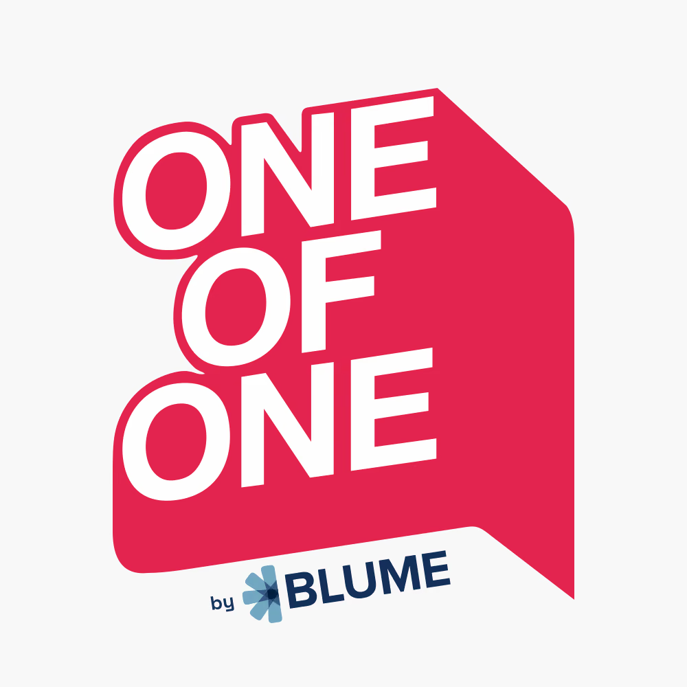
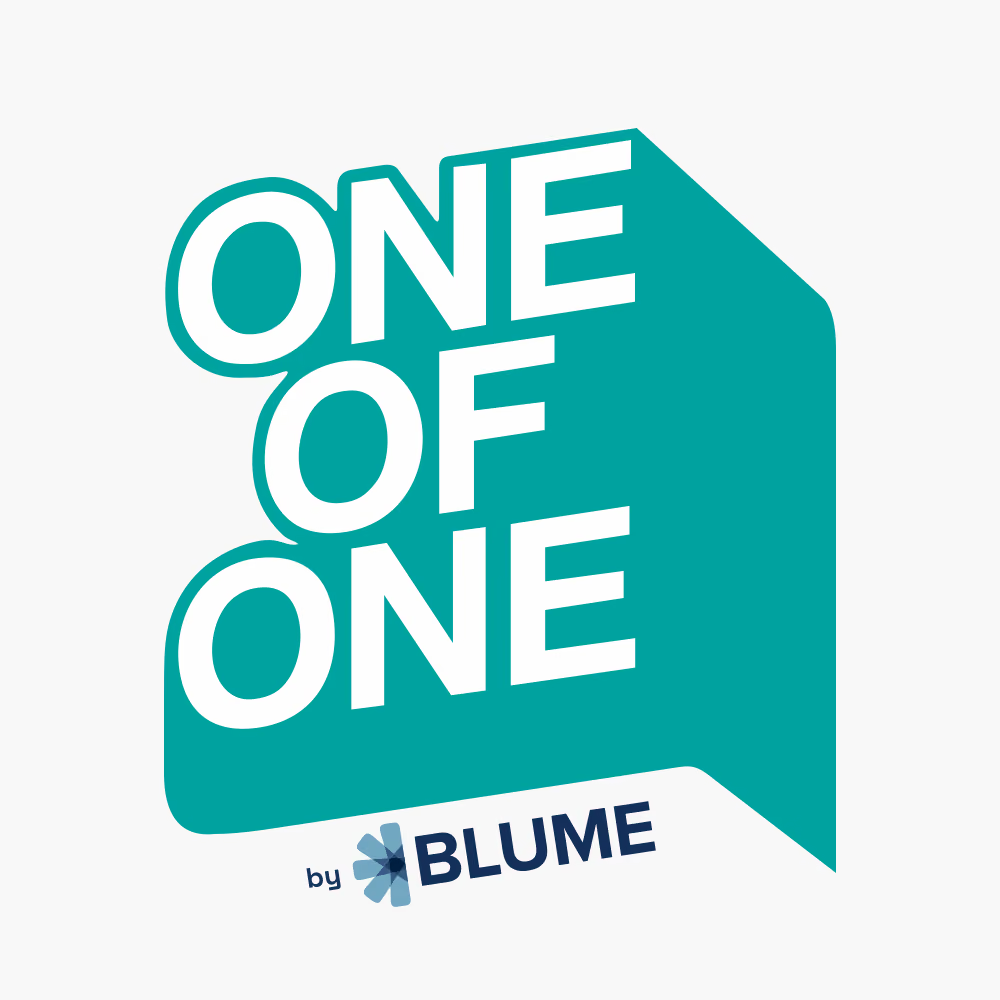
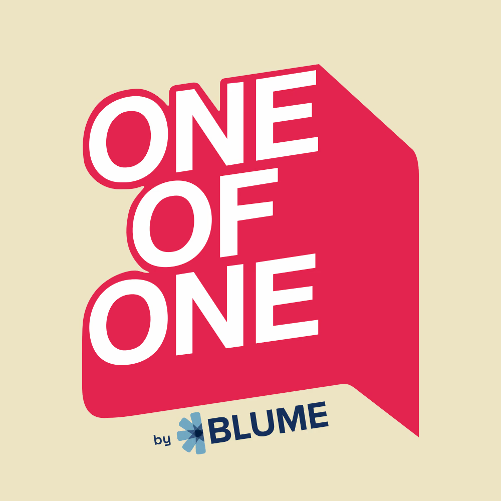
For special moments the bubble itself can take a Blume accent: red for marquee episodes, teal for named series, aqua for clips. The navy mark on Light Blue stays the default everywhere else, and the by Blume signature keeps its official colours in every accent version.
Readable combinations
Use the highest-contrast pairings for episode titles, guest names and small labels. White on cobalt holds up only for large headlines, so keep small text off it. Ratios follow WCAG 2.2: AA needs 4.5:1 for normal text, AAA 7:1.
- AaOne Navy on Light Blue7.7:1AAA
- AaWhite on One Navy13.3:1AAA
- AaWhite on Deep Navy15.9:1AAA
- AaWhite on Blume Red4.5:1AA
- AaWhite on Blume Cobalt4.3:1Large only
- AaWhite on Light Blue1.7:1Fail
Typography
Montserrat gives short One of One headlines a compact, confident rhythm, and it is already Blume's brand typeface, so the show inherits the parent voice. Source Sans 3 carries body copy. The lettering in the mark is artwork and is never recreated with live type. Both faces are free on Google Fonts.
- Regular
- SemiBold
- ExtraBold
- One voice. One guest.
- Worth hearing twice.
- Episode 12 · 48 min
- One of One shapes each conversation around the person in the room and the decisions that made them.
Usage
Every approved layout is built from the six habits; the mark works because it is never improvised. If a layout seems to need one of the treatments below, the layout changes, not the logo.

Applications
The show cover is the mark on Light Blue, nothing else. Everything with a guest borrows the bubble's outline as a frame, so the person sits inside the conversation. Photography stays black and white so the colour in the frame belongs to the brand. Quote cards run on deep navy, stories on cobalt, clip tiles with the waveform.
EP 01Karthik Reddy
SPECIALEP 01
Betting early on India's next decade
Karthik Reddy
Media and podcastsby Blume Ventures
EP 02
 The discipline of the first cheque
Sanjay Nath
Betting early on India's next decade
EP 01 · KARTHIK REDDY
The discipline of the first cheque
EP 02 · SANJAY NATH
The discipline of the first cheque