Designing Safer Data Configuration Workflows for Enterprise Reporting
At Petavue, RevOps teams and data administrators manage the configuration layer that determines what data is available across the product, how it is structured, and what it means to the business.
Disabling a column, modifying a metric definition, or removing a table relationship can silently break dashboards and reports with no visible connection to the original action. The failure surfaces hours later. Tracing the cause requires engineering support and a manual reconstruction of what changed.
I redesigned the Data Hub to surface the impact of configuration changes before they are made.
The Users
The Data Hub is primarily used by RevOps managers, data administrators, and analytics owners. These teams are responsible for keeping the reporting layer accurate: connecting data sources, maintaining column structure, and keeping metric definitions up to date as the business changes.
Most of them are not developers. They understand the business logic well but have limited visibility into the underlying infrastructure. They depend on the product to tell them whether a change is safe to make.
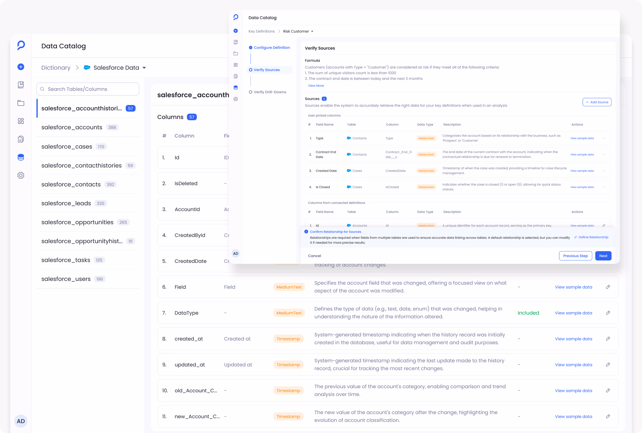
The Data Hub has two main surfaces. The Data Dictionary manages structural configuration: sources, tables, columns, and their relationships. Key Definitions sit on top of that, encoding business logic as named metrics like ARR Booked or Average Sales Cycle Length. A change to either surface can affect the other. Before the redesign, nothing in the interface made that connection visible.
The Problem
Three issues came up consistently across conversations with the product team, engineers, and administrators.
Configuration changes had no visible impact
Disabling a column, removing a relationship, or updating a definition all used the same simple toggle or form interaction. None of these actions felt dangerous in the moment. Any of them could affect downstream reports, metrics, or drill-down paths. The interface surfaced no indication of what depended on a column or definition before the change was confirmed.
Admins described the same pattern: make a change, assume it went through, discover something broke when a report failed hours later. The action and its consequence were separated by time and context.


Failures were disconnected from their cause
When a report failed, users saw a generic execution error. There was no path back to the configuration change that triggered it. Debugging always started from scratch: what changed recently, which column or definition was involved. Engineers got pulled into investigations that traced back to a simple admin action.


Business logic was hidden from the people managing it
Admins managing metric definitions had no visibility into which columns and tables each definition drew from. That information lived inside the underlying query. The Data Dictionary and Key Definitions were managed on separate screens with no visible connection between them, so updating one gave no indication of how it affected the other.


The risk in the Data Hub was not incorrect data. It was invisible impact. A technically correct change could still break reports elsewhere in the system.
Dependency Warnings
When an admin tried to disable a column that was already referenced in a definition, metric, or drill-down path, the system responded with a generic error after the action was attempted. The error confirmed the failure but not the cause.


Use slider to switch between old and redesigned dictionary page.
When a user tries to disable a column that is already referenced elsewhere, the interface now identifies the dependency causing the conflict: which definitions rely on that column, why the action is blocked, and what needs to be resolved before it can be completed safely.
Admins can identify and address dependency conflicts without pulling in engineering. The information is in the product.
Making Definitions Inspectable
Three decisions shaped the Key Definitions redesign.
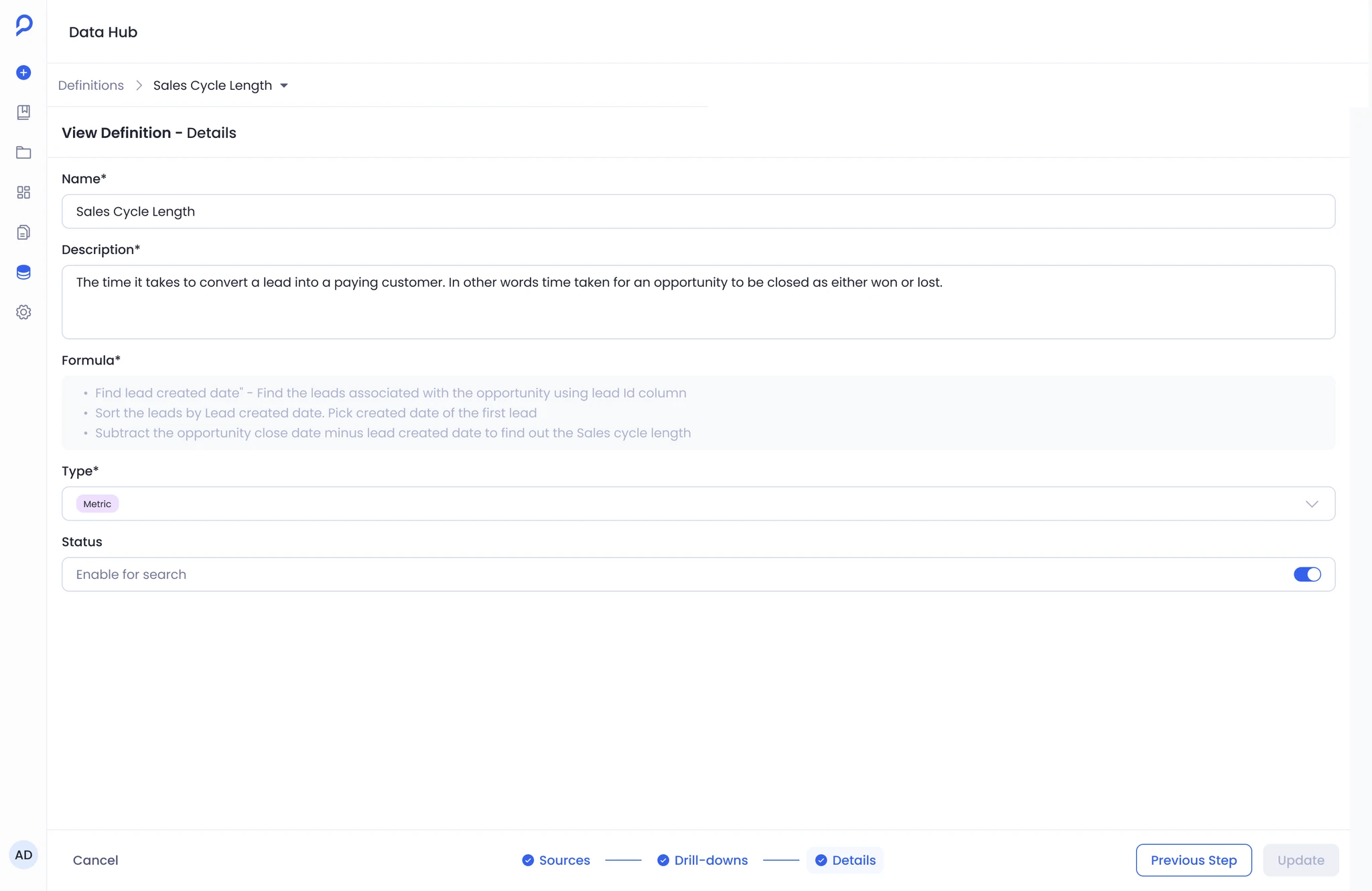
Natural language formula input
Configuring a definition originally required writing structured query syntax. Anyone without a technical background had to involve a developer to make changes that were conceptually straightforward: adjusting a formula, adding a condition, updating a calculation.
I replaced the syntax input with a plain language formula field. Admins describe what a metric should calculate in business terms, without writing a query. RevOps managers can now update metric definitions directly without engineering involvement.
Source visibility
The columns and tables powering a definition were not visible in the configuration panel. Understanding what a definition drew from required reading the underlying query.
Definition Configure Screen
Field name, table, data type, and description are now surfaced directly in the configuration panel. Fields the admin selected are separated from those inherited through connected definitions, making the boundary between direct and inherited data explicit. Admins can verify a definition's data sources at a glance and catch misconfigurations before they reach production.
Merge path selection
When a definition spans multiple tables, the join path that determines what it calculates was hidden. Setting up or editing a definition involving a join was the most reliable way to silently miscalculate a metric.
Merge path selection is now an explicit step in the configuration flow. Suggested paths are ranked by relevance, with a visual graph showing the exact join chain before the admin saves.
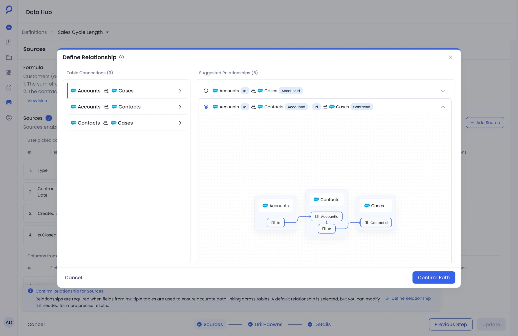
Merge Path Selection
This was the most common source of confusion during definition setup and the most opaque part of the original system. Making it an explicit step before committing removed the main mechanism for silent miscalculations.
Impact
Before the redesign, routine definition work reliably involved engineering. The syntax barrier meant RevOps admins could not update formulas, swap columns, or adjust join paths independently. When something broke, there was no path back to the cause without starting the investigation from scratch.
After the redesign, admins could handle these changes without engineering involvement. Natural language input removed the technical barrier to editing definitions. Explicit source visibility let admins verify what a definition drew from at a glance. When a configuration change would create a conflict, the system identified the dependency before the action was completed rather than surfacing a generic error after.


Reflection
The feature shipped in a better state than it started. Admins had visibility they didn't have before, the dependency between structure and meaning was no longer hidden, and the system's most dangerous actions were no longer silent.
Two things remain worth improving. Surfacing the dependency warning was the right first move, but it still ends in a blocked action. The admin knows something is wrong but has to investigate elsewhere to fix it. The next version should show what is affected, link to the conflicting dependency, and let the admin resolve it from the same surface.
The second gap is change awareness. The Data Hub is not a one-admin system. When one person updates a definition, others working on connected definitions have no signal that something upstream shifted. It was scoped out. It should come back.