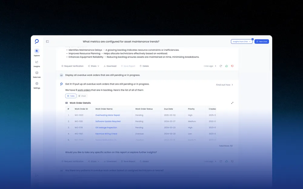
From 10K to 35K Weekly Visitors: Redesigning Petavue's Website and Content System for Organic Growth
Petavue's website was maintained externally. Small updates required multiple rounds of coordination and often took days to ship. As the company grew its content investment, that pace became a bottleneck for marketing and growth.
I took full ownership of the site: redesign, Webflow implementation, SEO structure, and a content publishing system that let marketing operate independently. Over five months, weekly organic traffic grew from 10K to 35K visitors.
View live site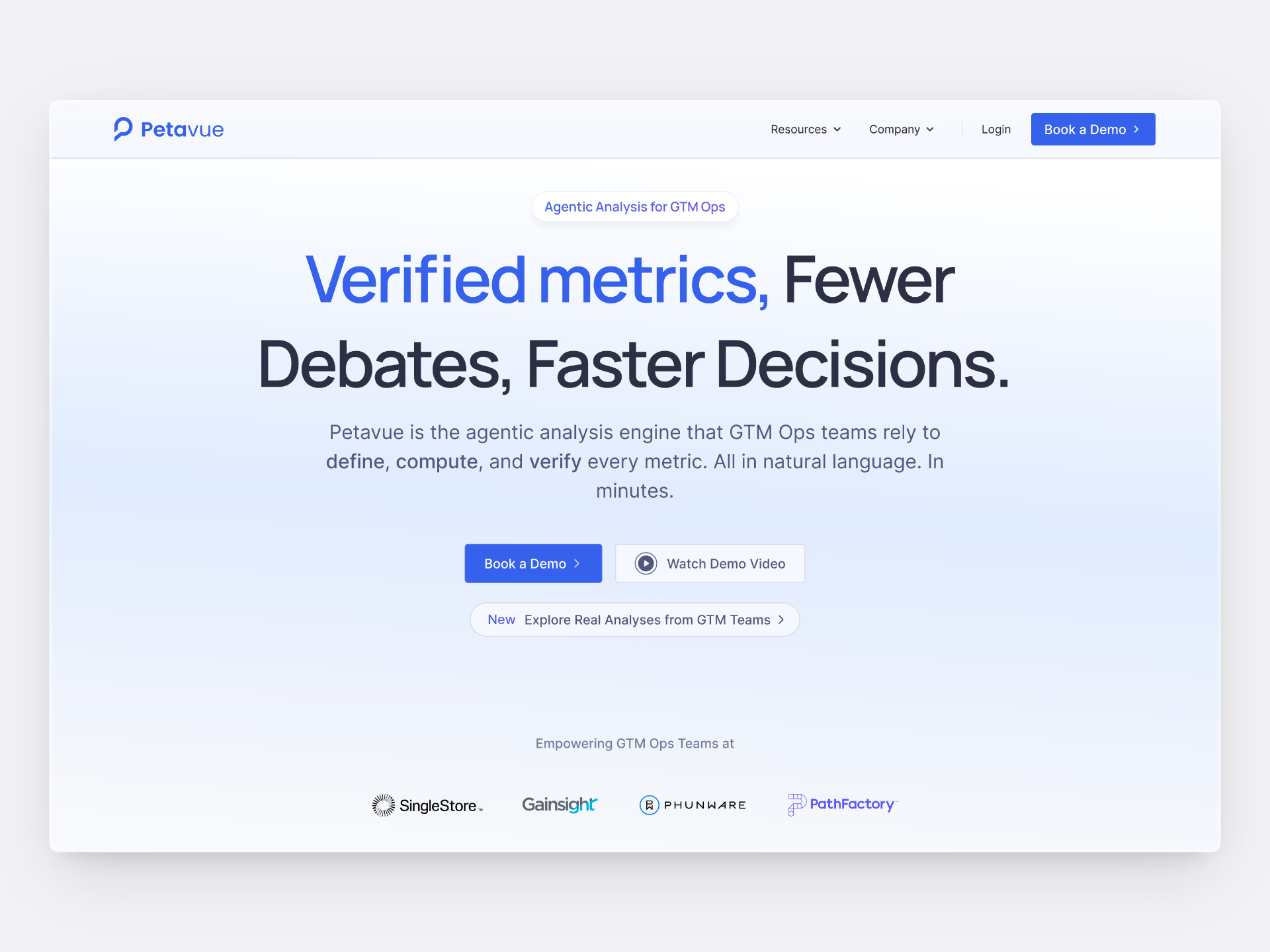
3x growth
Organic growth from 10K to 35K weekly visitors over 5 months
#1 ranking
in AI search overviews for core SaaS keywords
126% increase in clicks
on pillar content after SEO and CMS overhaul
The Problem
Two separate issues were limiting the site's effectiveness.
The first was operational. External maintenance meant that copy changes, layout adjustments, and new page launches required coordinating across teams and waiting on external development cycles. Marketing experiments moved slowly. By the time a test shipped, the moment for it had often passed.
The second was structural. As the content strategy expanded into glossary pages, long-form resources, and use-case content, the site had no architecture to support that volume. New content types were added ad hoc. There was no consistent structure for discovery, filtering, or internal linking, which limited how search engines could interpret the site and how users could navigate it.
Taking Ownership
I took over the site end-to-end: design, Webflow implementation, and the content systems underneath. The work spanned homepage redesigns, industry and use-case pages, resource content, glossary architecture, case studies, and motion design for marketing campaigns.
Bringing the site in-house changed the pace immediately. Design decisions and implementation happened in the same cycle. Marketing could review changes directly and give feedback that was live within hours. Experiments that previously required external coordination could be tested and iterated on the same day.
The design goal was consistency without rigidity: page templates that were easy to build against, easy to update, and visually coherent without requiring a custom solution for every new content type.
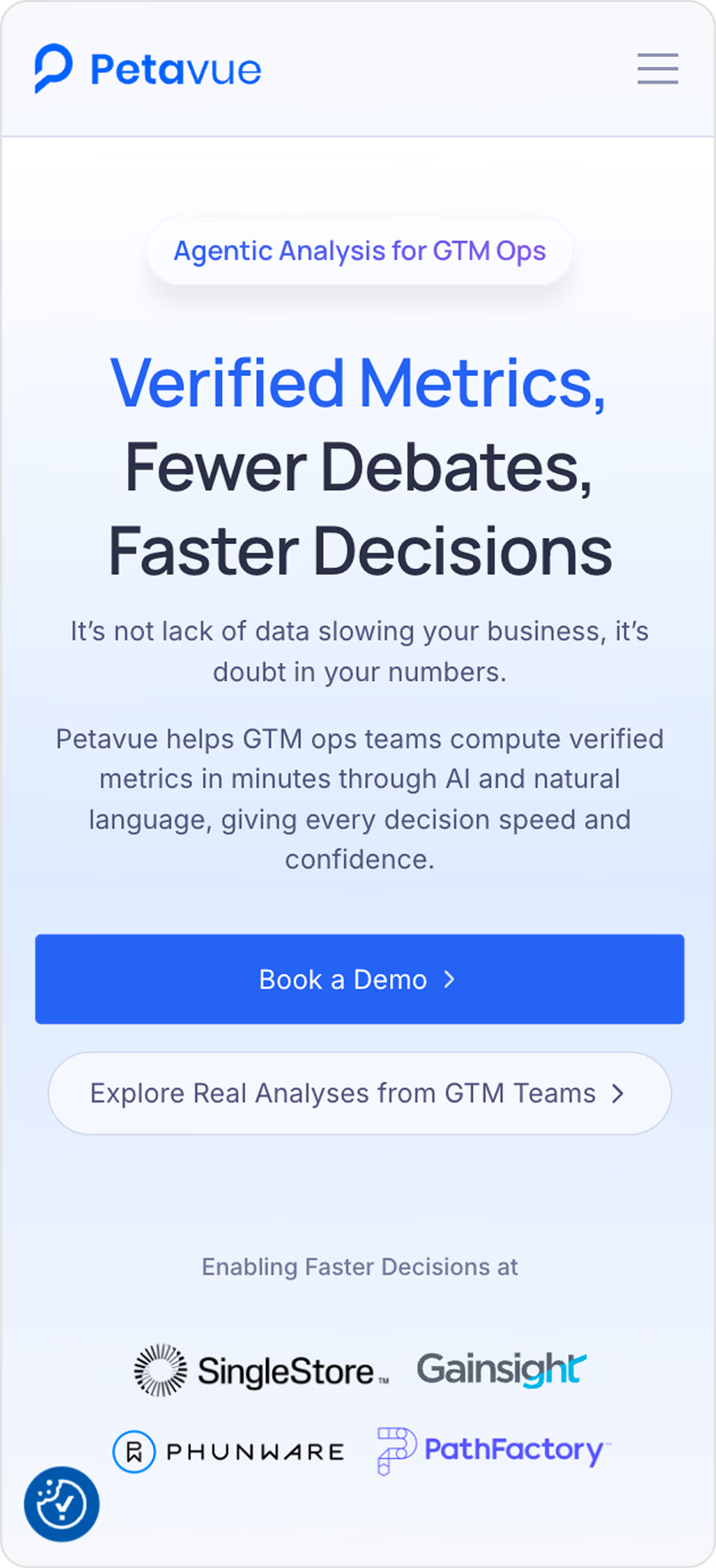
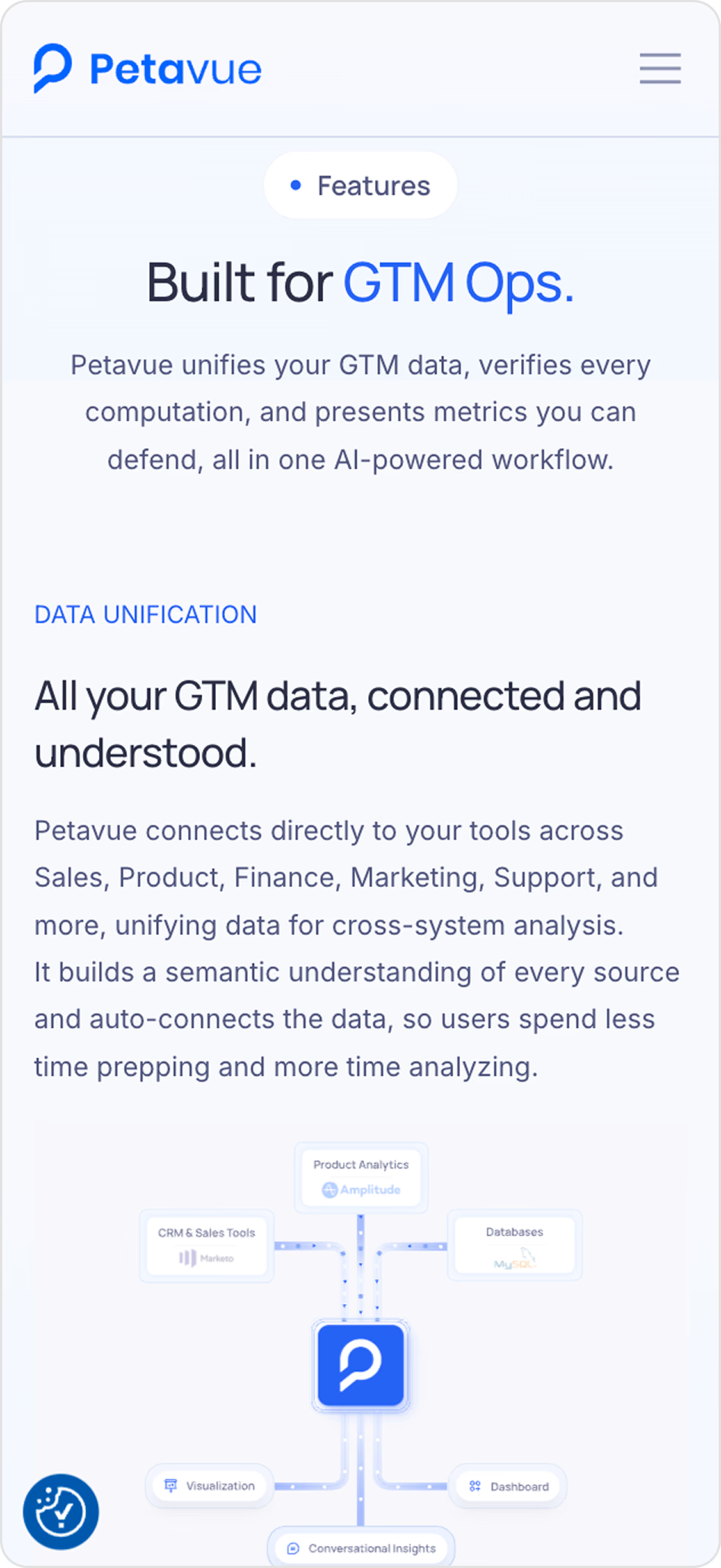
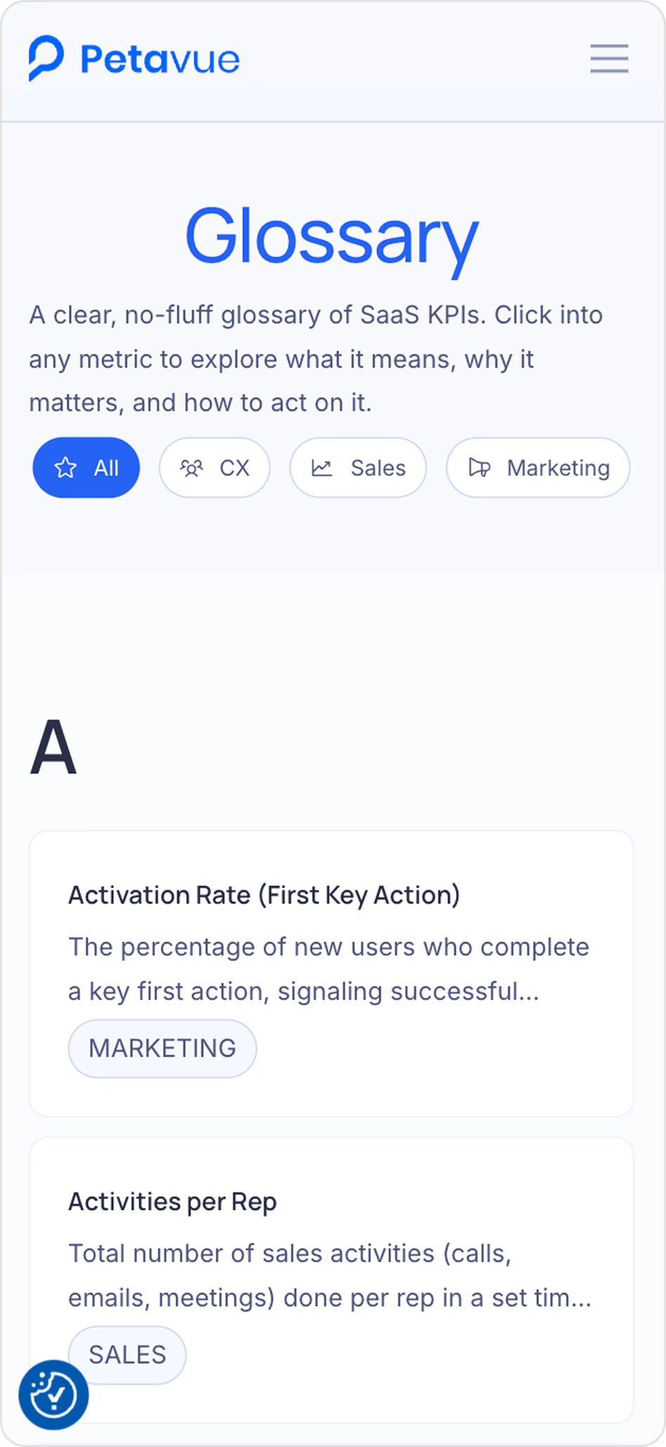
Mobile responsiveness
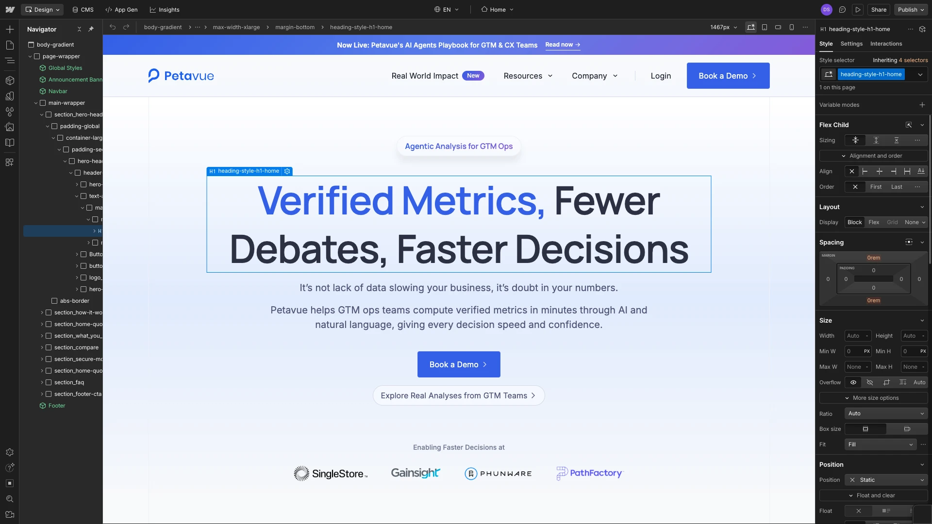
Webflow Interface
Solving for Scale in Webflow
As content volume increased, Webflow's native CMS capabilities started to show gaps. Filtering across collections, nested content relationships, and dynamic content structures all required solutions that Webflow doesn't handle out of the box. The common approach is custom JavaScript, but that adds maintenance overhead that compounds as the site grows.
I chose Finsweet Attributes instead. It handled filtering, search, and flexible CMS relationships without custom code, which kept the system maintainable and meant that future content types could use the same patterns without additional engineering work. This became the foundation for the glossary, prompt library, and use-case content.
Filtering in CMS Pages
Improving Search Visibility
With publishing and structure stabilized, I audited the site for search performance using Semrush. The priority fixes were metadata, heading hierarchy, and schema markup. I added structured schemas for the homepage, blog posts, FAQs, and glossary entries so search engines could interpret each content type accurately rather than treating every page as undifferentiated text.
The largest opportunity came from glossary content. Rather than targeting broad industry keywords with high competition, I focused on terms that RevOps and data teams searched during day-to-day work: NRR meaning, CLTV formula, DAU vs MAU, adoption rate. Pages were structured around clear definitions, supporting examples, and related content to give each entry enough depth to rank.
Keywords like "CLTV formula" moved up 20 positions. Core metric terms held top-3 positions. Weekly impressions grew from roughly 10K to 35K over five months. Glossary content became one of the site's strongest and most consistent sources of organic traffic.
Content Operations as a Design Problem
As the content library grew, publishing became a bottleneck for a different reason: every new resource page, glossary entry, or article required a designer or developer to manually enter content into Webflow's CMS. Marketing had the content ready. Getting it onto the site required technical access they didn't have.
The challenge was structural. I needed a content data model that non-technical team members could manage in a tool they already used, while keeping the Webflow templates I built in control of how content was presented and structured on the site.
I designed a data architecture in Airtable that mirrored the Webflow CMS collection structure: columns for content type, metadata, category, publish status, and related item references. Whalesync synced Airtable rows into Webflow CMS items automatically. The field mapping was the actual design work. Every content relationship and collection type required a deliberate structural decision that would determine what marketing could manage independently going forward.
After the system was in place, marketing could write and organize content in Airtable and have it appear on the site without opening Webflow. Design and development were no longer in the critical path for publishing. Content velocity increased without adding operational overhead on either side.
Featured Launch: AI Data Analyst Playbook
The AI Data Analyst Playbook was a three-part content series built with marketing, growth, and leadership. I designed the reading experience, built the pages in Webflow, structured the CMS for future expansion, and created promotional assets for LinkedIn.
Because the publishing system was already in place, the team spent their time on content rather than implementation. The launch used the same templates and content architecture built for the broader site, which kept the production timeline short and the result consistent with the rest of the site.
Reflection
The most useful thing this project clarified is that design decisions at the content system level have more leverage than decisions at the page level. A well-structured CMS collection or a thoughtful field-mapping decision in Airtable affected every piece of content published after it. A homepage redesign, however good, affects one page.
Owning both design and implementation gave me a direct view into how those pieces connect. Changes that looked small in Figma had meaningful implications for how Webflow rendered content, how Finsweet filtered it, and how marketing could manage it. Working across that full stack changed how I evaluate design decisions and what I think of as the scope of a design problem.