Designing a Virtual Try-On Experience That Makes Online Shopping More Confident
I joined Dopplr as the company's only designer and worked directly with the CEO and CTO to design a browser-based virtual try-on experience from the ground up. There was no existing product, no design system, no prior version, and no established user flows.
The work involved product definition, not just execution. Working alongside the founders meant helping shape what the experience should be, then designing the flows, interactions, and motion that brought it to life.
What I Owned
As the sole designer, I was responsible for every layer of the product experience. There was no handoff from a previous designer and no component library to start from.
- Product definition — shaping the core flows and decisions with the CEO and CTO before a single screen existed
- User flows — mapping the full experience from onboarding to avatar creation to garment inspection
- Interaction design — designing how users controlled a 3D object inside a browser with no established conventions to follow
- Motion design — building loading states, micro-interactions, and state transitions using ProtoPie and Jitter
- Prototyping — creating high-fidelity prototypes for founder reviews and developer handoff
- Design system — establishing components, tokens, and patterns from scratch as the product took shape
The Problem Space
The core challenge wasn't technical. It was trust. A virtual try-on only works if the person using it believes what they see. That belief doesn't come from visual polish alone. It comes from an avatar that feels close enough to the user's body to make the fit reading credible, and an interface that gets out of the way quickly enough for the garment to be the thing users are actually looking at.
Reaching that point meant making tradeoffs throughout the project: how much measurement input to ask for before showing a result, how to display fit data without overwhelming the garment, and how much interface chrome to expose before it started competing with the 3D view.
Several hard constraints shaped every decision:
- The experience had to run entirely inside a browser, which imposed real limits on rendering and scripting
- It needed to work across different ecommerce sites without a consistent environment to rely on
- Performance had to remain acceptable on consumer devices, not just developer hardware
- The 3D garment view had to stay the focal point at all times
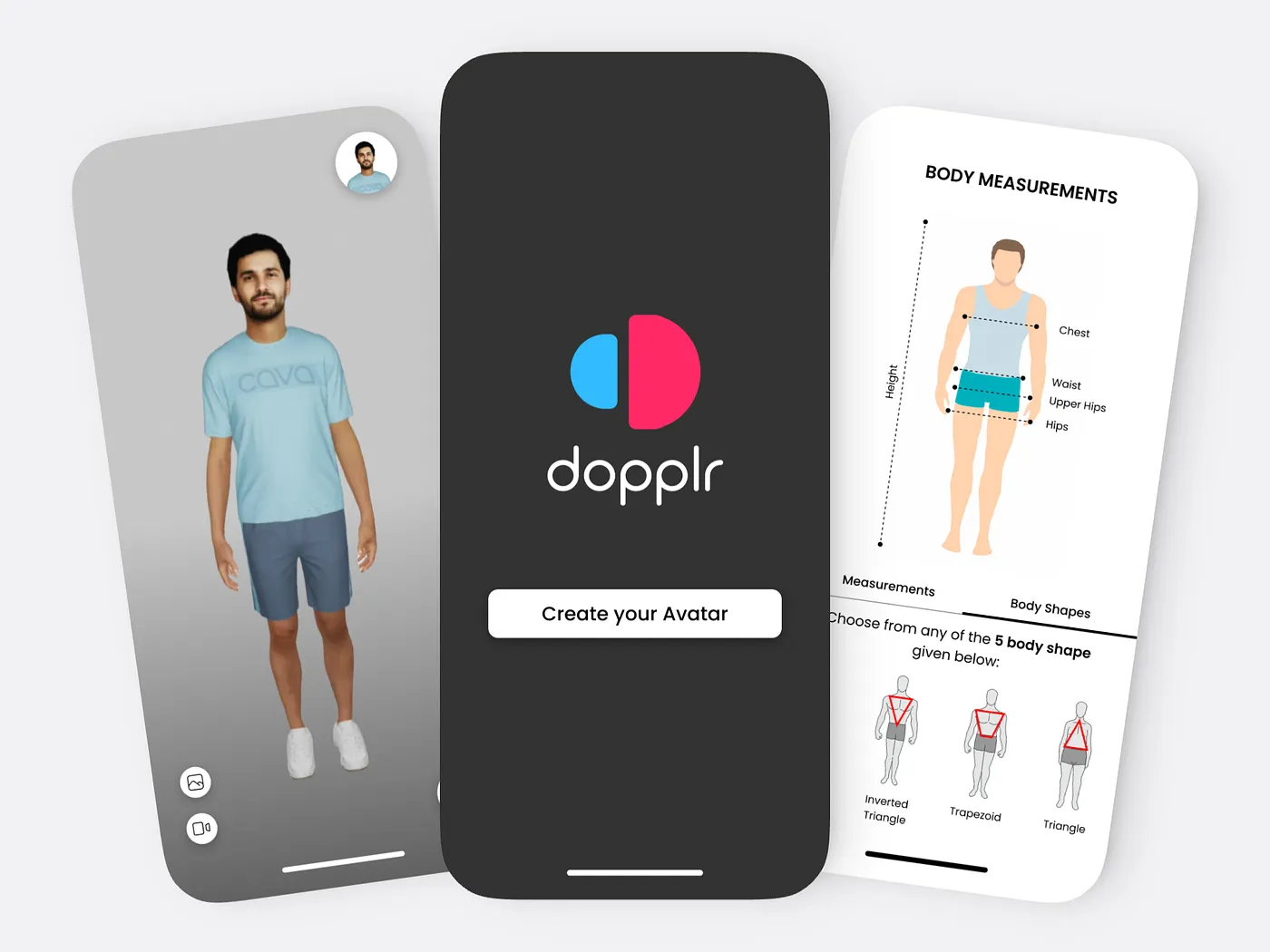
Avatar Creation
Users rarely know their exact body measurements. Asking for too many inputs before showing any result causes abandonment. Asking for too few produces an avatar that doesn't feel accurate enough to trust. The design challenge was identifying the minimum input set that could generate a believable avatar quickly enough to keep users engaged.
I explored several directions. A fully guided measurement flow with step-by-step illustrations gave users confidence in what they were entering, but it extended the time before they could see the avatar. A size-chart shortcut that mapped standard clothing sizes to approximate body dimensions was faster, but the output was too uniform to feel personal. A hybrid approach, using size as a starting point with optional measurement adjustments, was promising but created a two-step interaction that added friction without making the avatar noticeably more accurate for most users.
The final approach was a progressive input flow where the avatar updated in real time as values were entered. Users didn't need to complete a form before seeing a result. They could enter a few measurements, see the avatar respond, and decide whether to continue refining. The goal was a specific moment: a user looks at the avatar and thinks "that's roughly me." That recognition was what made the rest of the experience worth engaging with.
Throughout this phase I worked closely with the CTO to understand what measurement inputs the 3D generation system could actually use to produce meaningful variation. That constraint ruled out some of the simpler approaches: a size-only input produced avatars that were too similar across users to support trust in the fit output.
The Try-On Interface
The central problem with the try-on interface was that the interface itself was competing with the garment.
Early concepts included persistent control panels, visible toolbars, and labeled buttons for every available action. During design reviews it became clear that users were spending time reading the interface rather than looking at the clothing. The chrome was drawing attention away from the 3D canvas, which was the only part of the screen that actually mattered.
I removed persistent controls. Nothing remained visible except the canvas and the garment. Controls surfaced contextually based on what the user was doing: rotate on drag, zoom on scroll, options on hover. Labels were reduced or replaced with motion that communicated the action directly. The interface became something users passed through on the way to the garment rather than something they had to manage.
This required close collaboration with the CTO and developers throughout. Several concepts were cut because they required rendering or scripting overhead that affected frame rate on consumer devices. Persistent animations, layered UI elements, and complex state logic all had measurable performance costs in a browser environment. The final interface was substantially lighter than the early explorations, and the constraint of having to justify every element's cost made the design more focused than it would have been otherwise.
Dopplr Product Prototype
Fit Visualization
Fit data was what made the try-on meaningful beyond visual appearance. Knowing where a garment was tight, where it had room, and where it might cause discomfort over time was the information that actually helped someone decide whether to buy. The challenge wasn't visualizing fit. It was adding fit information without overwhelming the garment itself.
The initial approach was a persistent heat map overlay on the 3D render. In practice it consistently dominated the view. The color layer flattened the depth of the garment, competed with fabric texture, and read as alarming regardless of the palette. Users focused on the color overlay rather than the clothing underneath, which inverted the experience's purpose.
I tried several color systems, opacity levels, and activation triggers. A softer palette was less alarming but harder to read. An outline-based approach instead of fill-based was cleaner but lost specificity at smaller garment scales. The persistent nature of the overlay was the consistent problem: fit data presented at all times felt like a warning rather than an inspection tool.
The final version made the heat map an optional layer: off by default, single tap to activate, easy to dismiss. This let users look at the garment first, then choose to inspect fit when they were ready. The color system was tested across different garment types and render conditions to maintain readability without flattening the 3D quality. As a secondary tool rather than the default view, the information added value without controlling the experience.
Motion as Feedback
Loading 3D assets in a browser takes time. That's a technical reality the design had to account for directly. The question wasn't how to hide the wait, it was what to do during it.
I designed loading states that reflected the visual language of the product and gave users a legible signal of what was happening. For avatar generation, the loading state showed the avatar taking shape. For garment loading, it showed the draping process beginning. The motion told users what the system was doing, not just that it was working. In a product where the payoff requires waiting for a render, the loading state is part of the experience, not a gap in it.
The same thinking carried into micro-interactions across the product. State changes were animated with direction and purpose. A garment swap had a different quality of motion than a zoom interaction. Transitions communicated the relationship between states rather than just bridging them. The goal throughout was a product that felt responsive without ever pulling attention away from the canvas.
What I Learned
This was my first project where I was the only designer from the first conversation. There were no existing patterns to inherit, no senior designer to review work, and no component library to start from. Every interface decision was the first decision made about that part of the product, which meant there was no baseline to anchor to, only the constraints of the problem and the feedback from the people I was building with.
Working directly with the CEO and CTO changed how I think about design in early-stage products. Most decisions involved competing pressures: what users needed, what was technically buildable in a browser, and what the team had time to implement. Learning to frame design decisions in terms of feasibility, not just desirability, became the core of how I collaborated on this project. The CTO's feedback on performance implications shaped decisions I would have treated as purely visual choices in other contexts.
Designing for a browser-based 3D product also changed my baseline understanding of what interface choices cost. Persistent animations, layered UI, and complex conditional logic all have real performance implications at the rendering level. I started making those tradeoffs explicitly rather than discovering them during implementation, which made collaboration with engineering more productive and less corrective.
The thing I would change is the amount of user testing during avatar creation. Most feedback during that phase came from internal reviews with the founders. We moved quickly, which was the right call for where the product was, but some usability issues in the measurement input flow surfaced later than they should have. If I were approaching this again, I would push for at least one round of external testing before locking the onboarding flow, even if it was informal. The cost of changing the input model late was higher than early testing would have been.