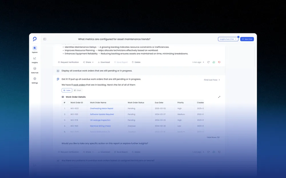
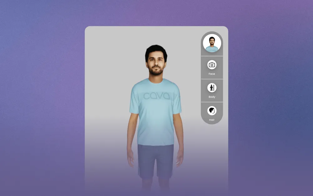
Designing a Consistent AI Experience Across an Enterprise Analytics Product
Petavue helps go-to-market teams generate and publish dashboards from business data. While dashboards show what happened, they rarely explain why it happened or what to do next. Sage extends the dashboard experience by helping users investigate metrics, understand trends, and make decisions without leaving their workflow.
At a Glance
The problem
Dashboards showed what changed, not why — so people fell back on Slack messages, throwaway dashboards, and recurring meetings to get an answer.
The decision
Sage lives inside the dashboard, not beside it — grounded in the same definitions, never a separate destination to learn.
The hard part
Making an AI-generated answer feel checkable, not just confident — through layered reasoning, not a single trust badge.
My role
Owned the interaction model and trust/conversation design end-to-end, and prototyped it in code to test what static comps couldn't show.
Dashboards Answer "What." Not "Why."
A dashboard at Petavue is trustworthy by the time it reaches a viewer: every metric defined consistently, every number checked before publishing. But correct isn't the same as understood. A number moves, and the real question is never whether the data pipeline worked. It's why it moved, whether it's worth reacting to, and what to do next, none of which a static chart can answer on its own.
A dashboard is built to display a computed state clearly. It was never built to explain how that state came to be.
Before Sage, People Filled the Gap
That gap got filled the way it always does in enterprise software: through people, not the product.
Before Sage
Message an analyst, then wait.
Build a second, throwaway dashboard just to cross-reference the first.
Hold a recurring meeting so someone can explain, out loud, why a metric shifted three months ago.
With Sage
Ask the dashboard directly, in the same screen.
Get an answer grounded in the same data and definitions already on screen.
The reasoning stays attached to the dashboard for the next person who asks.
None of the old paths were fast, and none left a record the next person could find. Even the workaround itself was manual labor: a single revenue dashboard blends Salesforce, marketing spend, and product usage, so "why did this account's health score drop" meant a human stitching together a support ticket, a usage dip, and a stalled deal from three separate systems, every single time.
That Gap Became Sage
Not "give Petavue an AI feature," but let a person go from a chart that raised a question to a decision they trust, inside the same screen.
Sage's job was to close that gap without becoming a second product people had to learn.
Deciding Where a Conversation Should Begin
The default shape for a feature like this is a standalone assistant, its own page, its own history. We prototyped that path and walked through the first sixty seconds of using it. The cost was entirely about context: a RevOps manager would have to leave the dashboard where they noticed a drop, open Sage elsewhere, name the metric they were already looking at, and restate a date range they'd set thirty seconds earlier, before they could even ask their real question.
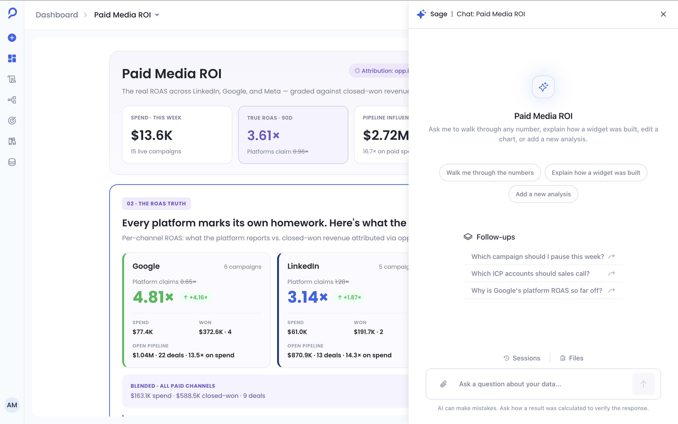
- 1Dashboard stays fully visible — the chart that prompted the question never leaves the screen.
- 2Panel opens beside the dashboard, not over it — nothing already on screen gets hidden.
- 3Opening message already reflects the widget, filters, and date range in view.
Keep the dashboard visible while chatting, instead of opening Sage as a full-screen destination.
Users should never lose the visual context they're asking about, or need a chat window to describe in words what's already on screen.
Less horizontal room for the conversation, and a harder layout problem for engineering, in exchange for never asking someone to re-explain what they're already looking at.
Everything downstream, the prompt suggestions, the reasoning layer, the response format, only works because the conversation never has to start from zero.
Designing for Confidence, Not Conversation
Nobody asked for a warmer chat tone. Every research conversation surfaced some version of "how do I know this is right," because a wrong answer about pipeline health, presented confidently enough to act on, is a real cost. That reframes the whole problem: not "make Sage sound smart," but "make Sage's confidence legible," so a reader can tell an answer worth acting on from one worth double-checking.
Plain-language reasoning
What Sage is checking, in the language the question was asked in, visible by default and updating live.
Technical execution
The actual query and calculation steps, one click away for anyone who wants to verify against the source.
Engineering details
Internal system state and error codes stay out of the default view entirely. They exist for debugging, not for reading an answer.
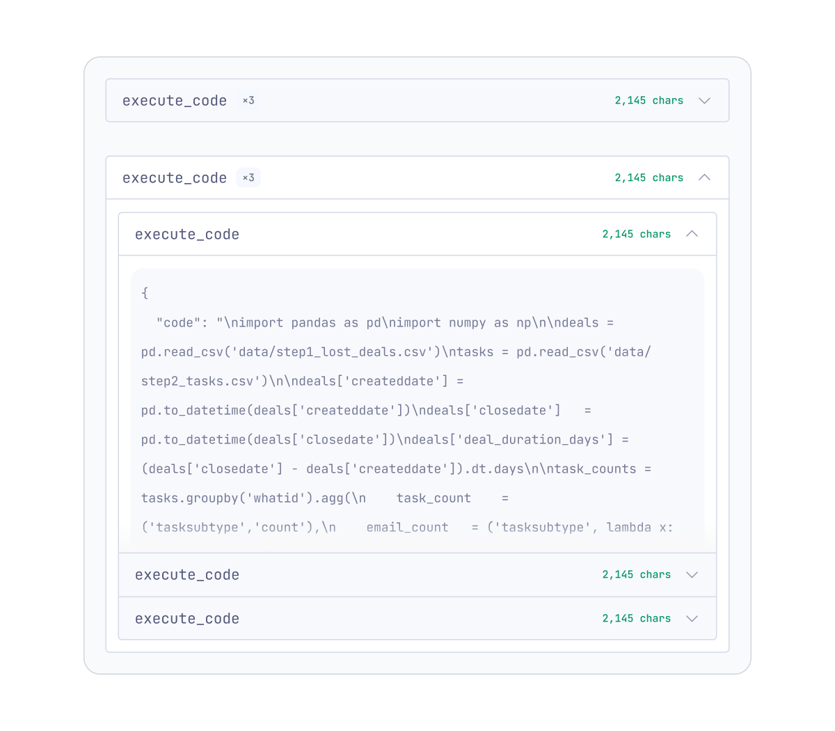
Hide engineering details by default.
Most marketers and RevOps managers care about the evidence behind an answer, not the implementation that produced it.
Power users take one extra click to inspect execution, while everyone else gets a simpler default they don't have to opt out of.
This is also where "not a chatbot" stops being a branding line and becomes a real constraint. A chatbot optimizes for feeling conversational. Sage optimizes for being checkable, and checkable answers occasionally read as more clinical, an intentional trade after watching people hesitate over confident answers with nothing to verify against.
Answering With the Dashboard's Own Definitions
The failure mode we designed against from day one: Sage quietly disagreeing with the dashboard it was opened from, by reinterpreting what a metric means instead of reading the definition already configured for it. In an enterprise product where a metric's definition is often months of internal debate, that kind of silent disagreement is the fastest way to make a team stop trusting a feature. So Sage reads from the same metric and business-logic definitions the dashboard already used, rather than interpreting raw data independently.
Ground every Sage answer in definitions already configured in Petavue, rather than letting it interpret raw data independently.
A number that quietly used a different definition than the dashboard would silently disagree with something the team already trusted.
Sage can't answer questions about metrics that haven't been defined yet, and has to say so plainly rather than approximate an answer, less impressive in a demo, more honest in practice.
What a Response Needs to Do That a Chart Can't
A question like "where are we wasting marketing spend" isn't a short exchange. It needs evidence specific enough to support a conclusion, a recommendation grounded in that evidence, and a way to keep investigating, more than a single chat bubble can hold. So every Sage response is organized the same structured way, regardless of what was asked, and a reader learns the shape once.
Verdict
The answer itself, stated plainly, first.
Evidence
What supports the verdict, specific enough to verify.
Recommendation
What to do about it, not a restatement of what happened.
Follow-up prompts
Where the investigation could go next, already suggested.
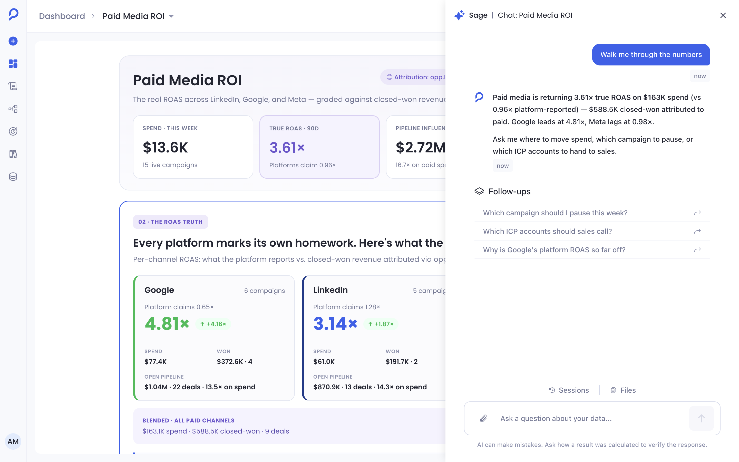
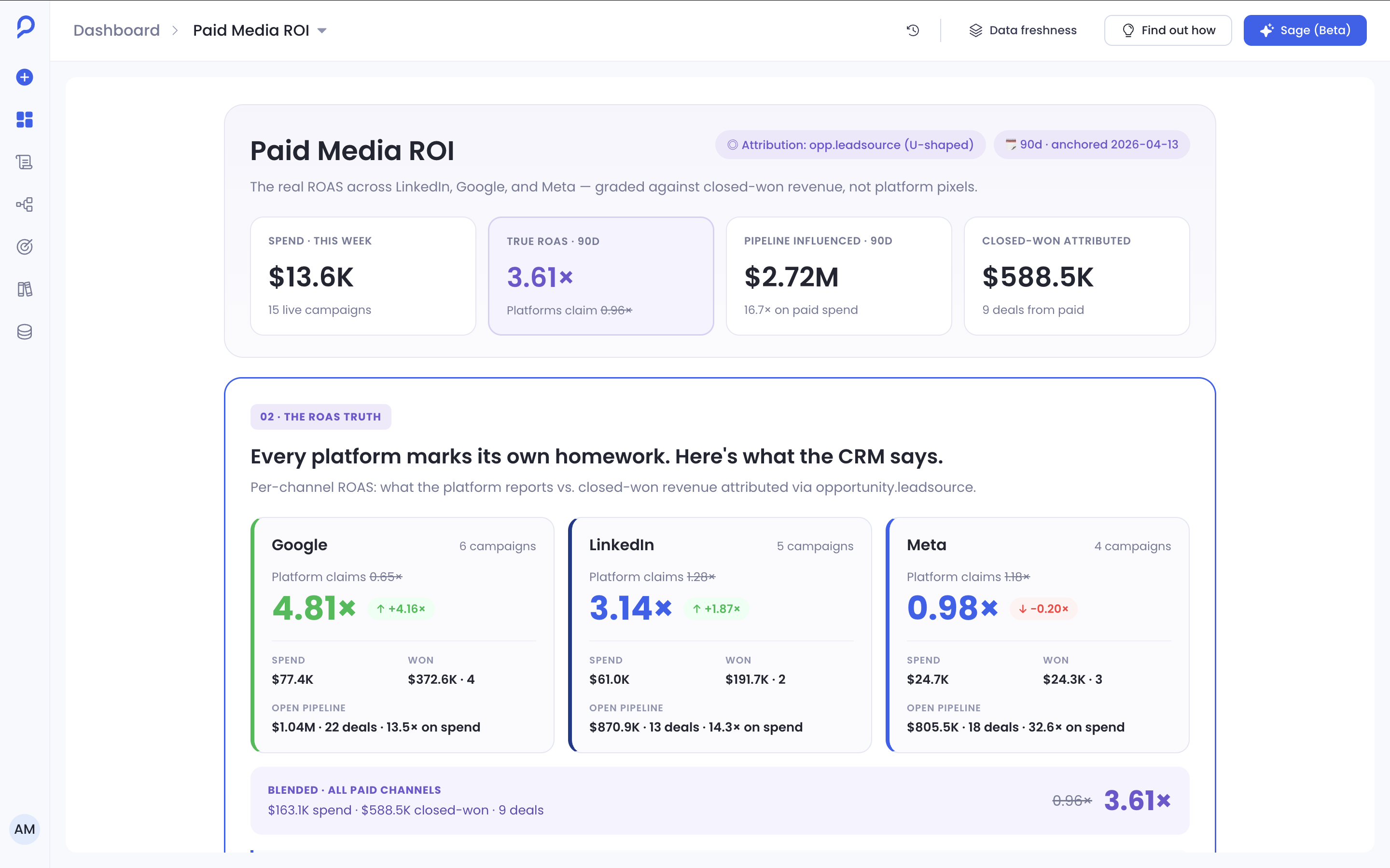
- 1Verdict states the true ROAS against platform-reported ROAS in the first sentence: 3.61x versus 0.96x, before anything else loads.
- 2Evidence breaks the number down by channel, Google leading at 4.81x, Meta lagging at 0.98x, so the headline figure isn't taken on faith.
- 3Recommendation is offered as a choice grounded in what it just found: move spend, pause a campaign, or flag specific accounts to sales, not a generic "consider reviewing your campaigns."
- 4Follow-up prompts anticipate the next three questions a RevOps manager would actually ask, rather than a blank box waiting for one.
This structure isn't unique to Sage, and that's deliberate: it's the same headline-detail-next-step shape people already use to review a dashboard elsewhere in Petavue, so Sage reads as an extension of the product instead of a bolted-on feature.
The Cold-Start Problem
An empty prompt box assumes someone already knows exactly what to ask. Most don't, especially the first time, and that gap is where features like this quietly die: one vague question, one vague answer, and the tool never gets opened again, no loud failure, just a feature that stops getting used.
Sage generates its suggested prompts from the dashboard currently in view, so someone on a pipeline dashboard sees prompts about pipeline movement and rep performance, not a generic "ask me anything." Early versions surfaced safe questions like "tell me more about this dashboard," which taught the wrong lesson, that Sage was a summarizer. Rewriting them toward "why did this metric drop this week" nudged people toward the kind of question Sage actually exists to answer, turning that first interaction into recognizing a question that was already there, not inventing one from nothing.
One Assistant, Wherever the Question Comes From
Most conversations never start from Sage's own home in the product. They start from a dashboard, a proactive recommendation, or a goal someone is tracking, and Sage has to feel identical from every one of those, or people learn several slightly different tools instead of one. It would have been faster to ship a lighter version for recommendations, where context is narrower, but that shortcut teaches people that Sage's depth depends on how they got there.
In practice, the recommendation surface turned out to be where most people met Sage for the first time, which made this consistency requirement far more consequential than it looked on a whiteboard.
Answers That Don't Disappear
A chat interface implies its own contents are disposable, fine for a general assistant, not for a product whose original complaint was that reasoning lived only in someone's memory of a meeting. So every Sage response is anchored to the dashboard and moment it was generated, not floating in a timeless chat log. Someone can return weeks later and find the exact analysis that explained a past change, still connected to the state it was based on, shareable with a teammate who wasn't in the original conversation.
Conversation Design Is Interaction Design
A chat interface looks like a solved layout problem, a message list, an input, a send button. Almost none of the real design work happened there. It happened in the states below, each one solving a specific way a clean Q&A model breaks down in practice.
Empty
Suggested prompts drawn from the exact dashboard in view, not a generic list.
Streaming
Answers build in as they're generated, so a wait reads as active, not stalled.
Clarification
An ambiguous question gets asked back, instead of a confident guess.
Missing data
States plainly what hasn't finished syncing yet.
Permission-restricted
Names the restriction directly, not a generic error.
Long-running
Status reflects reality: "still checking three data sources," not a bare spinner.
Failure
Honest about what broke, never a vague "something went wrong."
Follow-up
Every answer ends with a way to keep going, never a hard stop.
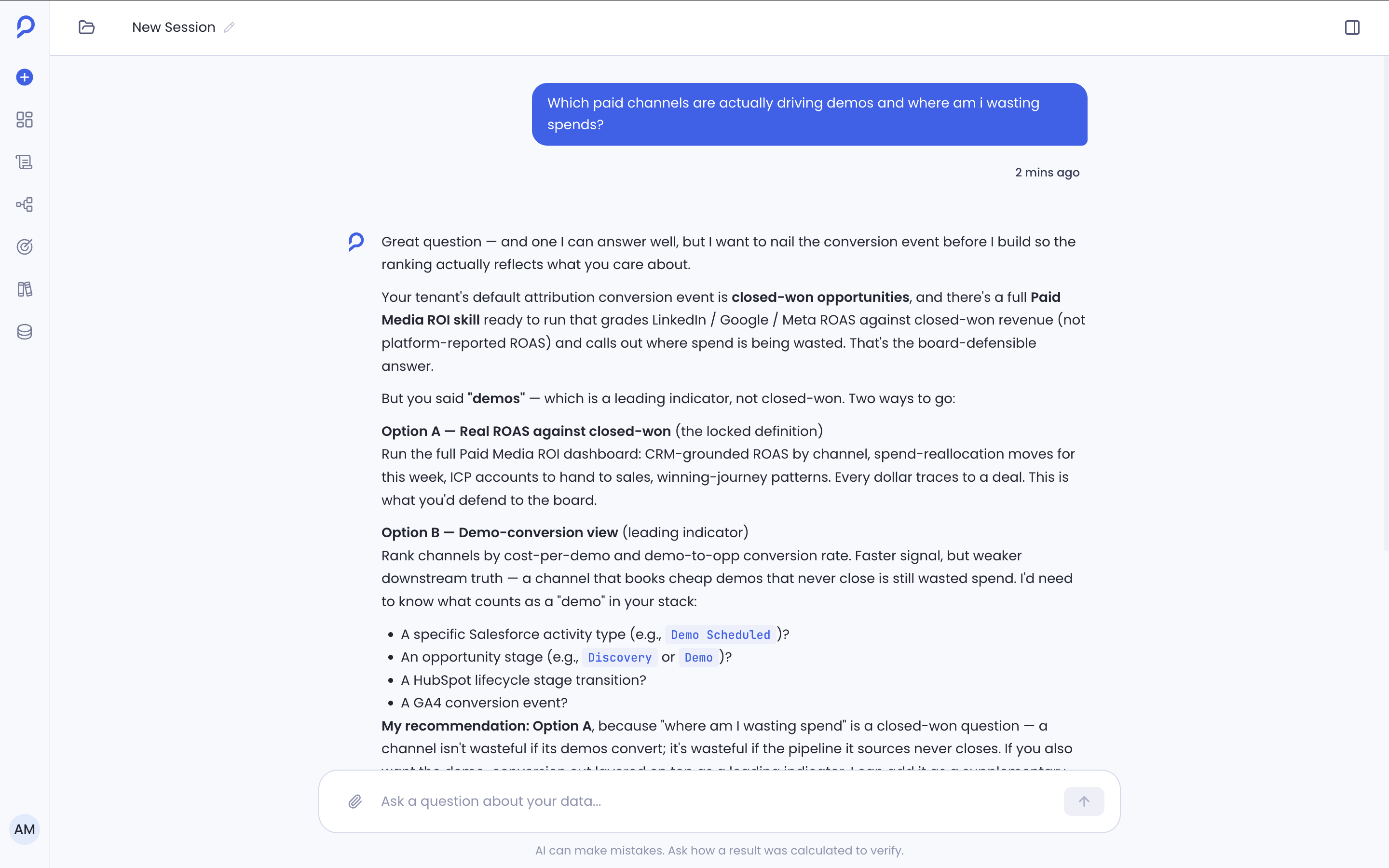
None of these show up in a happy-path screenshot, which is exactly why they're easy to underestimate. They're the reason the experience feels dependable even when a query is slow or data is mid-sync, and in practice they took roughly as much design time as the response layout itself.
Prototyping the Interaction, Not the Interface
Static comps show a response frozen at one moment. They can't show what it feels like to watch an answer stream in at a natural or sluggish pace, or hit a clarification question mid-conversation, because conversation design lives entirely in time. So I built a working front-end prototype in Claude Code, using React and the product's existing design system, specifically to test streaming pace, transition timing, and how disruptive a clarification felt in the moment, questions no static comment thread can answer.
That prototype became the actual review artifact for product and engineering, ahead of the polished Figma file rather than after it. Reviews shifted from opinions about spacing on a static screen to whether the interaction itself held up, and several timing decisions got settled in that room, before a single line of production code existed to relitigate them.
What Engineering Constraints Actually Shaped
"Worked closely with engineering" usually describes proximity, not substance. What actually happened: most of the interesting design decisions here came directly out of a technical constraint, and understanding the constraint was the fastest way to the right design answer.
Streaming responses
Multi-source analyses genuinely took several seconds to run. Waiting silently reads as stuck, so answers stream in as generated, which meant reasoning copy had to work as a sequence of standalone true statements, not one composed paragraph.
Context locking
The dashboard re-renders independently while Sage is open. Keeping both perfectly live-synced added real complexity, so a conversation's context locks to the dashboard state at the moment it started instead.
Lock a conversation's context to the dashboard state at the moment it started, rather than trying to keep it live-synced.
A silently reconciled context risks an answer that references a filter the user has since changed, without ever saying so.
Someone who changes the dashboard mid-conversation starts a new question, in exchange for every answer being honest about exactly what it's based on.
Execution labels went through several rewrites with engineering for the same reason: "Executing aggregation query on filtered dataset" is accurate and useless. "Checking spend across your active campaigns for the selected period" answers the only question that matters, is Sage looking at the right thing, and getting there required engineering to walk through what each query step actually did.
What Success Looked Like Without a Launch Metric
Sage was new enough at launch that there was no baseline to compare against, so success was defined as specific behavior to watch for, not a number chosen because it was measurable.
Every one of these is a behavior, not a metric with a target attached. A conversion number can be hit by accident. These couldn't be.
Reflection
The goal was never to make conversations feel intelligent, close to a trap for this category of product. It was to make dashboards more useful, measured against whether someone's next decision got easier, not whether the conversation felt impressive.
One tension ran under almost every decision here: simplifying Sage, hiding engineering details, locking context, collapsing complexity into plain language, always risked feeling less transparent to someone who wanted to look closer. Exposing more always risked overwhelming the person the product was built for. Finding where to draw that line, repeatedly, for each interaction, was the real design work, far more than any single screen.
The biggest lesson: a good AI feature doesn't replace the product it's attached to. It amplifies the product by making the next decision easier, by staying quietly in service of the workflow instead of trying to become a new one.