
A Hotel Booking App Built Around How People Actually Compare Options
HotelArc is a self-initiated concept project. The starting observation was specific: people searching for hotels repeatedly return to listings they have already seen, compare the same two or three options multiple times, and continue browsing after finding acceptable choices. The problem is not access to options. It is that photos, pricing, and reviews are distributed across screens in ways that make direct comparison slow and stopping difficult to justify.
I wanted to understand which parts of the experience produce those behaviors and whether different information hierarchy and navigation decisions could address them.
Results
- Self-initiated concept project: built end-to-end, from research through a full component library.
- Identified the real behavior driving indecision: users kept comparing the same listings because nothing signaled the search was complete.
- Four research-backed decisions shaped the flow: upfront pricing, unified comparison, a linear booking path, and exploration-first browsing.
- Full prototype covering onboarding through payment confirmation, built in Figma.
The Problem
Most hotel booking apps optimize for inventory. Users are shown hundreds of options across dozens of filters and multiple screen states. More information should help people decide. In practice, the way that information is organized often requires users to hold too much of the comparison in their head at once.
Through user interviews and competitive analysis, three patterns appeared consistently.
Total pricing was not visible until late in the flow
Taxes, fees, and cancellation terms appeared only at checkout. Users evaluating options based on the listed price had to commit to a specific hotel before learning the actual cost, which sent them back to search results to start the comparison over.
Comparing hotels required navigating between screens
Photos, reviews, and pricing were separated across tabs or required extensive scrolling to find. Users moving between a hotel listing and search results to check different properties lost context each time they switched and often reopened listings they had already seen.
Reviews and photos were buried behind promotional content
Sponsored placements and upsell modules pushed photos and reviews below the fold on most platforms. Users had to scroll past content the platform prioritized for commercial reasons to reach the information most relevant to their decision.
Design Goals
The project focused on four observable problems that appeared across research and competitive analysis:
Make total pricing visible before users commit to a specific hotel
Surface photos and reviews near the top of the hotel detail page
Reduce the number of screens required to compare options
Keep the booking flow linear with no moments where users had to retrace steps
Each translated into a specific decision about information hierarchy, navigation, or page structure.
Design Process
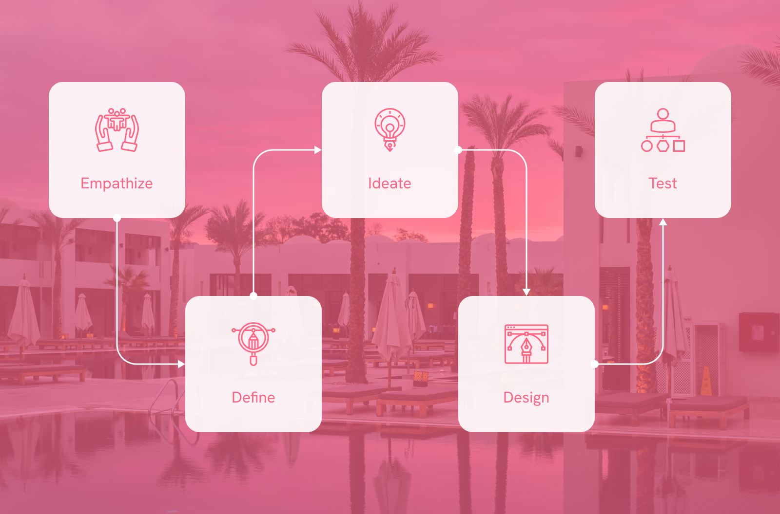
Research, flows, wireframes, visual design, prototyping, and system design. Working through each stage independently made it easier to see how decisions in one area created constraints or opportunities in the next.
Research
User interviews and competitive analysis surfaced one behavior above the rest: people kept searching after finding suitable options. Not because the options were inadequate, but because the experience gave them no clear signal that the search was complete — there was always another listing worth checking.
That pattern shaped the central design challenge: how to structure the experience so users have enough information to stop looking, rather than reasons to keep going.
User Personas
Ashwin, 32 - Accountant, married
Ashwin is a busy person who lives with his family. His wife loves travelling but high demand in summer means hotel rooms sell out quickly before he can commit. He needs an app with a better system.

- Safety and comfort in travel
- Finding the best hotel for his family
- Getting detailed information to plan ahead
- Clear payment procedures and confirmation processes
- Mobile-responsive design
- Features like loyalty programs and personalised recommendations
- No refund policy
- Availability and pricing issues
- Difficulty booking during peak seasons
Vishal, 26 - Student, single
Vishal believes life is short and should be enjoyed fully. He visits different locations with friends and family often. Finding and booking the best hotel or resort quickly would mean the world to him.

- Easy and clean booking experience
- Finding the best deals
- Browsing domestic and international locations
- Clear disclosure of features and amenities
- Rooms and resorts included, not just hotels
- Good customer support
- Complicated booking systems
- Too many choices without enough structure to narrow them
- No refund policy
Empathy Map
After building the personas I created an empathy map to organise user behaviours and context more clearly.
What users think and feel
- I want the booking process to be stress-free and straightforward.
- I feel excited about finding the perfect place to stay.
- I worry about hidden fees or misleading information.
What users see
- Clean interface with easy navigation.
- High-quality images of rooms and amenities are crucial.
- Clear and transparent presentation of pricing and policies.
What users hear
- Positive reviews reassure me about the quality of the accommodation.
- Word-of-mouth recommendations carry a lot of weight in my decision-making.
- A responsive and helpful customer support team builds trust in the app.

What users do
- I start by setting specific filters like location and price range.
- I compare options based on reviews and amenities.
- If there's an issue, I reach out to customer support for clarification.

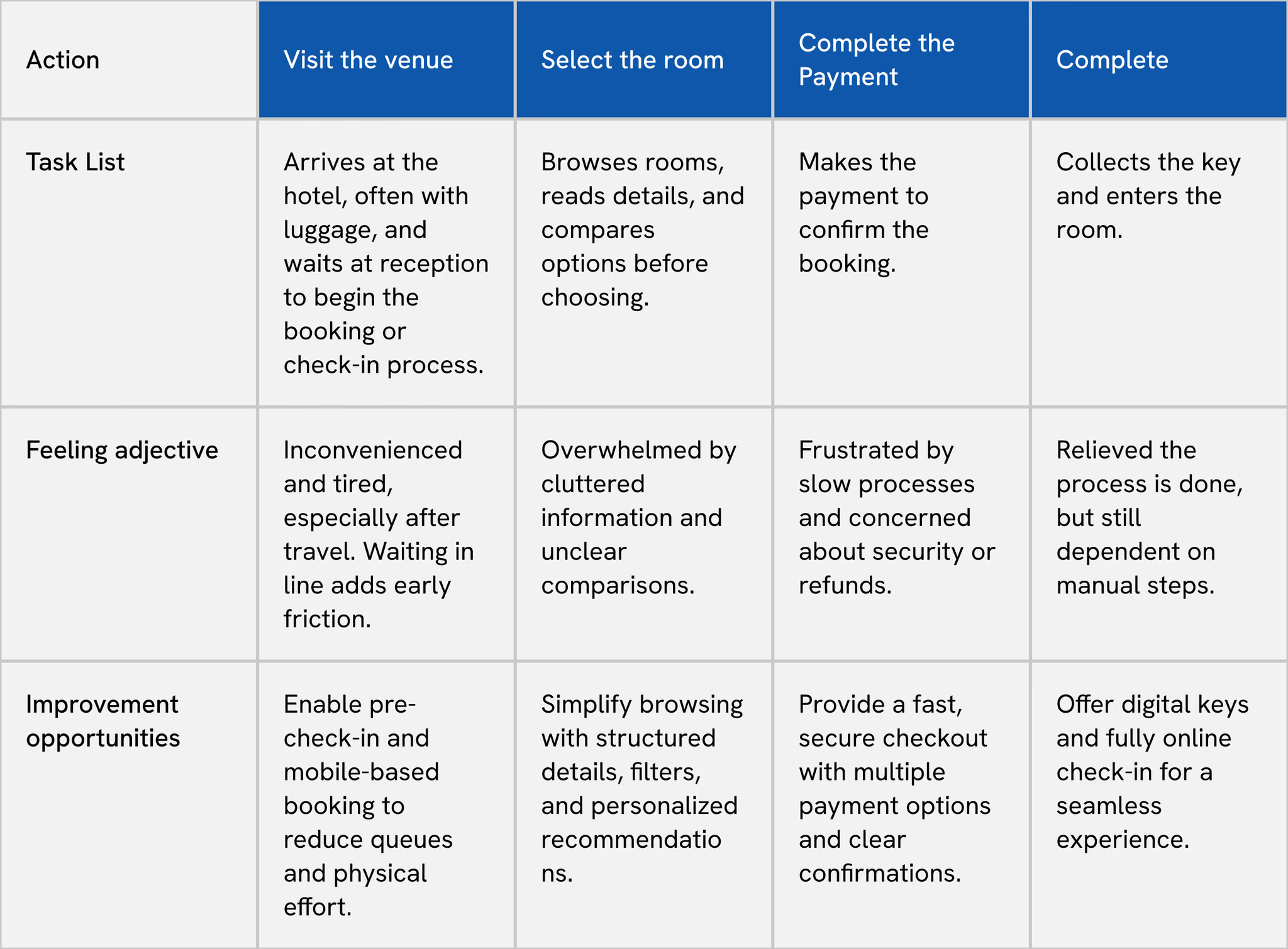
User Journey Map
Mapped across four stages to identify where the experience breaks down and where the biggest opportunities sit.
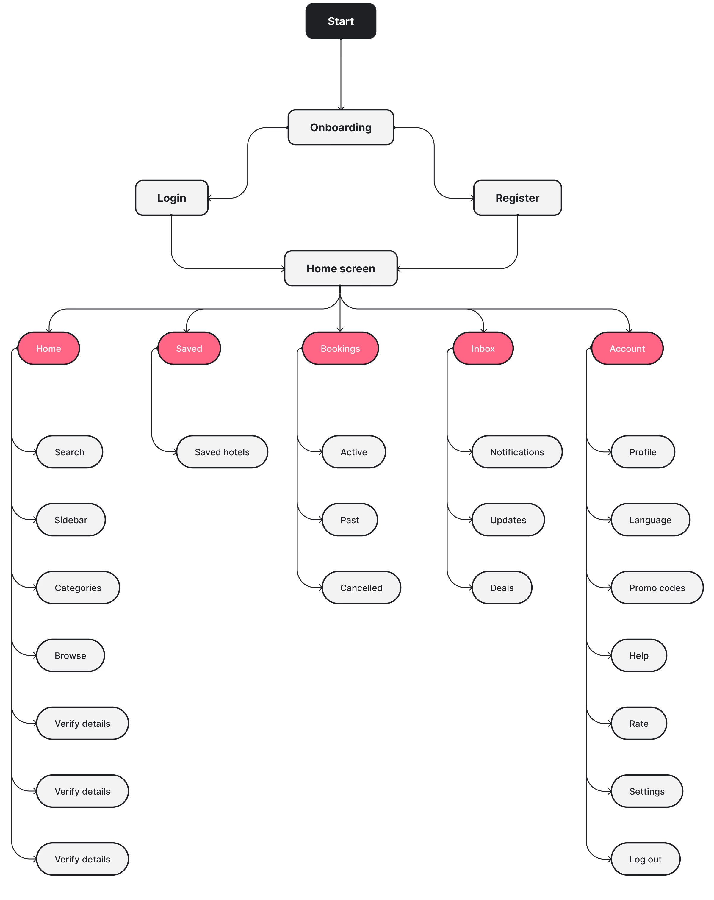
User Flow
The user flow was designed around a single sequence: search, selection, booking, confirmation. The goal was to remove branching paths and moments where users had to figure out how to move forward, since losing that forward momentum was one of the behaviors that sent people back to search results unnecessarily.
Wireframes
Wireframes focused on structure and hierarchy before any visual decisions. Four specific decisions shaped the layout, each tied to a behavior identified in research.
Decision 1: Lead with exploration, not a search form. Users who have not fully decided where to stay are forced into a search-first interaction on most apps, which requires a commitment before they have enough context to make one. The home screen leads with destinations, recommendations, and popular properties, giving users a starting point before they have committed to a specific place or date range.
Decision 2: Prioritize photos, reviews, and price on the hotel detail page. Users navigating between listings consistently returned to the same three pieces of information to evaluate options. Burying any of them below the fold required an extra step that broke comparison momentum. The hotel detail page surfaces all three near the top. Amenities and policies remain accessible but appear below the information users actually use to compare.
Decision 3: Show the complete cost before confirmation. Pricing that changed between the listing and checkout sent users back to search results to recalculate and compare other options. The payment screen presents a full summary before any action is required: hotel, dates, room type, and total cost including taxes and fees. Nothing appears for the first time at the final step.
Decision 4: Keep the booking flow linear. Users who hit a dead end or had to navigate back lost their place in the comparison process. Navigation is reduced to five consistent tabs accessible from every screen. Search, selection, booking, and confirmation follow a clear sequence with visible progress throughout.
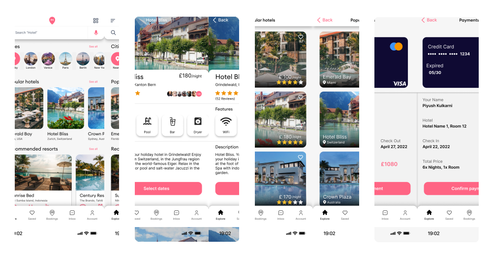
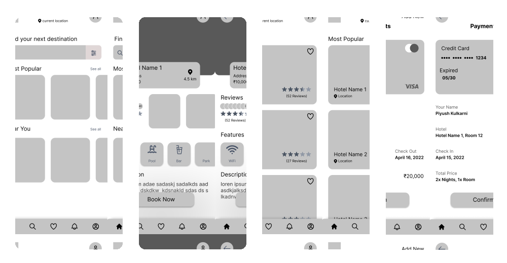
Use slider to switch between Wireframe and Final Design
Prototype
The prototype covers the full user journey from onboarding through payment confirmation, built in Figma. Working through the search and hotel detail screens in prototype form made the navigation decisions tangible and clarified how the payment summary information needed to be sequenced to avoid surprising users at the final step.
User Interface
Onboarding Flow
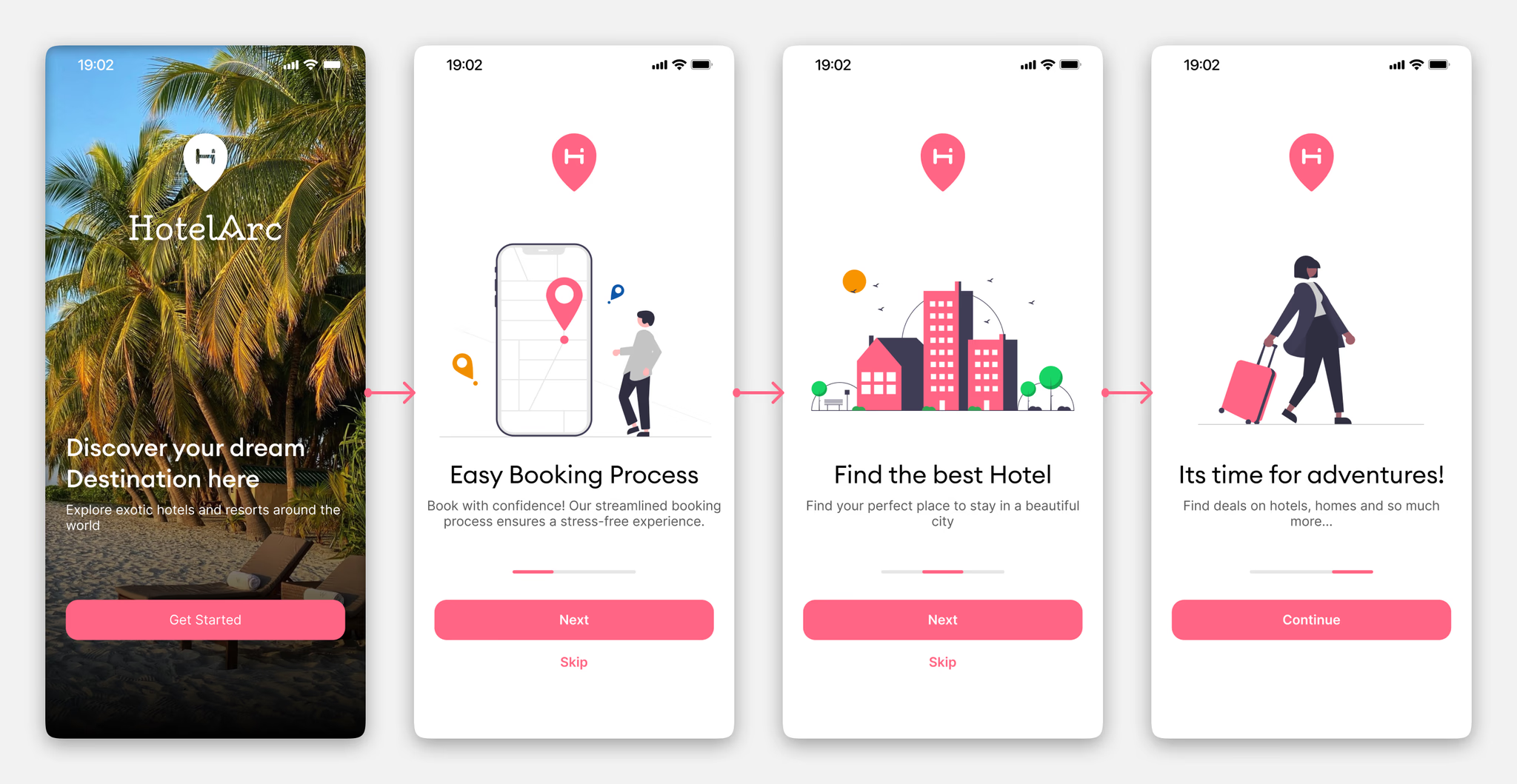
The onboarding introduces HotelArc's core value across three screens without asking for anything upfront. Each screen communicates a single idea clearly so users arrive at signup already oriented.
Signup and Sign In
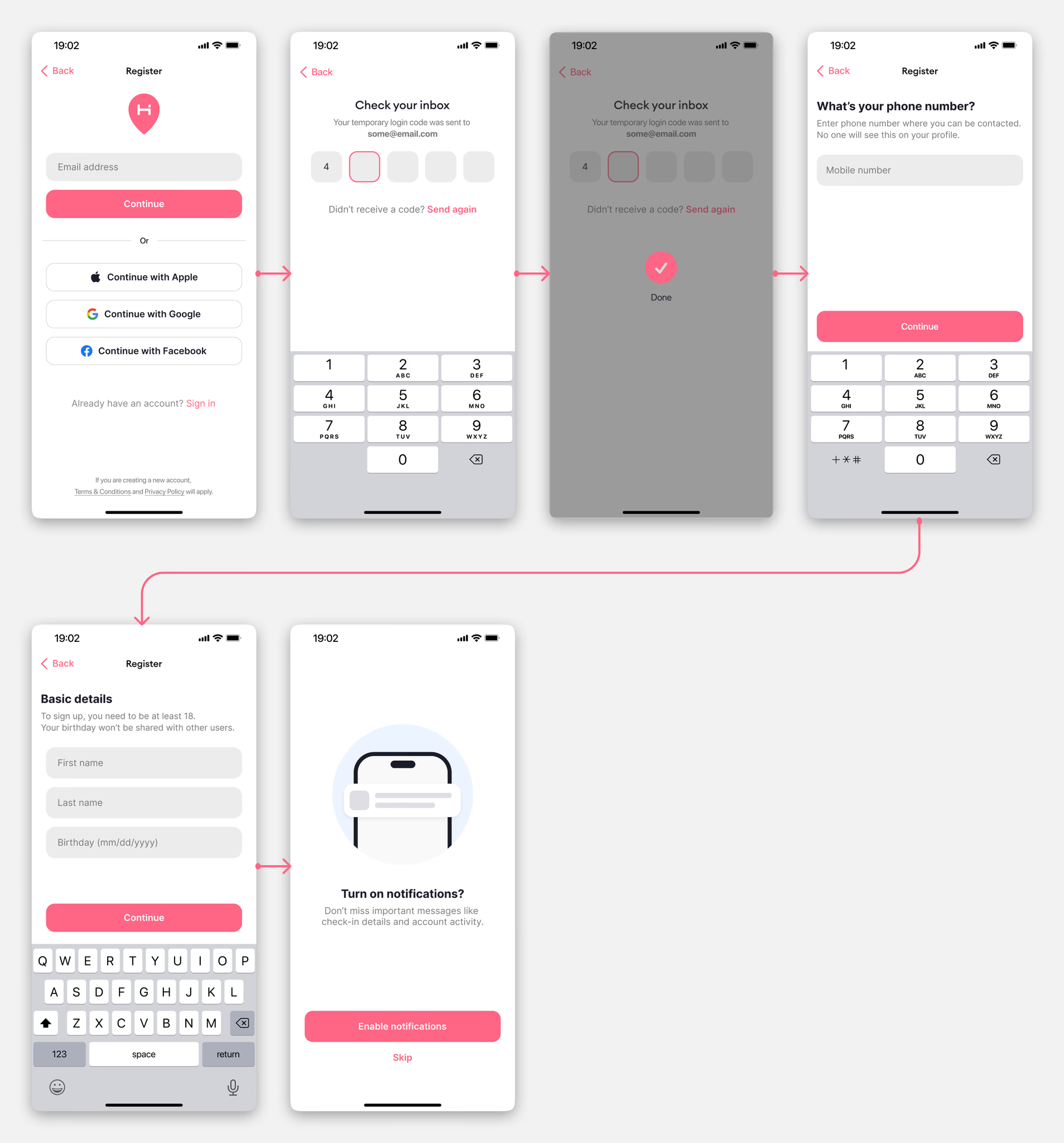
Sign up offers Apple, Google, and Facebook login to reduce the commitment barrier. For users who prefer email, the flow is short: verify, enter name, enter number, proceed. No unnecessary steps.
Booking Flow - Home to Payment
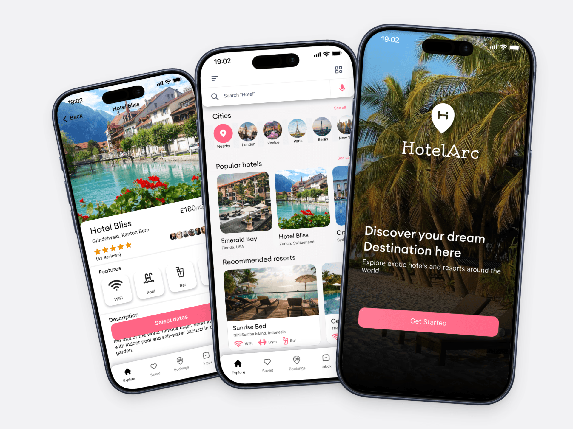
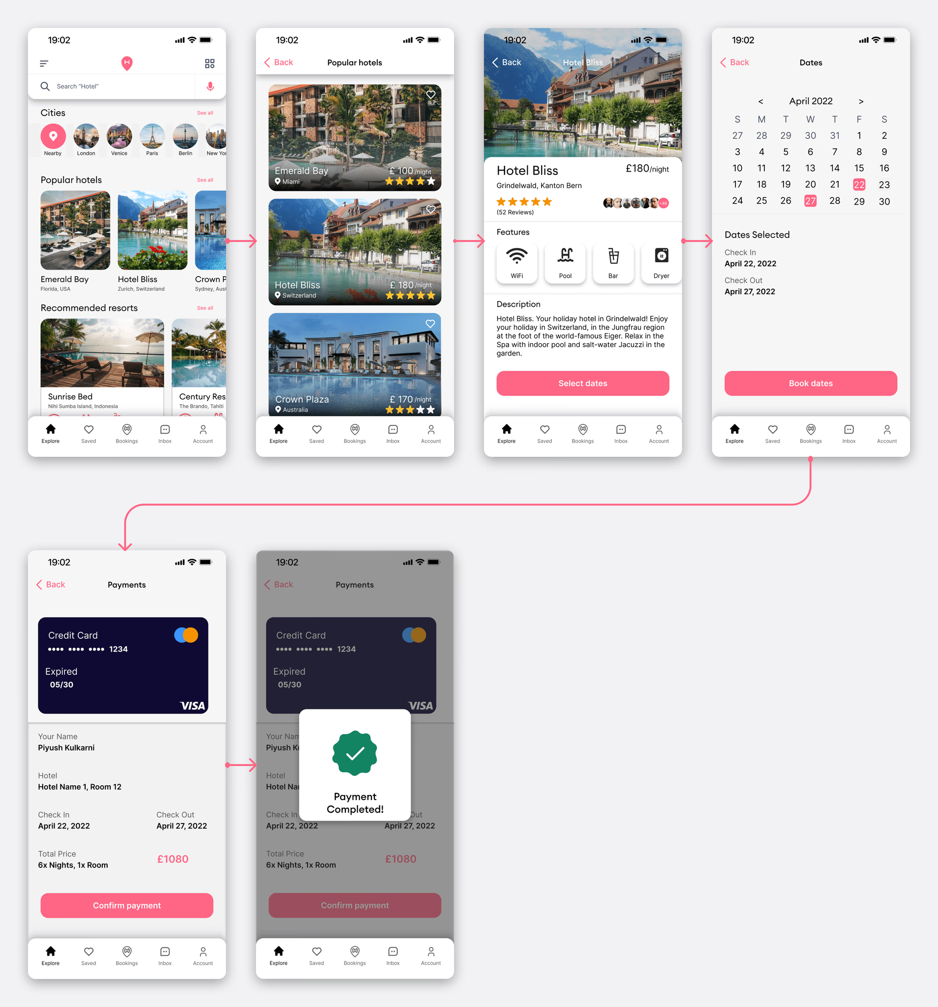
The home screen leads with cities, popular hotels, and recommended resorts. Exploration first, search second. From there users can browse, check availability, select a room, choose dates, and confirm payment in a linear flow with no dead ends.
The hotel detail page prioritises photos and reviews above the fold. Pricing and room selection sit below without being buried. The payment screen shows a full summary before confirmation: hotel name, check-in, check-out, total price including fees. No new information appears at the last step.
Additional Screens
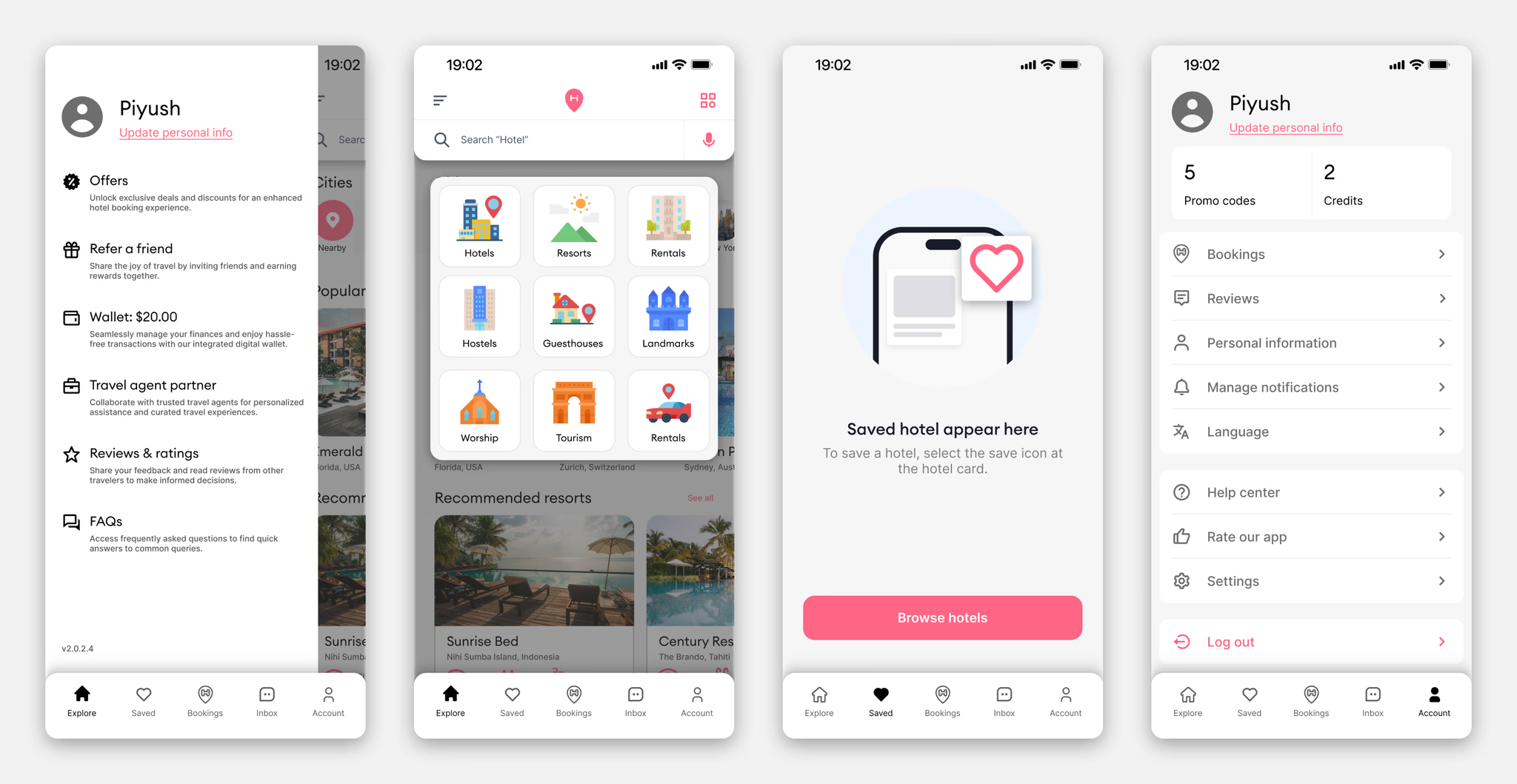
Profile, saved hotels, explore by category, and account settings round out the full product. The saved hotels empty state was designed to guide users back to browsing rather than leaving them on a blank screen with no clear next action.
Design System
Components
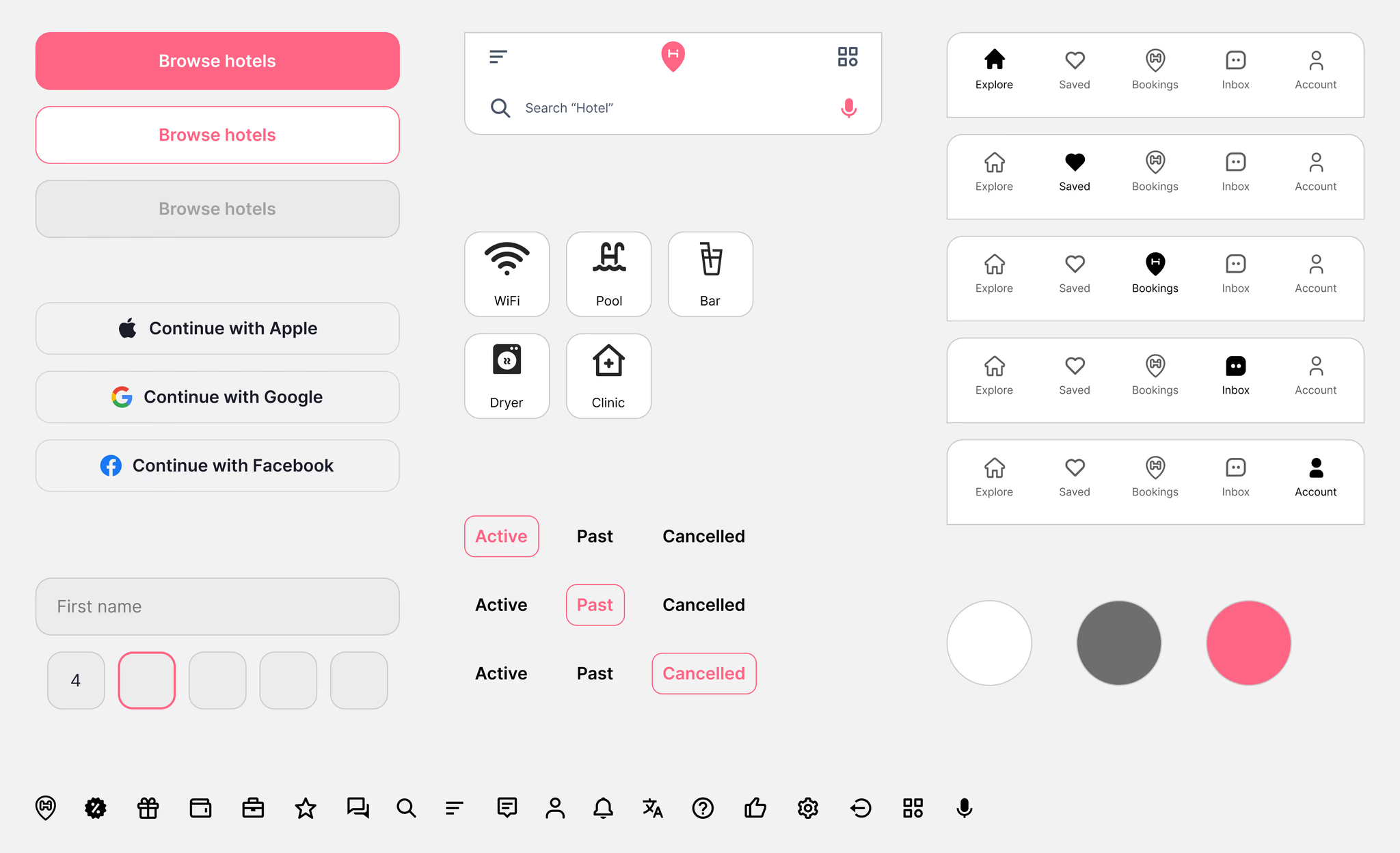
The component library covers everything needed to build and scale the product consistently:
- Buttons: primary, secondary, ghost
- Input fields and search bar with location pin and voice input
- Feature tags: WiFi, Pool, Bar, Dryer, Clinic
- Navigation bar across five active states
- Booking toggle states: Active, Past, Cancelled
- Register buttons: Apple, Google, Facebook
- 24px custom icon set
Typography
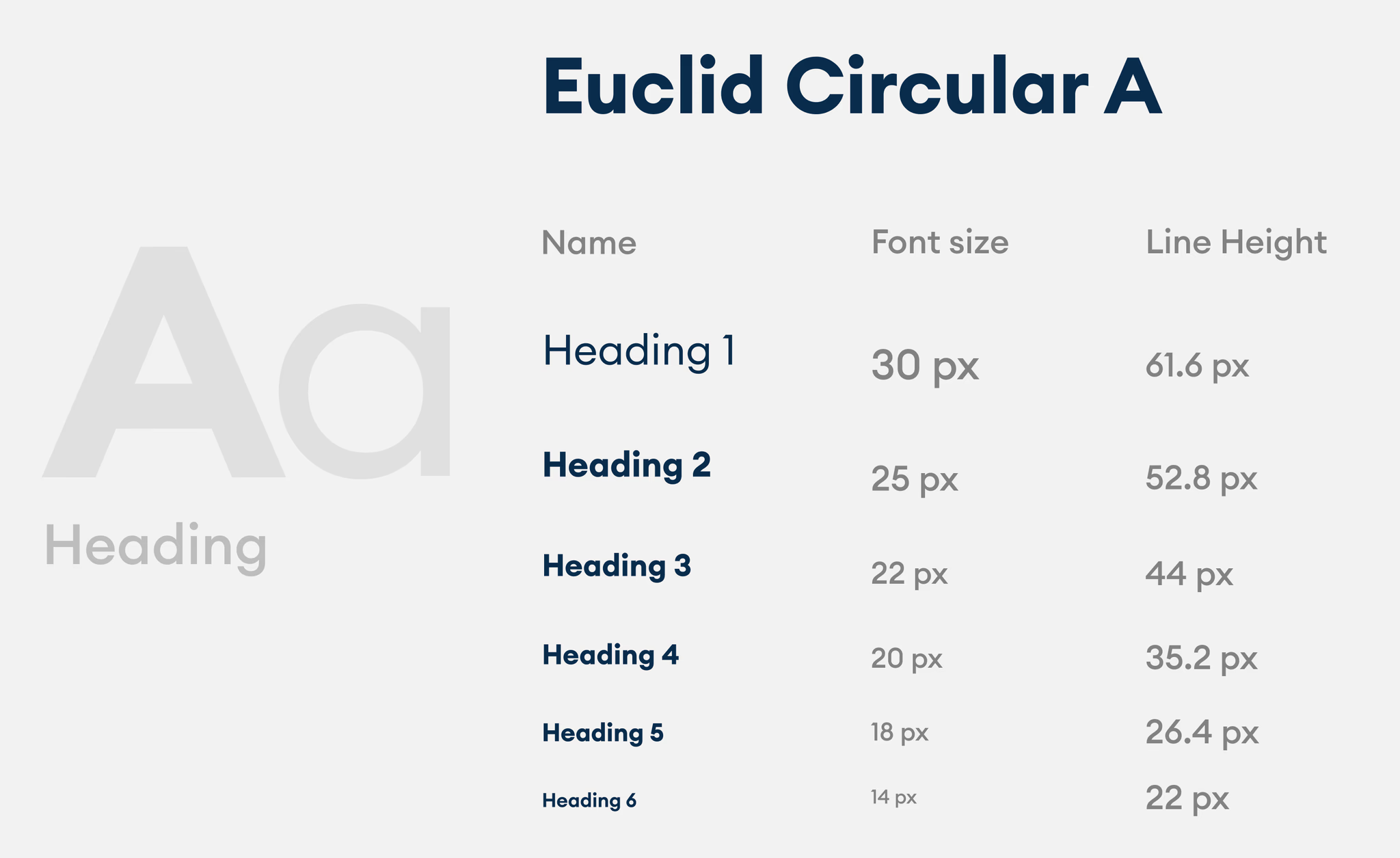
Euclid Circular A throughout. Six heading levels from 30px down to 14px, with line heights scaled for comfortable reading on mobile.
App Icon
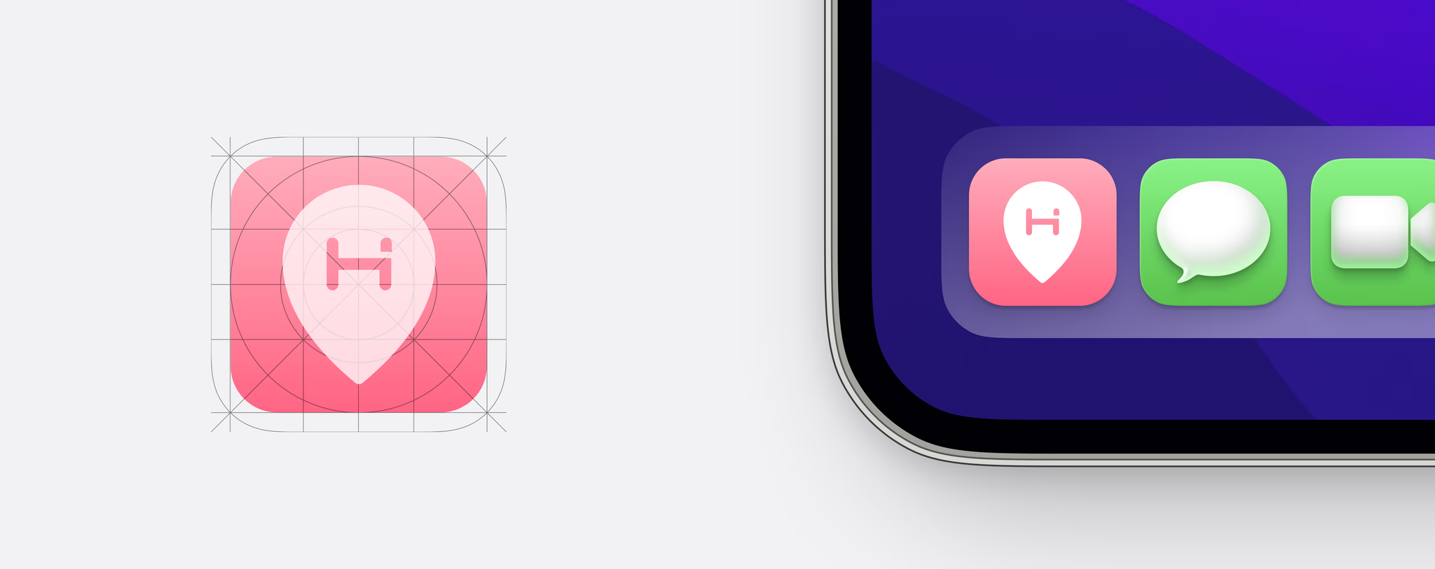
Coral pink background with the HotelArc location pin mark, built on a grid for consistency across iOS home screens.
What I Learned
This was my first attempt at running an end-to-end product design process independently. Working through research, flows, wireframes, visual design, prototyping, and system design in sequence made it clearer how a decision made in a wireframe creates constraints that show up later in the component library, and how a gap in research shows up in a flow that does not hold up under scrutiny.
Looking back, I would spend more time testing the hotel detail page and search results with actual users. Those two screens carry most of the comparison work and are where the hierarchy decisions either hold up or do not. Competitive analysis and interviews pointed toward what to prioritize, but the order and weight of elements on those screens deserved more external validation than the project included.
A future iteration would also explore a comparison mode, where users could view two or three hotels side by side without navigating between screens. That came up consistently during research as a behavior people were trying to approximate manually, and it is the most direct response to the pattern of reopening the same listings repeatedly.