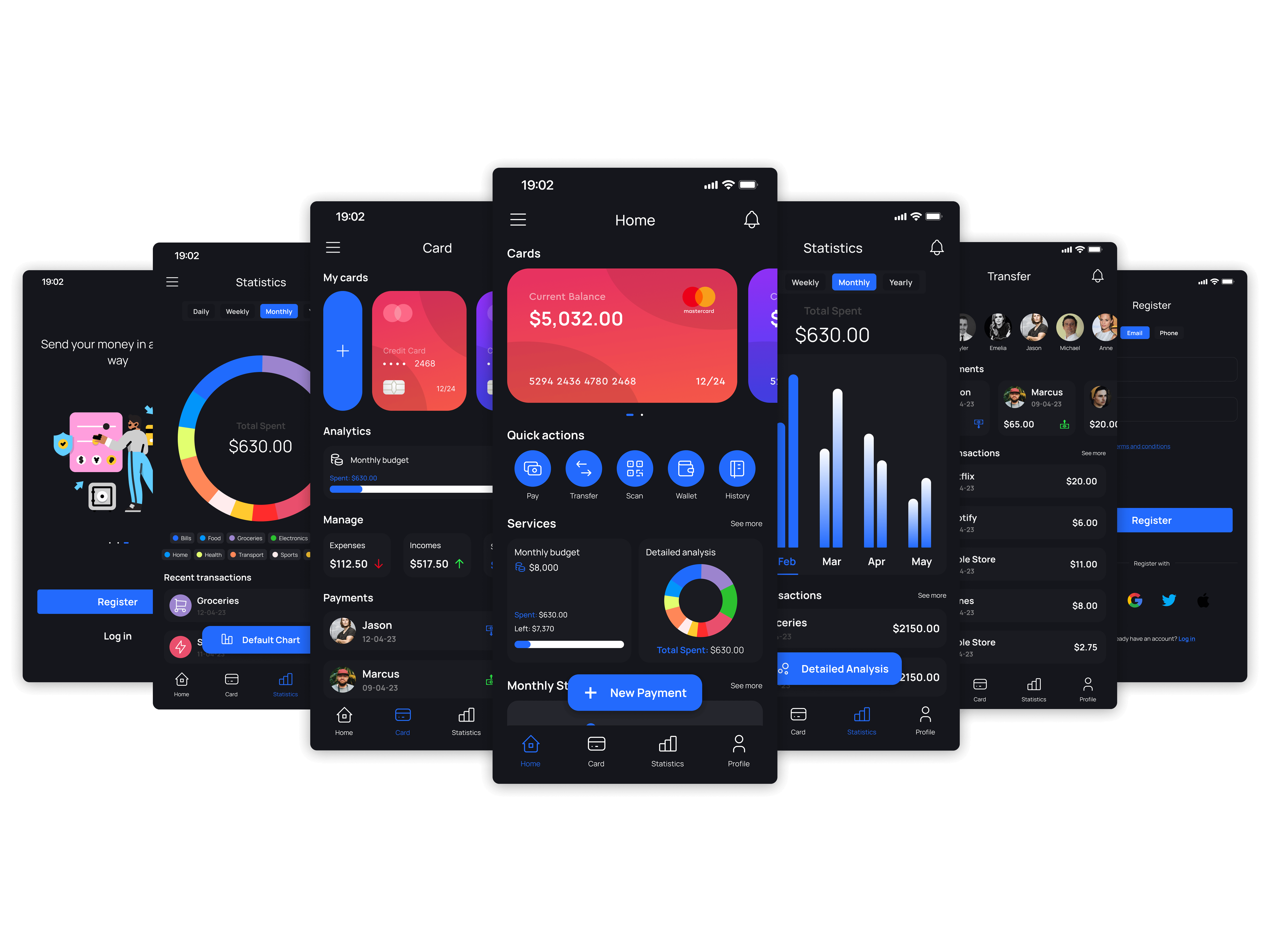
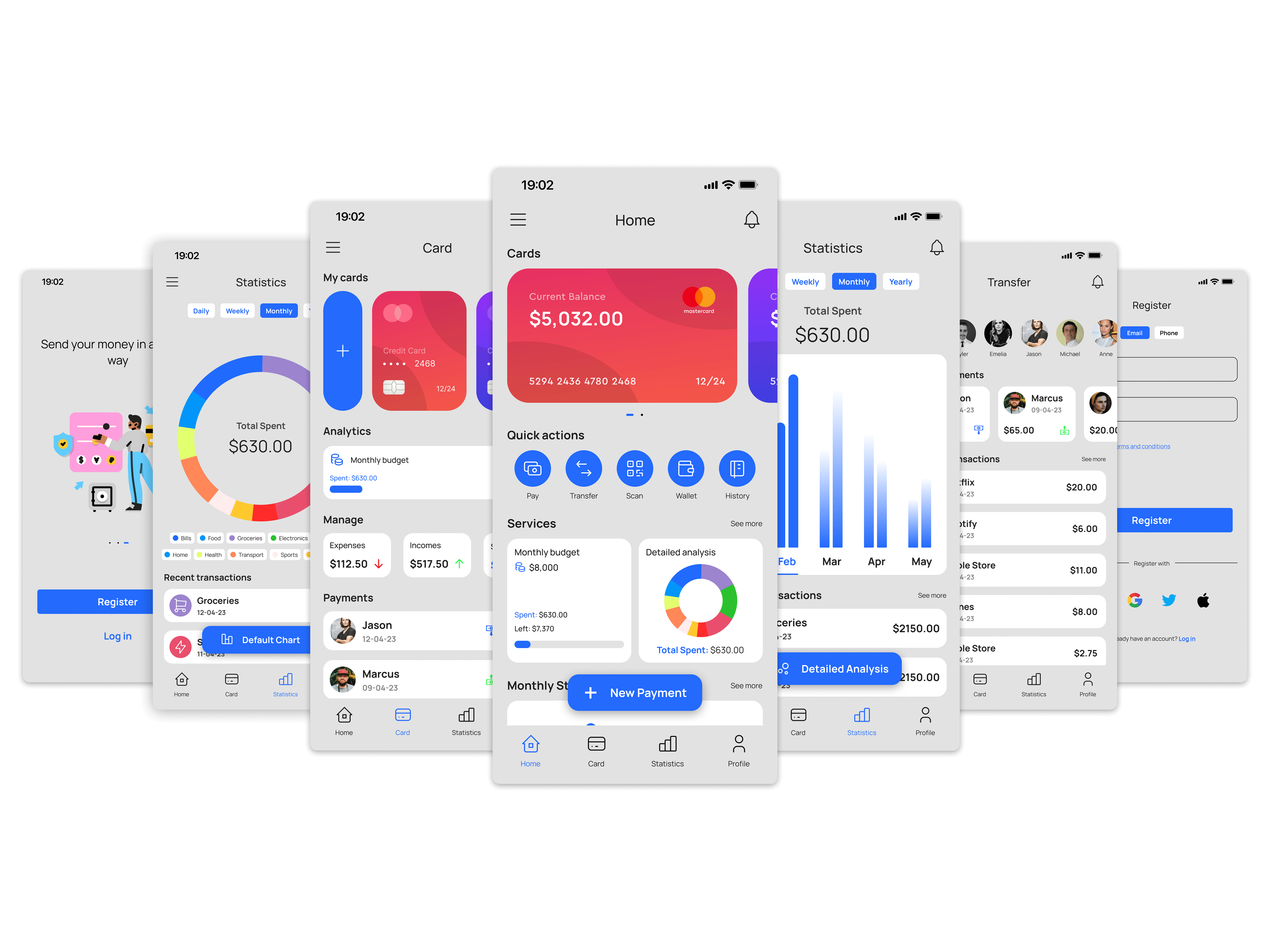
Designing a Mobile Banking Experience Across Light and Dark Themes
iMoney is a mobile banking concept focused on everyday money management. The project explored how financial information could be presented clearly across light and dark interfaces while maintaining consistency, readability, and visual hierarchy.
The work focused on visual design rather than product strategy. My goal was to create a banking experience that felt modern, easy to scan, and comfortable to use throughout the day, regardless of theme preference.
Use the slider to switch between light and dark mode.
The Design Challenge
Banking apps present a large amount of information in a small space. Balances, transactions, budgets, cards, payments, notifications, and analytics often compete for attention on the same screen.
This challenge becomes more noticeable when supporting both light and dark themes. Financial data must remain readable, charts need sufficient contrast, and important actions should stay easy to identify without overwhelming the interface.
The project focused on three questions:
- How can account information be scanned quickly?
- How can financial data remain readable across themes?
- How can visual hierarchy stay consistent throughout the app?
Establishing a Visual System
Before designing individual screens, I defined a visual system that could scale across the entire application.
A single blue accent color became the primary interactive color throughout the experience. Supporting colors remained neutral so balances, charts, and transaction data would receive the most attention. The typography system used Manrope across multiple weights to maintain consistency across dashboards, forms, and detailed financial views.

Designing for Light and Dark Modes
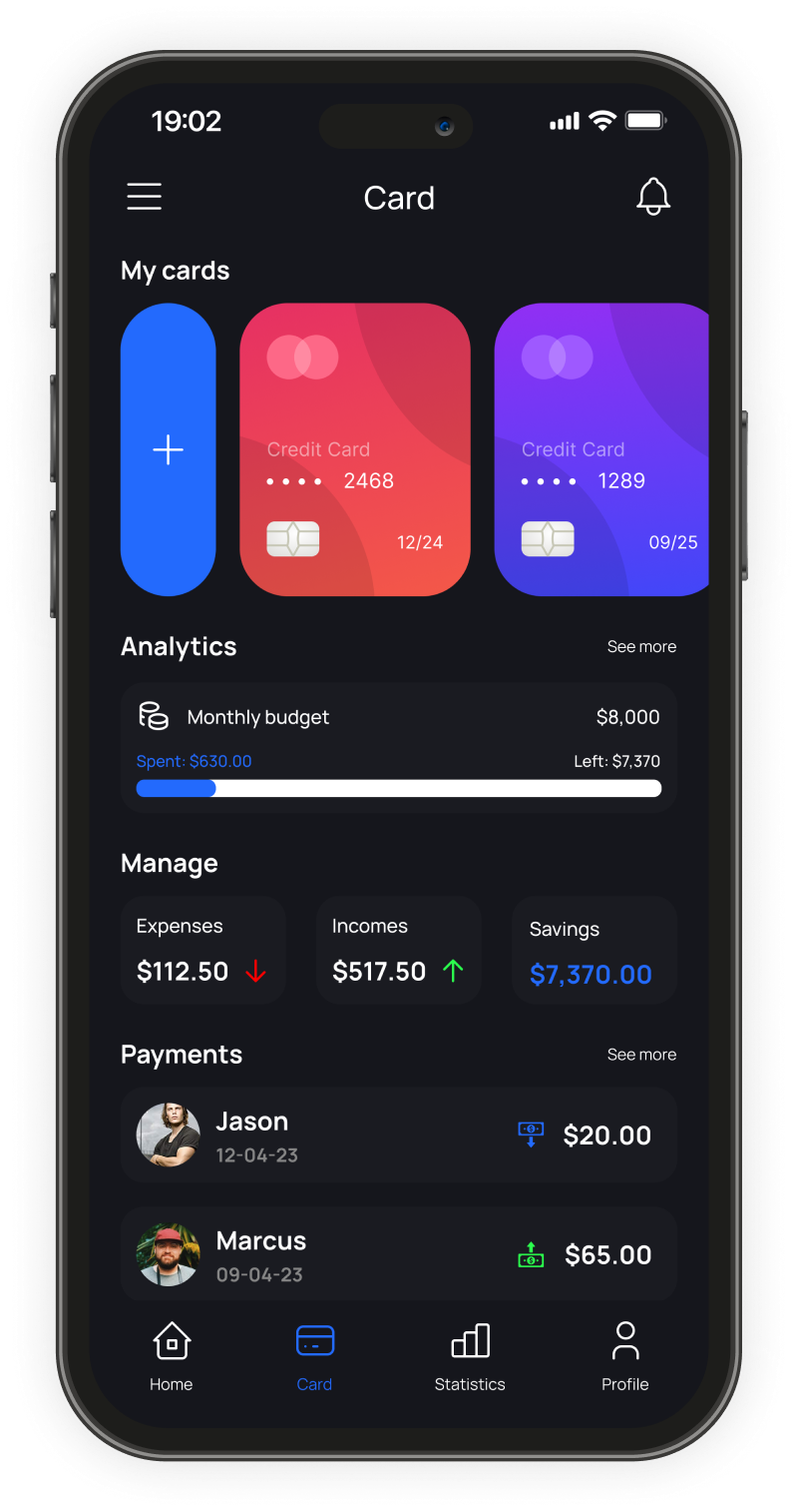
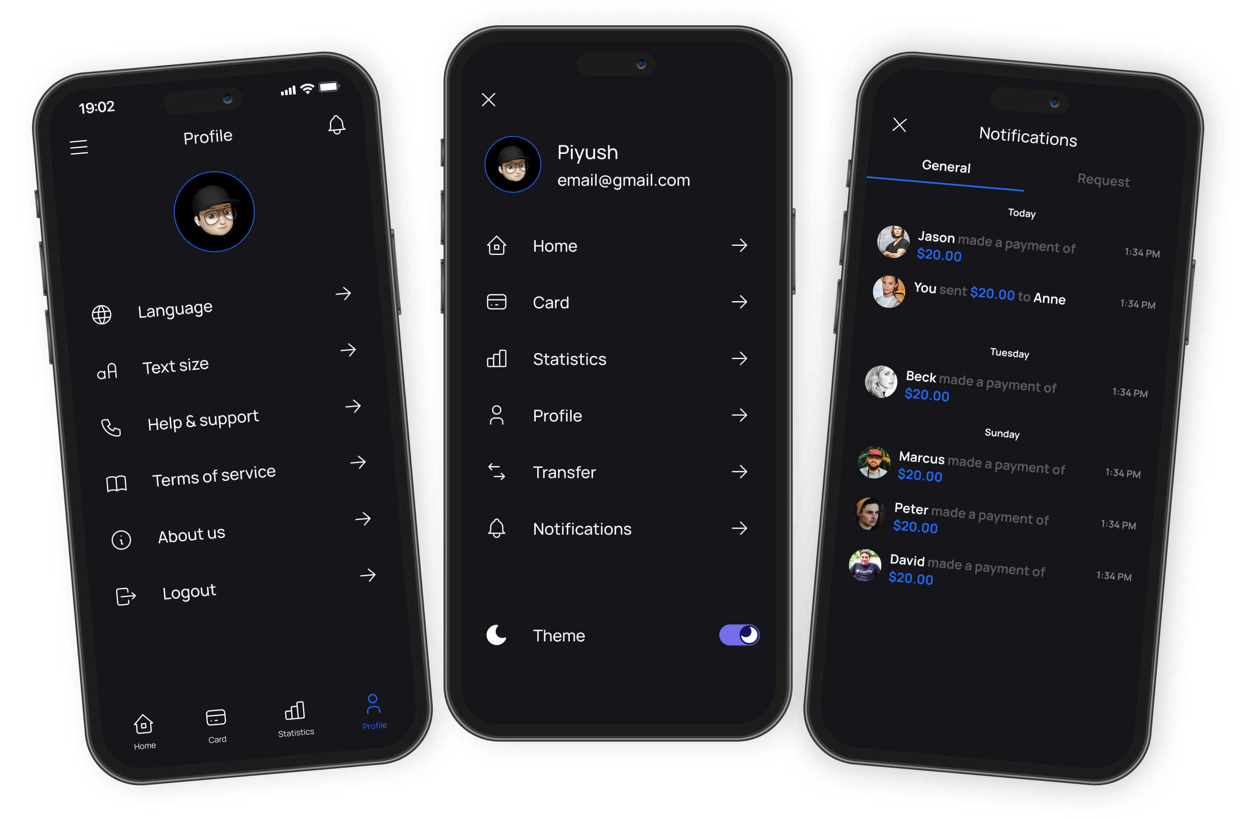
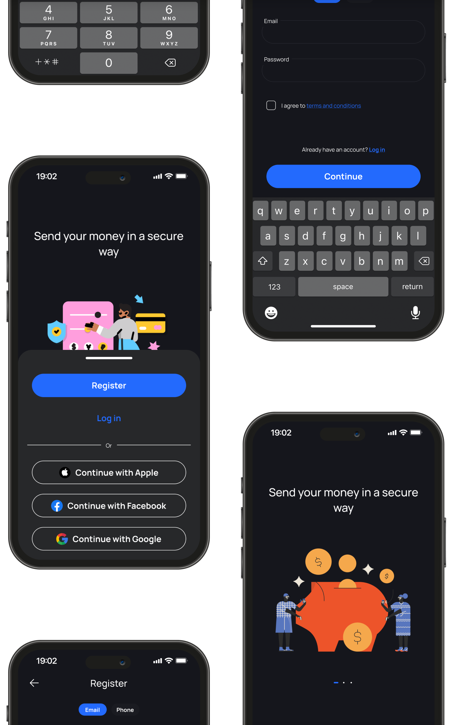
The project was designed in parallel across light and dark themes rather than treating dark mode as a later adaptation. This influenced decisions around card elevation, surface hierarchy, chart colors, text contrast, and status indicators.
Dark mode required particular attention to hierarchy. Using pure black backgrounds caused cards and sections to blend together, making financial data harder to scan. Instead, layered surfaces helped separate information without relying on heavy borders.
In light mode, spacing and contrast carried more of the hierarchy, allowing financial summaries and actions to stand out without introducing additional visual elements. The goal was consistency — users switching themes should never feel like they were using a different product.
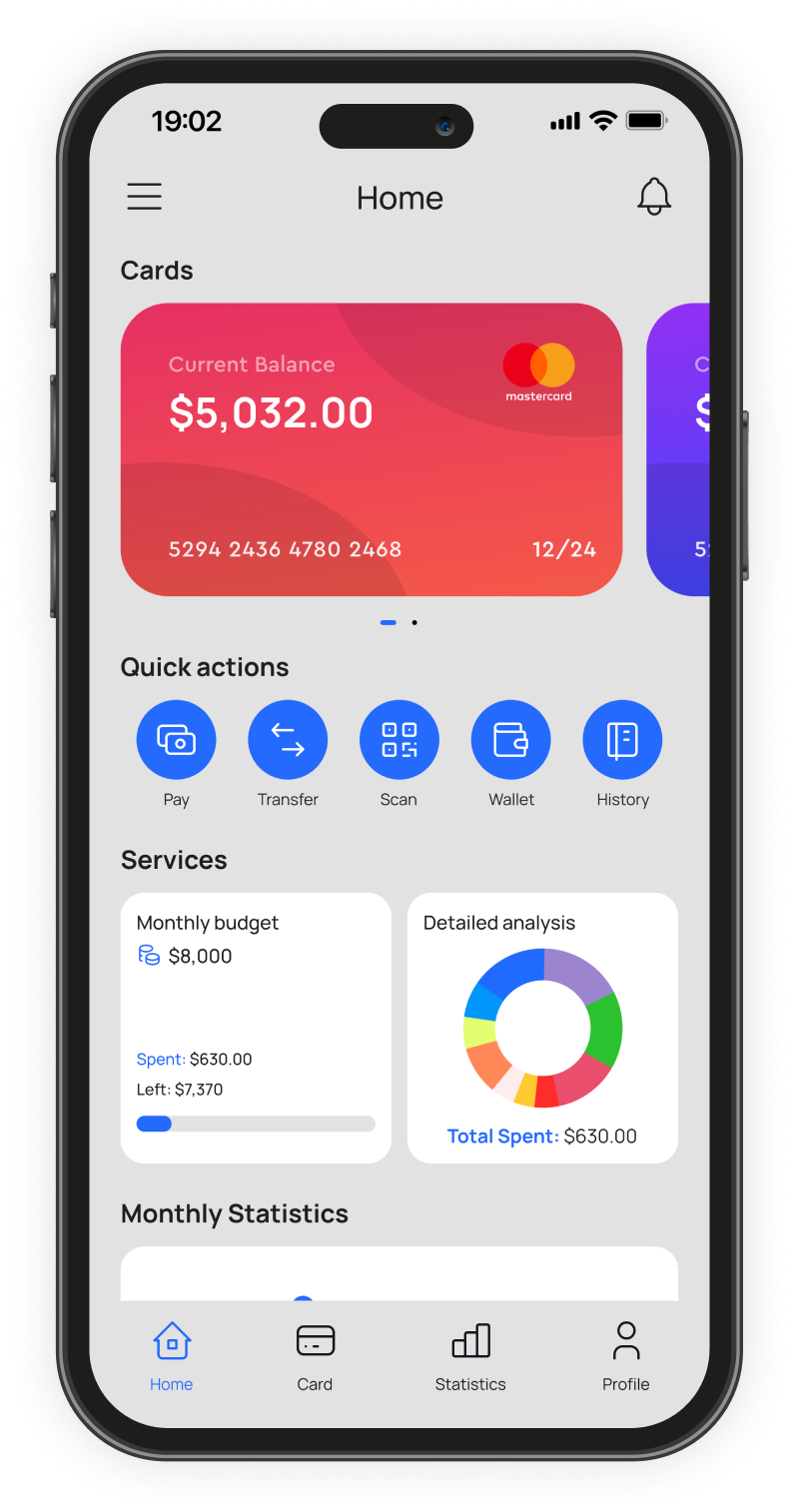
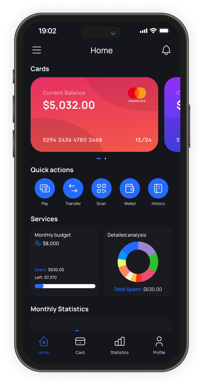
Home Screen
The home screen was designed around the information users check most frequently — current balance, recent activity, budget status, and quick actions — with the objective of surfacing those items without requiring scrolling.
Quick actions such as payments, transfers, wallet access, scanning, and transaction history remain accessible directly from the dashboard. Monthly budget information can expand into different time ranges while keeping the overall layout compact.
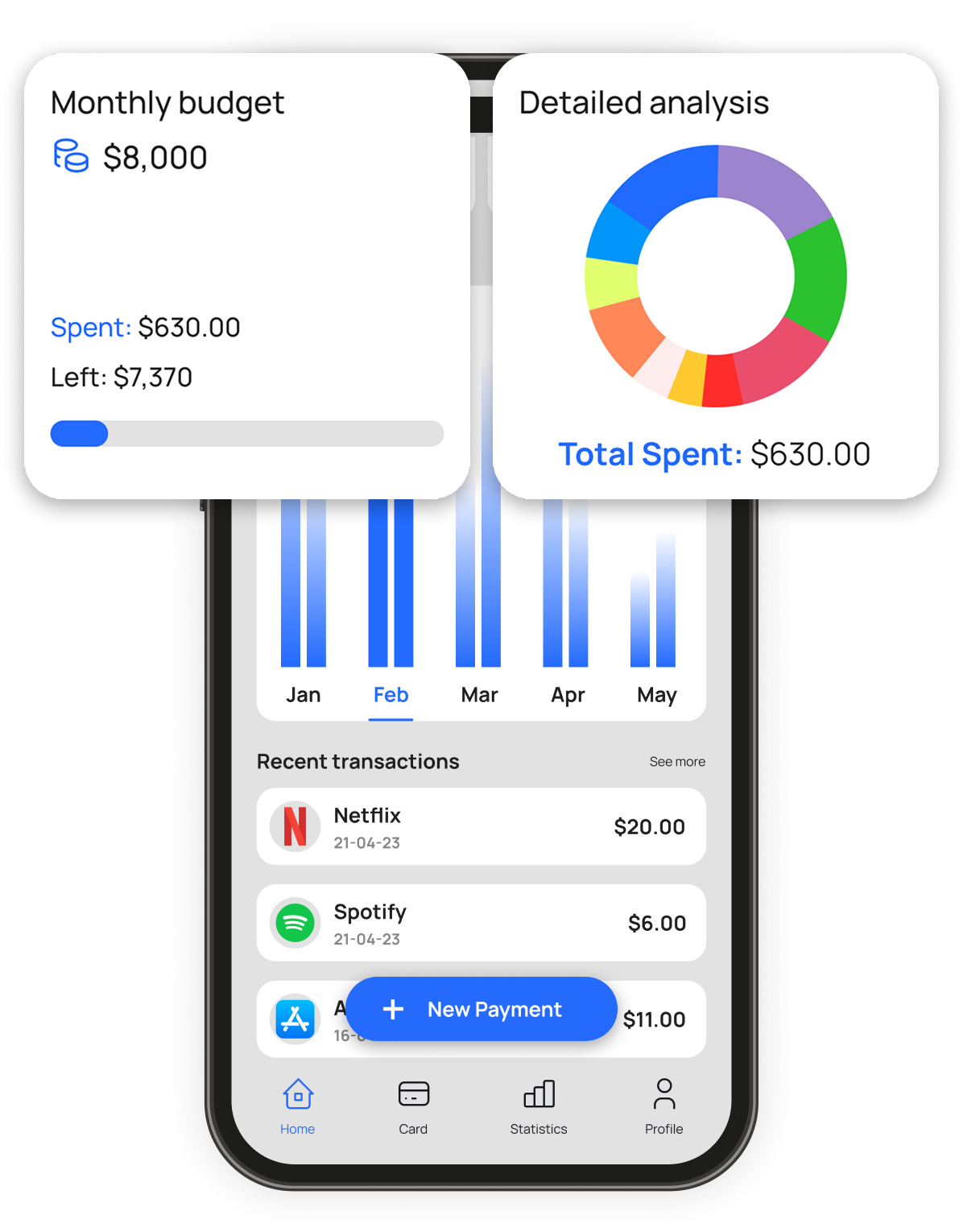
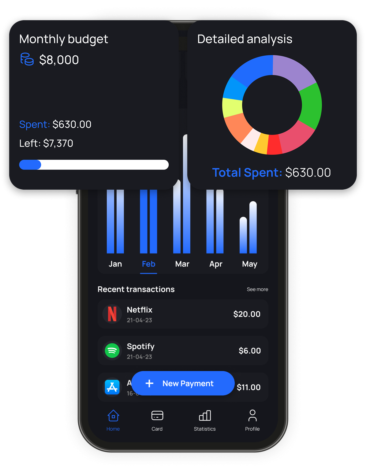
Budgets & Payments
Budget tracking and payments are among the most common actions in a banking app, but they often compete for attention. The design separates monitoring from action.
Budget information remains visible through expandable summaries that switch between daily, weekly, and yearly views. Payment actions stay available through dedicated entry points, keeping the interface focused while ensuring frequent actions remain easy to access.
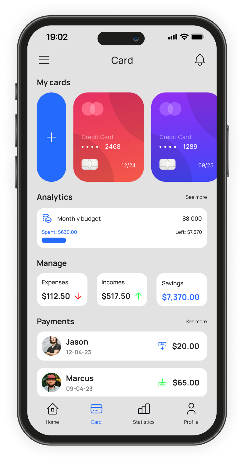
Cards and Account Management
Many banking apps separate card management and spending visibility into different areas. For this concept, I explored combining those views.
Users can view linked cards alongside expense, income, and savings information without navigating through multiple screens. Recent transactions remain visible within the same context, making it easier to associate spending activity with a specific card.
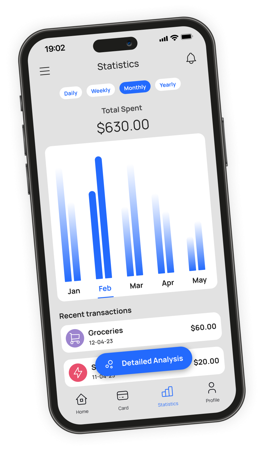
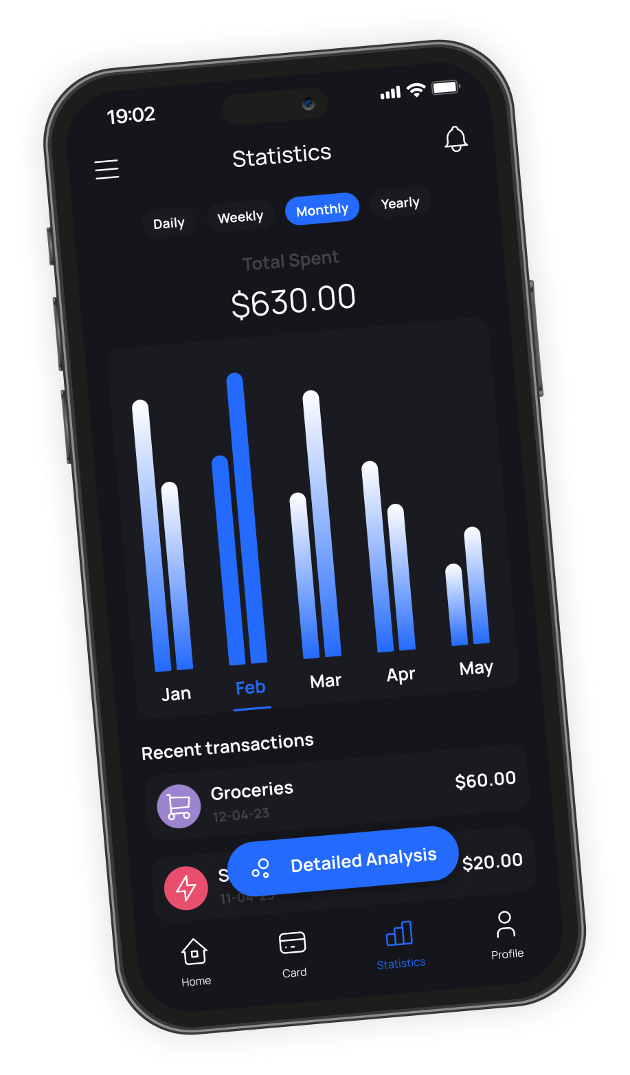
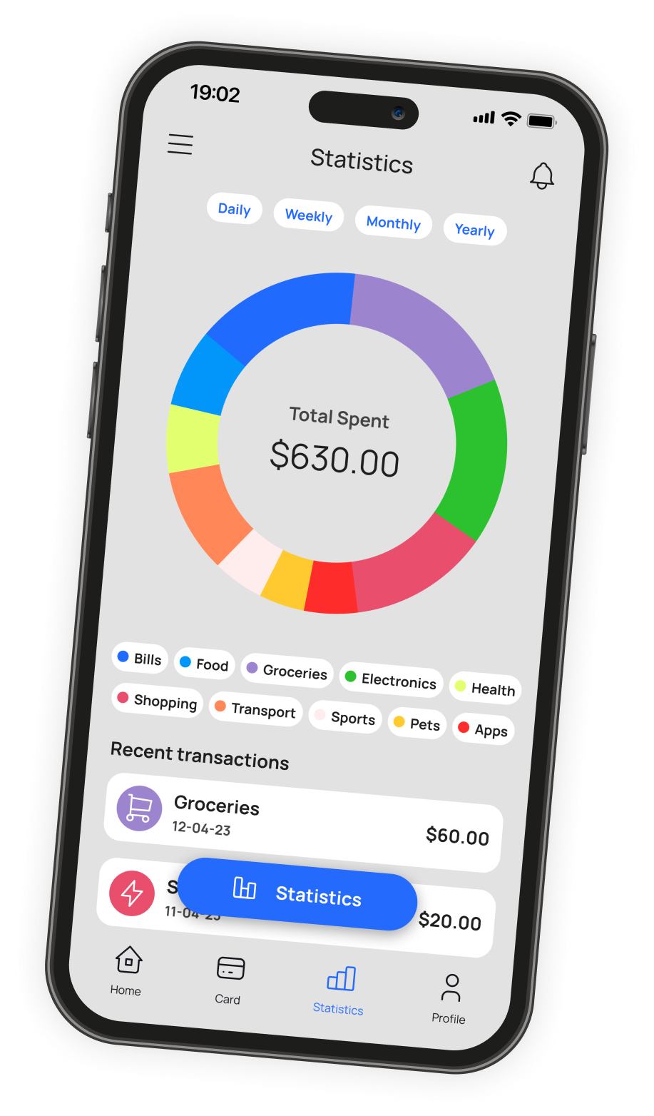
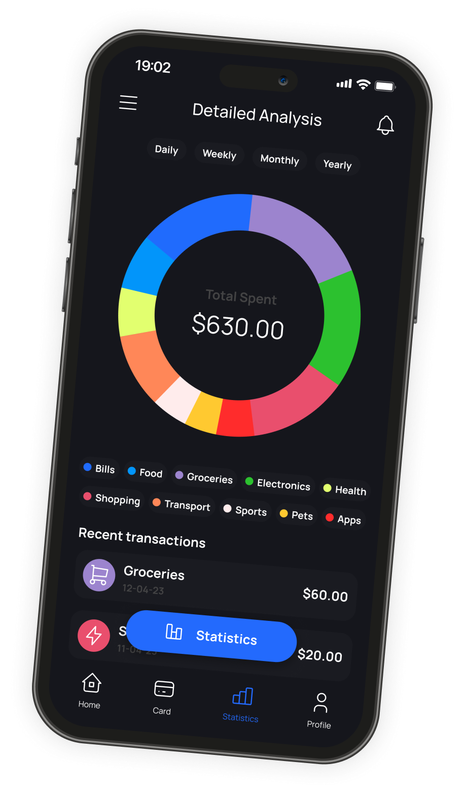
Financial Analytics
Financial data becomes more useful when users can view it from different perspectives. The statistics screen allows switching between spending trends and category breakdowns without leaving the page. Users can move between summarized views and transaction-level detail depending on the level of information they need.
Designing charts for both themes required balancing contrast and readability while ensuring colors remained distinguishable across different viewing conditions.
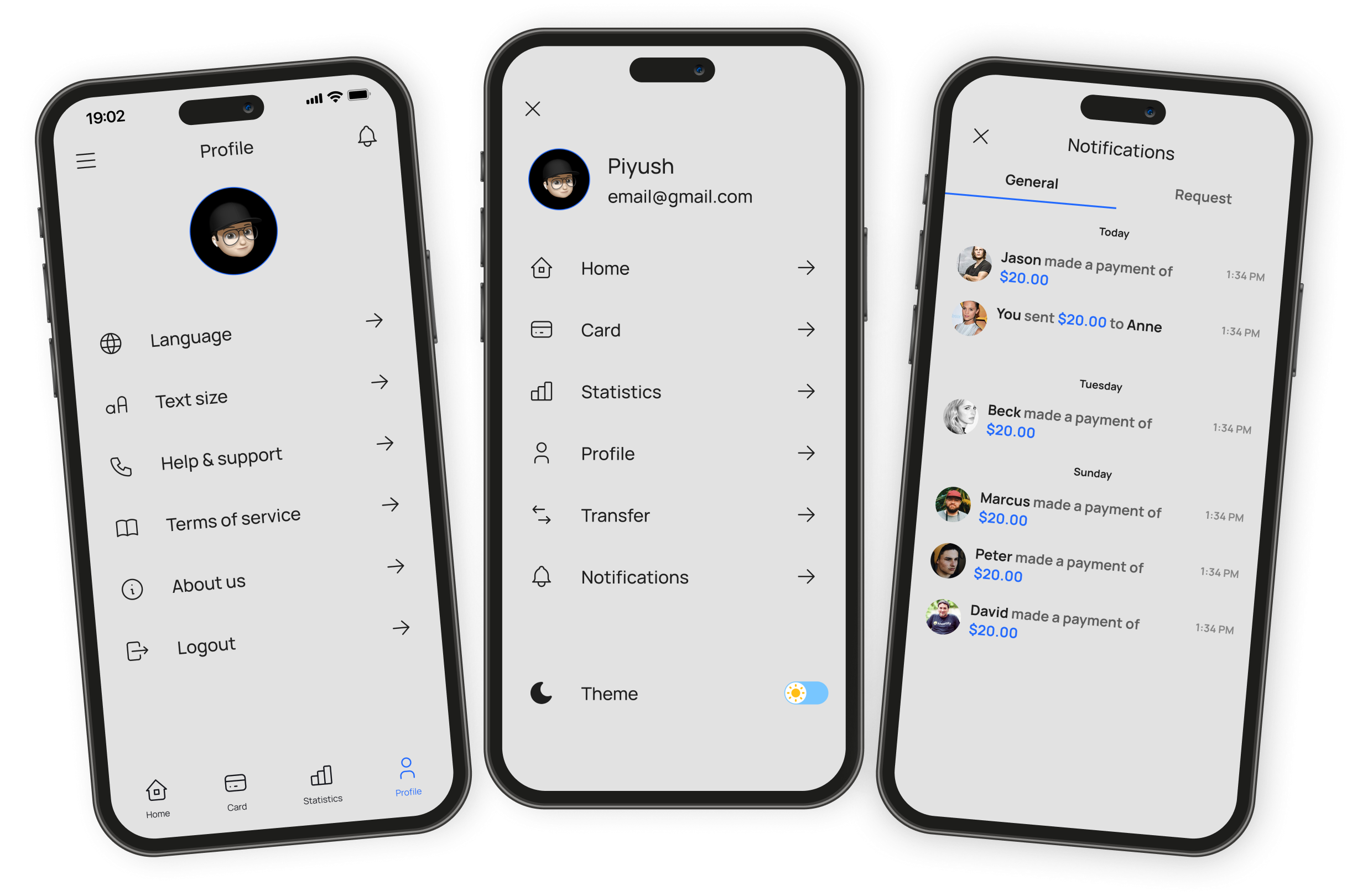
Profile, Menu & Notifications
Onboarding and Account Creation
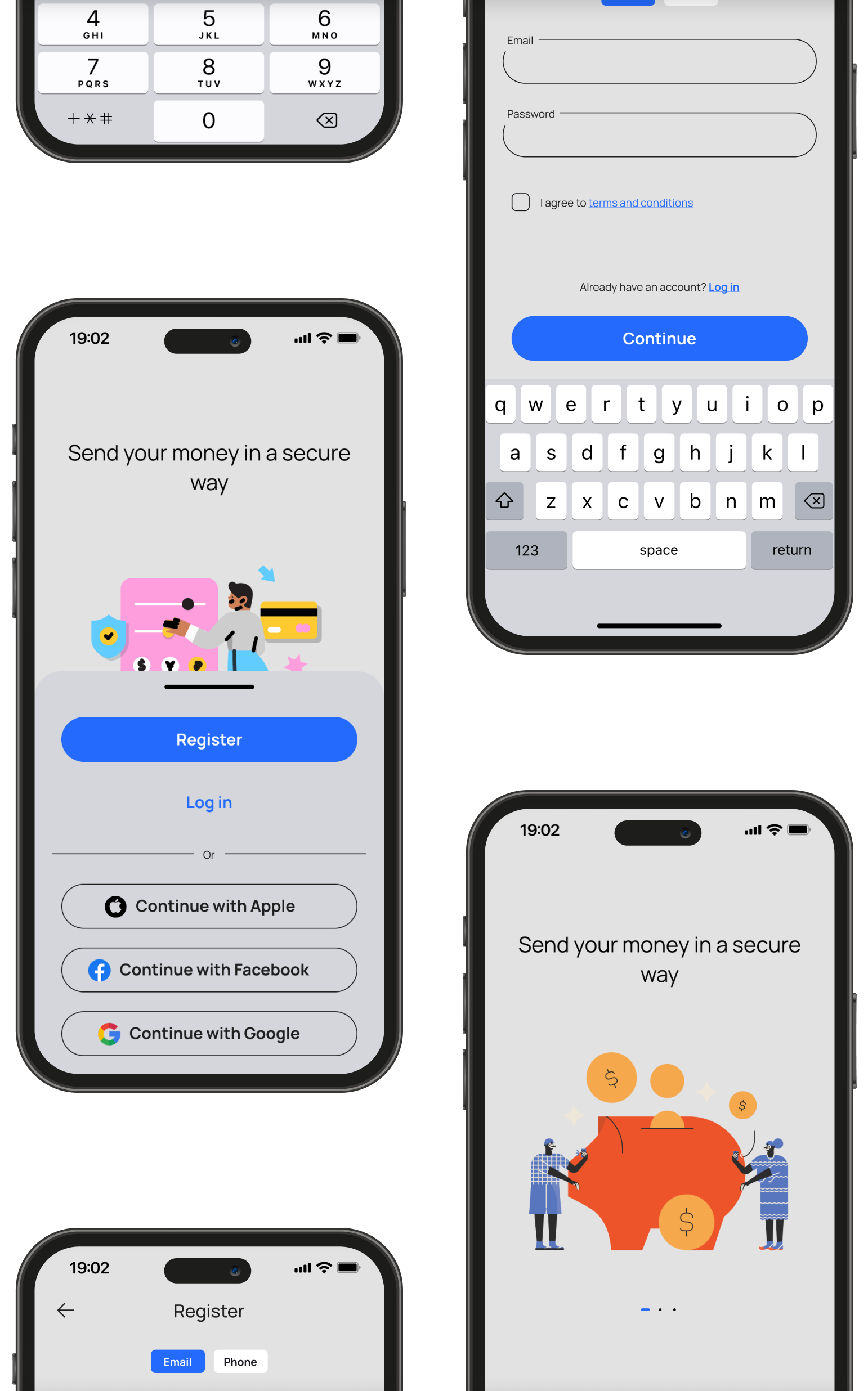
The onboarding flow introduces the product before requesting account creation. Registration options include email, Apple, Google, and Facebook sign-in, followed by OTP verification. The visual design keeps the experience simple and focused so users can complete setup quickly without unnecessary distractions.
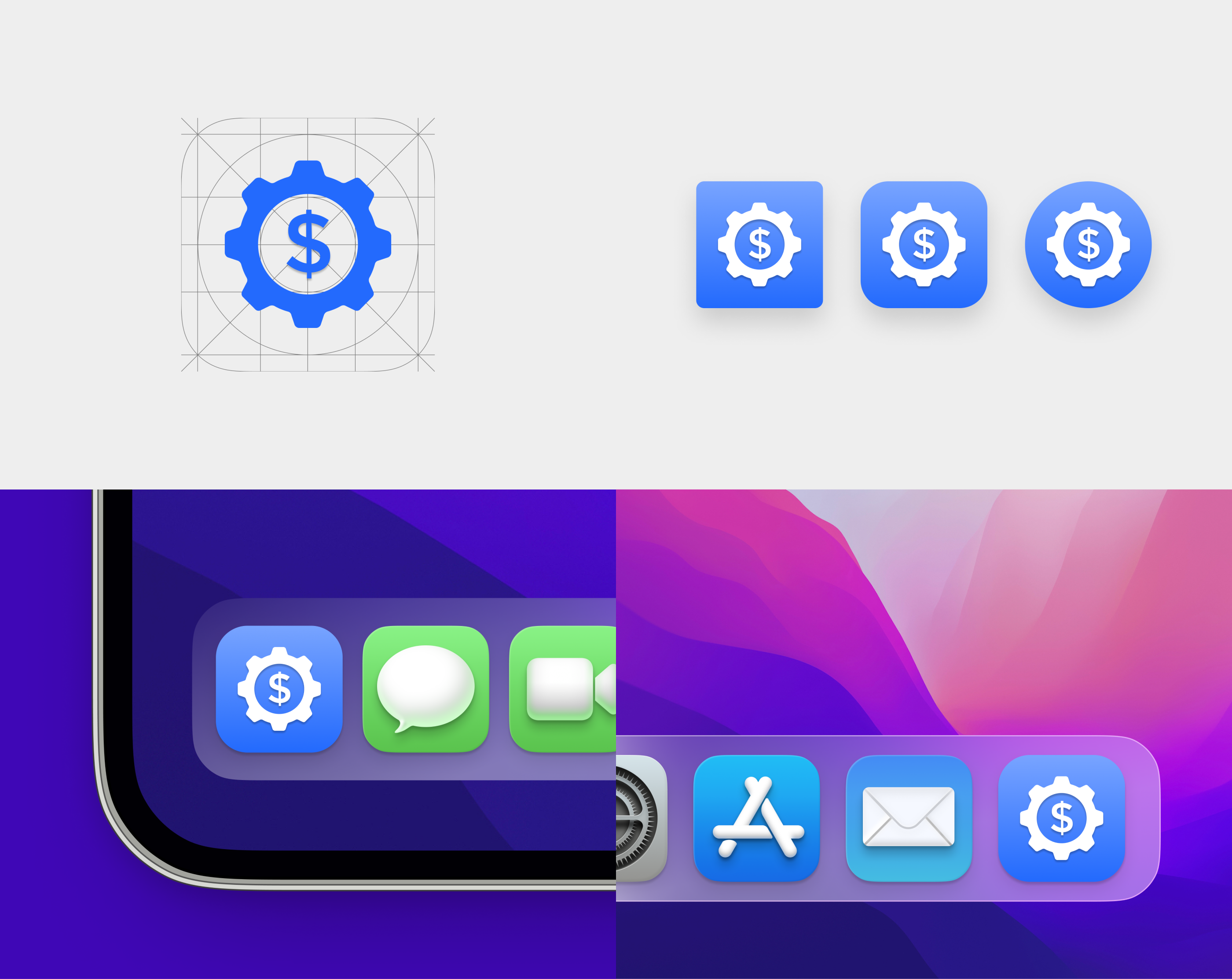
Application Icon
The icon combines two concepts associated with personal finance: money and control. A dollar sign integrates with a gear symbol to create a recognizable mark that remains legible across different device sizes and operating system treatments.
Reflection
This project gave me an opportunity to focus on visual design fundamentals across a complete mobile product. Most of the work involved decisions around hierarchy, spacing, contrast, color, and theme adaptation. Designing both light and dark experiences simultaneously exposed inconsistencies much earlier than designing a single theme first.
Looking back, I would spend more time testing chart readability and accessibility across different screen brightness levels and viewing conditions. Financial products depend heavily on information clarity, and small visual decisions often have a larger impact than new features.