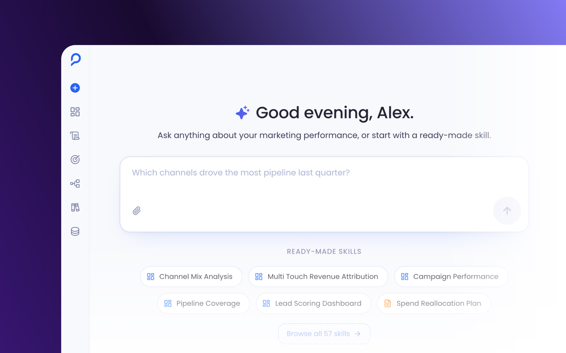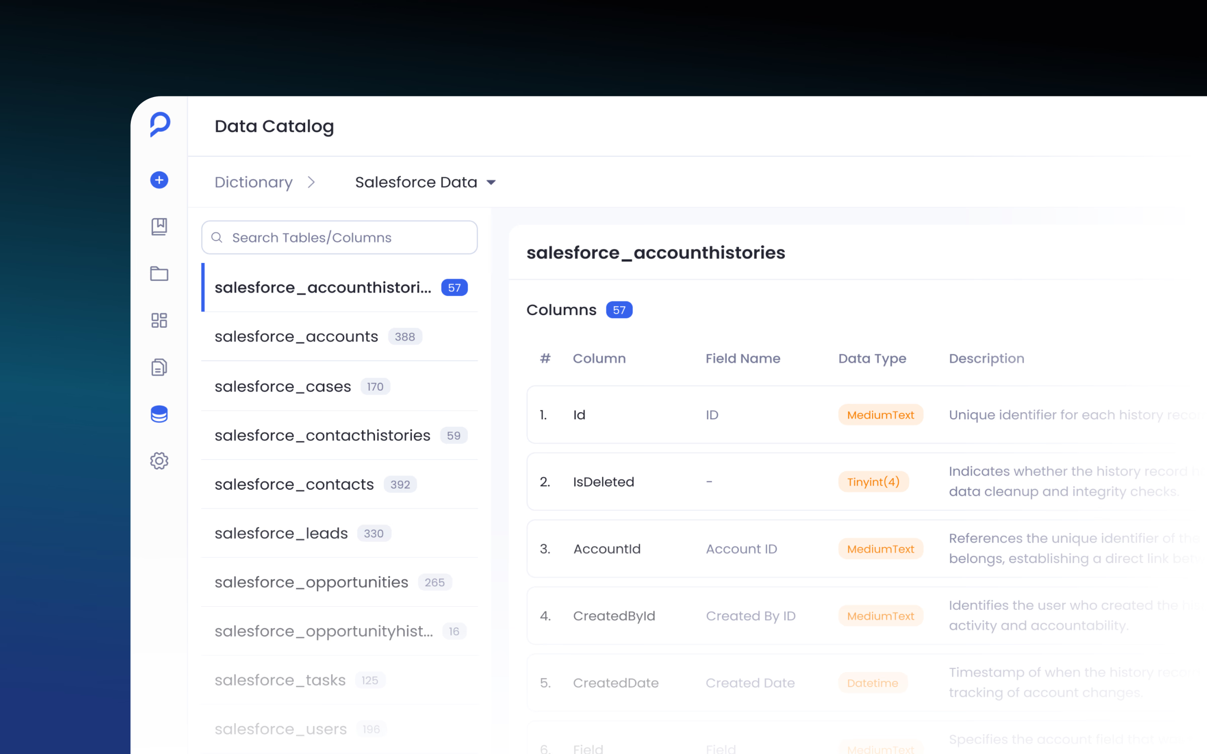

Making Petavue's Design System Easier to Use
I joined Petavue as one of the product designers. The team already had a design system, but a lot of its components were scattered across product files and Figma files, some living only inside specific product screens or random pages. One of my first tasks was to create one consolidated space where all of them would live. Later, that same foundation became the base for the React components I used to build prototypes with Claude Code.
Results
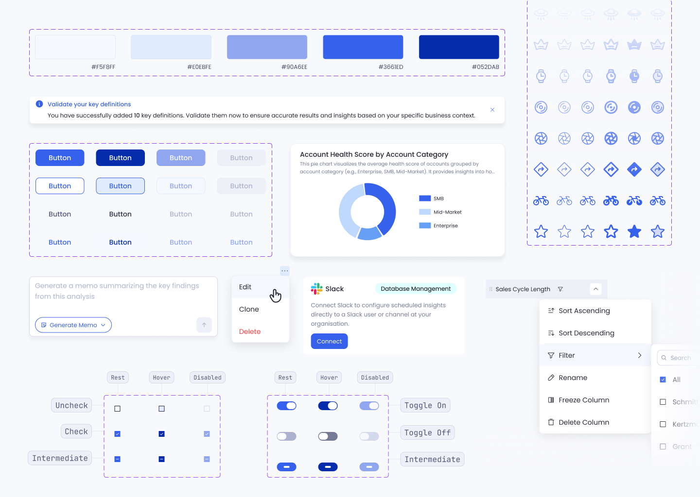
The system was used across the product, and newer components were built as variants of existing ones instead of becoming new duplicates. It later became the foundation for React prototypes.
The System Already Existed
Petavue already had a design system when I joined, but it had grown alongside the product and gotten harder to use. Components were spread across different Figma files, there were duplicates of the same pattern, inconsistent naming, and a lot of missing states.
Frontend engineers rarely came to Figma for a component reference. They'd look at the product screen where the component already lived and use Figma's dev mode to pull its properties. When a component was missing a state, like an empty state, or how it looks with different rows and items, the frontend often had to come up with their own version, and the design drifted across products and features.
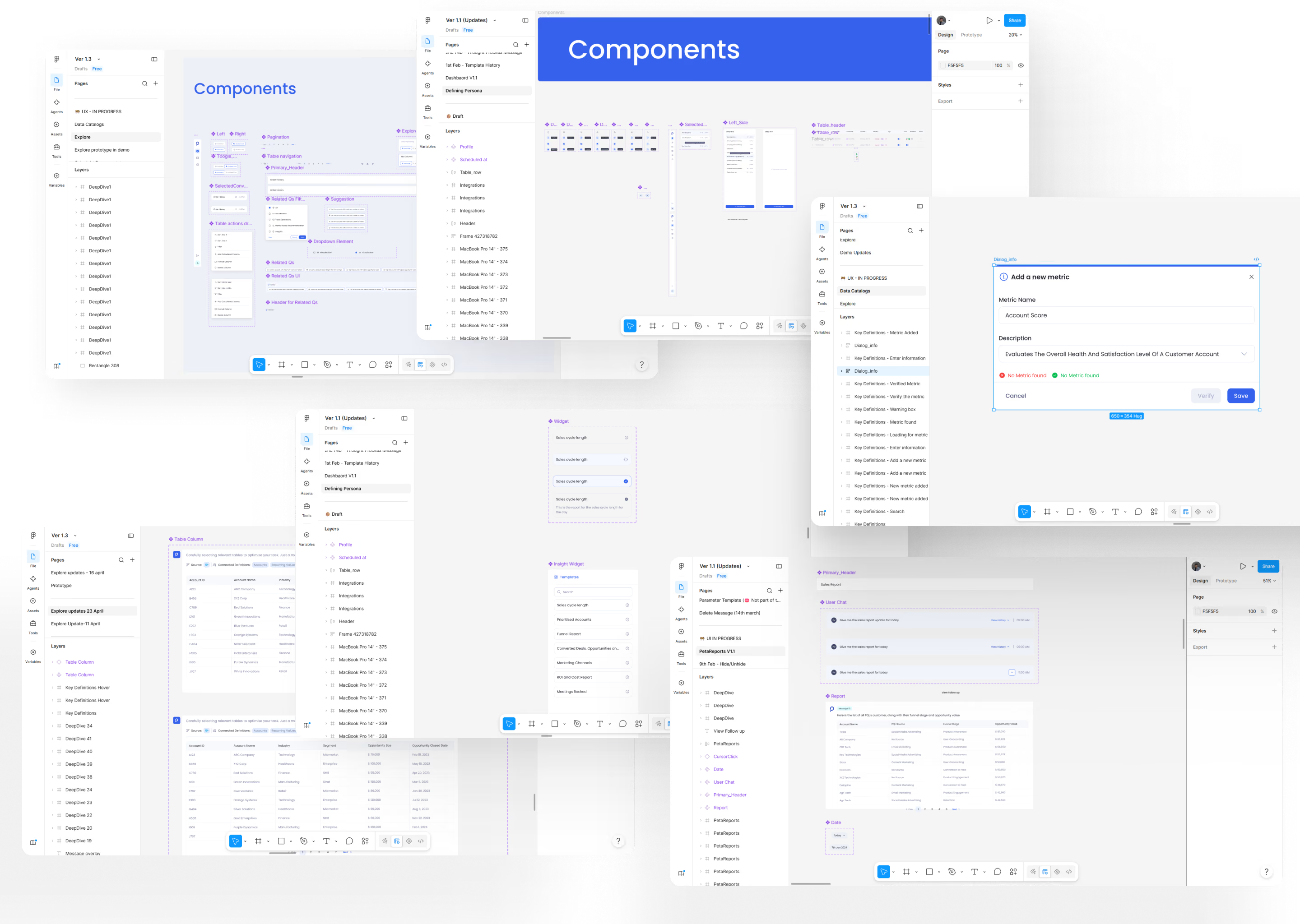
Before designing a new screen, we were often solving the same UI decisions again.
I Built the Foundation
I pulled the commonly used components into one library and cleaned up patterns that had accumulated over time. A lot of them had to be rebuilt, because some had multiple frames, incorrect states, or incorrect naming. That gave us a single file for every component, and the place other designers would come in to maintain it. One place to find a component. One place to maintain it.
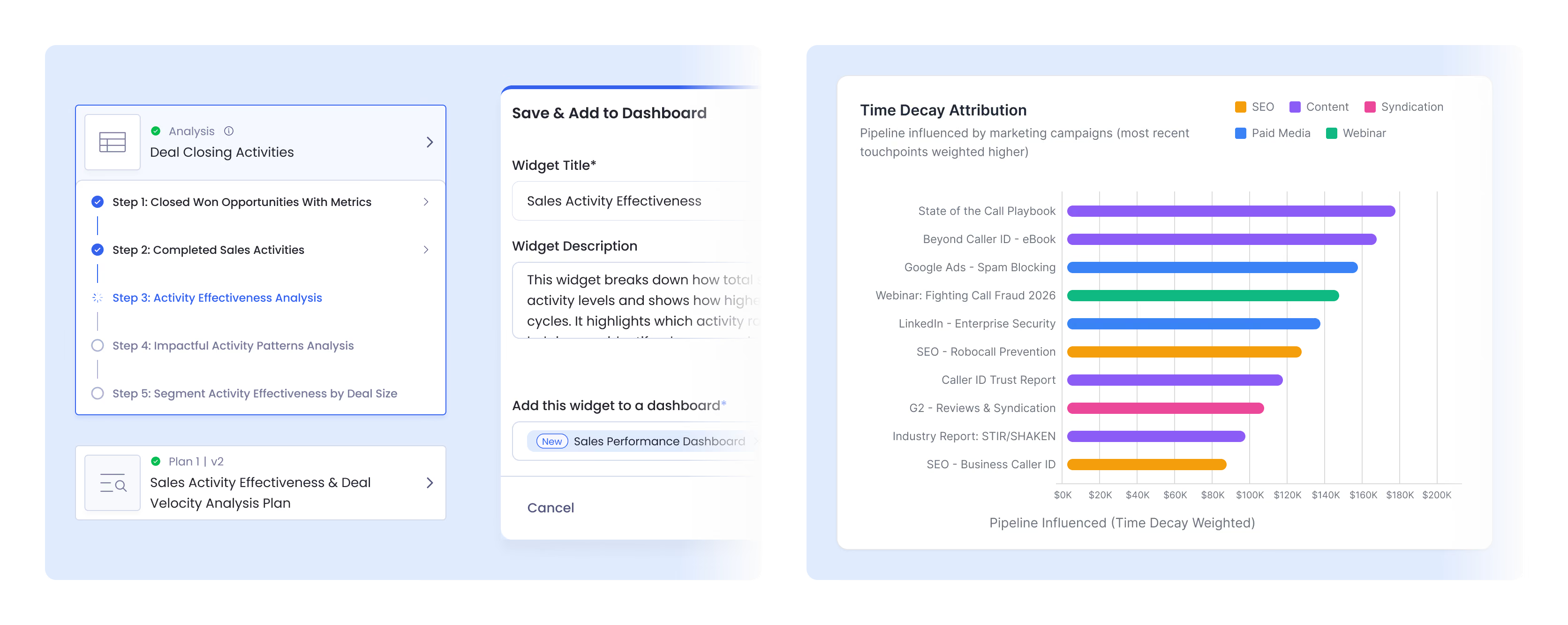
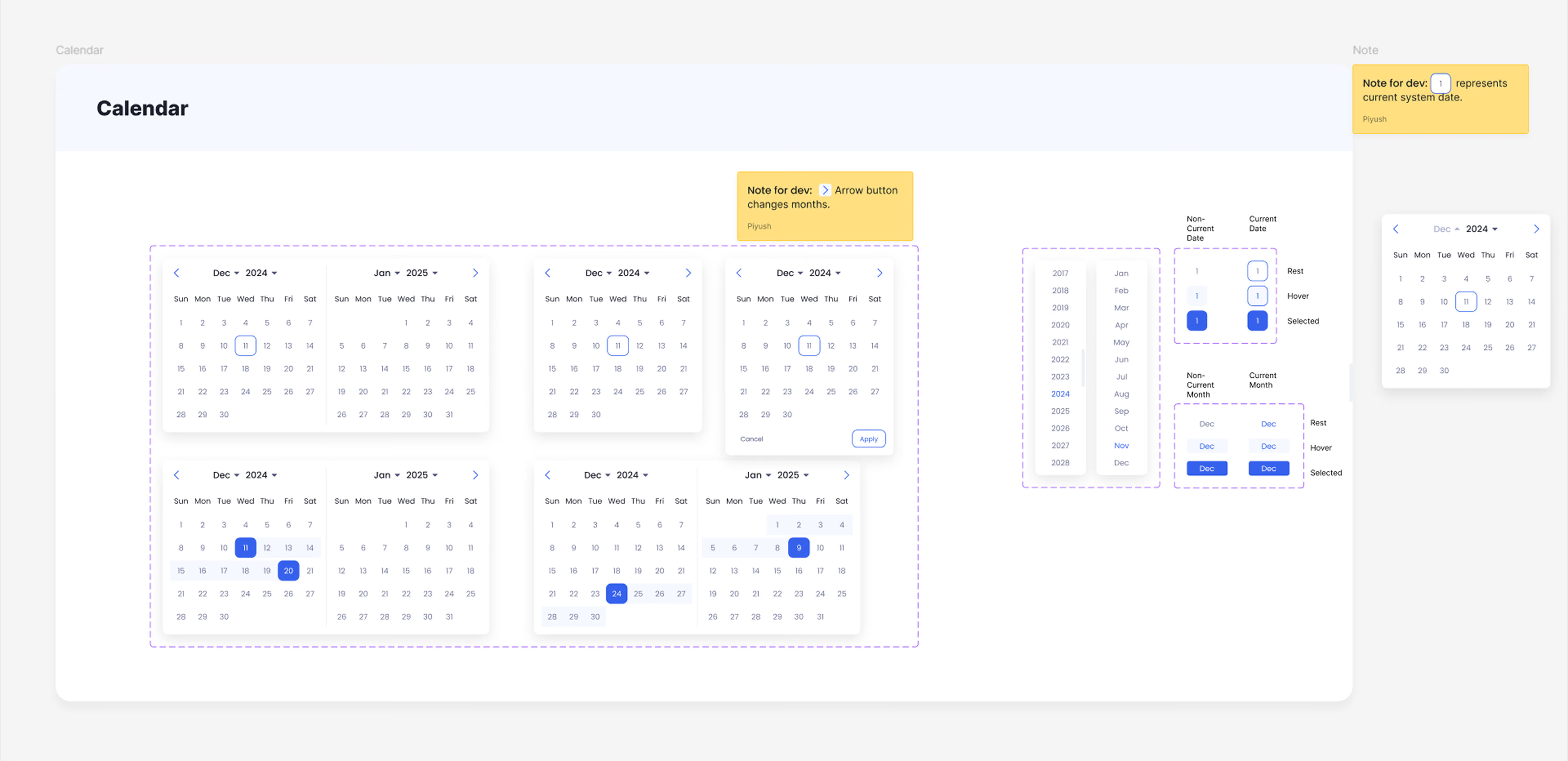
A component wasn't finished when the default state looked right, so I added the loading, error, empty, hover, pressed, and disabled states it needed to live with the component instead of getting rebuilt inside every screen. They were stored as variants, so when something new was needed, I could change a property instead of breaking the component down and building a new one from scratch.
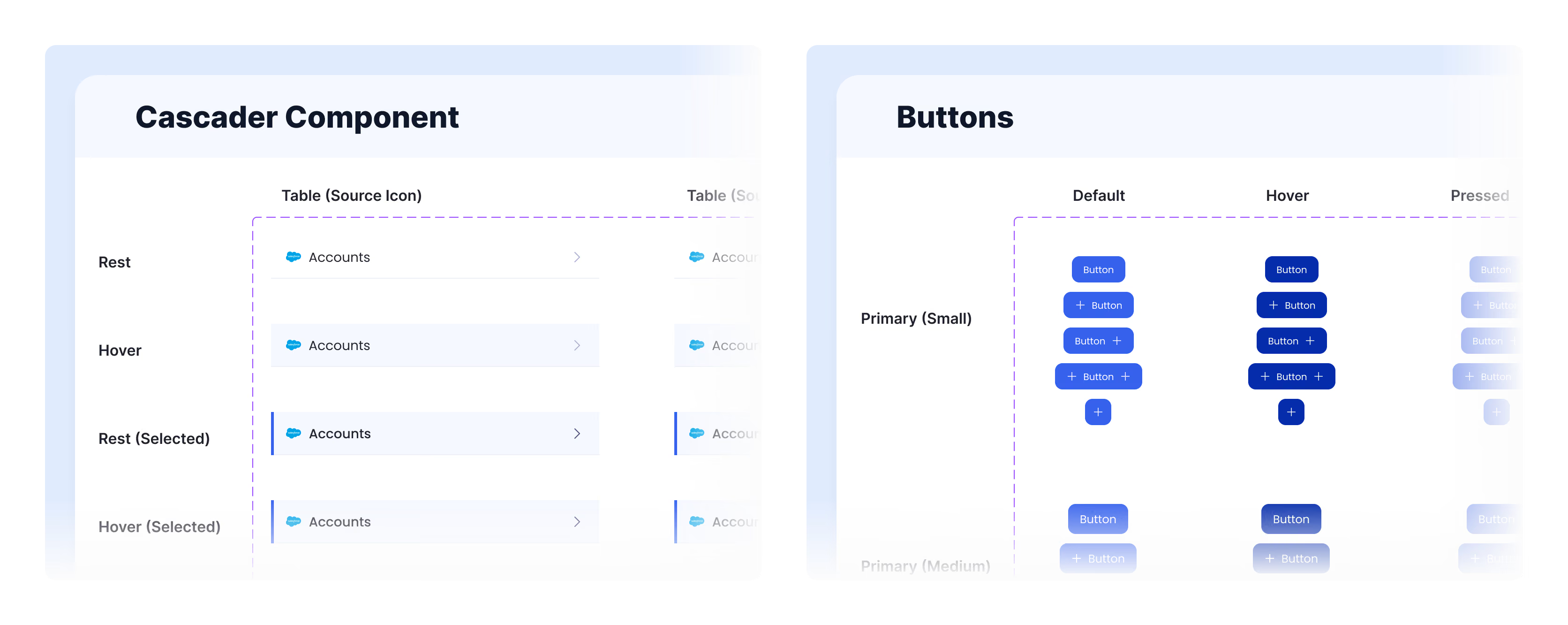
The System Had to Work With the Product
Once the foundation was cleaned up, it became the starting point for new product work. New screens could be assembled from existing patterns instead of rebuilding UI each time. It felt a bit like a video game: placing blocks to build a base, and it made designing UI much quicker.
Even our early wireframes were so close to dev-ready work that, when the actual dev-ready designs were needed, we only had to change or design a few new components.
Consistency Still Needed Room for the Product
Reuse didn't mean forcing every use case into the same component. Sometimes a use case really did call for its own component. The same base component could get used as-is for reporting, adapted for configuration, or extended for a more advanced case, and when it needed to change, I treated that change as part of the system instead of creating another version somewhere else.
Demos Needed to Move Fast, Without Inventing New UI Each Time
We often designed quick demo prototypes for the stakeholder team, and sometimes they came to us with a demo brief on only a few days' notice. Because the component library already existed, the other designers and I could split the work: one focused on the overall user experience flow, the other assembled the screens from the library so they looked product-ready. The demos needed a few minor touch-ups, but nothing was built from scratch, so they came together fast without looking different from the product.
A Word From the CEO

Handoff Was Practical, Not Just a Figma Link
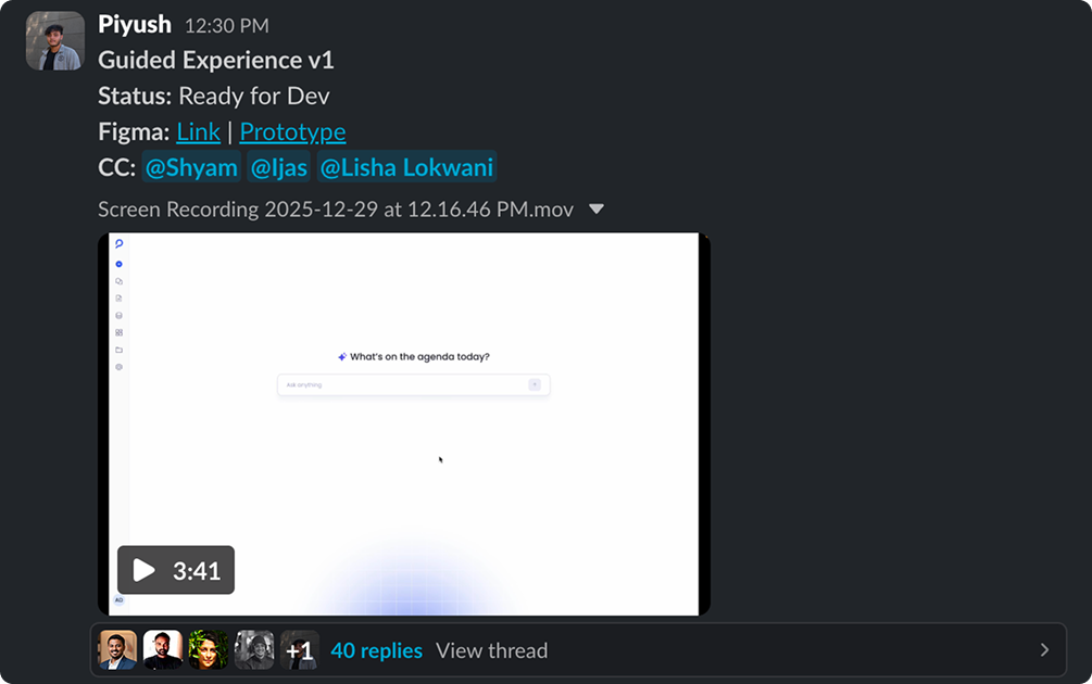
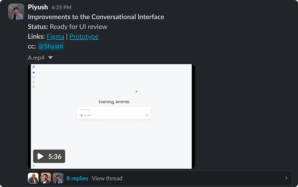
Once the UI was ready, I'd share the Figma and prototype with product and engineering, mark it as ready for UI review or ready for dev, and call out the scenarios that needed attention. Developers could flag implementation issues early, and we'd adjust the scope before development started.
Then I Started Building With It
Building the library early paid off again in 2026, when I learned Claude Code and started designing and building my own screens. I saved the components as React components, so instead of designing a Figma screen every time, I could build quick wireframe prototypes in Claude Code, send them to Figma to fine-tune, and then publish them in real code. Because the components and visual rules were already defined, I could spend more time testing the interaction instead of rebuilding the UI.


From Component to Working Interface
Instead of stopping at a polished Figma screen, I could build the interaction and test it in a real interface. That changed what I could prototype and how quickly I could get an idea in front of the team.
Two components from the library, live and clickable:
A dialog composed from the same components, generate a link, expand for more detail, and reveal the API key:
The button component's four types, primary, secondary, ghost, and ghost blue, each with real hover, pressed, and disabled states. Click one:
I also compared the same component in code and the browser, to see whether the design decisions actually carried through:
View more interactions on the Explorations page.
What Changed
Before
Components were scattered across files, duplicated, and missing states. We kept solving the same UI decisions again in Figma.
After
One working library of reusable components with defined states, used across both Figma and React, so designing everyday screens got quick.
The system became something we used every day rather than something that only lived in Figma.
I inherited the system, so my first job was figuring out what was worth keeping, what needed to change, and what the team actually needed.
The biggest shift was seeing the design system as part of the product workflow. Once the same foundation supported product design, prototypes, and React builds, it became much more useful.